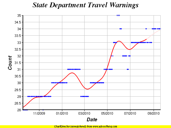
The chart above is the number of Current Travel Warnings from the US State Department over the last year. Just noting that the trend is upward. Of course, the trend has generally been upwards since the first time I looked at this back in 2004. Here is a chart showing that whole time period. Prior to 2009 though, I was only adding data very sporadically, for instance adding only 2 data points at all in the 2005-2008 time period. Since April 2009 though, I automated it to add one new data point every day, so the trends are much clearer.
| Abulsme.com | Abulsme Blog | Election Graphs | Curmudgeon's Corner Podcast |
| True Binary Clock | Random Trips | Live WebCam |

