This is the website of Abulsme Noibatno Itramne (also known as Sam Minter). Posts here are rare these days. For current stuff, follow me on Mastodon

Categories

Calendar

November 2024
S M T W T F S
 12
3456789
10111213141516
17181920212223
24252627282930

Electoral College: Virginia moves to Lean Obama

Chart from the Abulsme.com 2012 Electoral College Prediction page. Lines represent how many more electoral votes a candidate has than is needed to tie under several different scenarios.

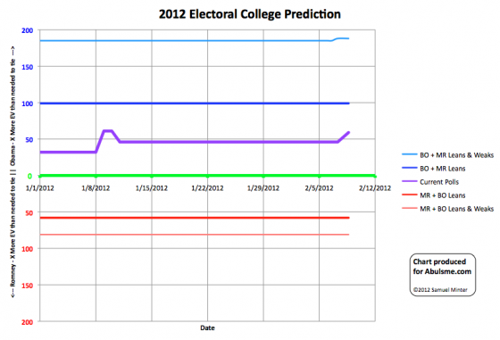
A couple of new polls move my “last five poll” average in Virginia from being “Just barely Romney” to being “Just barely Obama”. In reality, the state is too close to call. But if everybody won all the states they are ahead in at the moment, that would make the result Obama 328, Romney 210… a pretty solid Obama victory. To match his 2008 record though, Obama would need to also win all of the remaining “Lean Romney” states. And of course Romney still has possibilities to win by grabbing “Lean Obama” states back. It is a long year.

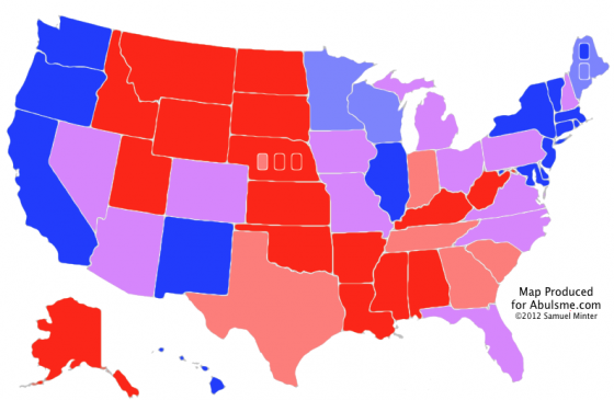
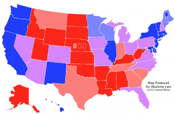
The map doesn’t change since I’m coloring all too close to call states purple, but here it is again anyway:

Map from the Abulsme.com 2012 Electoral College Prediction page.

Edit 2012 Feb 16 19:48 UTC to correct typo.

Electoral College: Montana Weakens

Map from the Abulsme.com 2012 Electoral College Prediction page.

And so, in the first update since I began tracking the general election matchup between Obama and Romney, we have a change in the status of one of the states. A new poll in Montana brings my five poll average (seeded with 2004 and 2008 results) under 10%, which moves Montana from Strong Romney to Weak Romney. Now, my average still has Romney ahead by 9.7%, which is still almost strong… his lead would need to fall below 5% for me to consider the state a toss up, and it is a long way from that.

But still, movement! State by State polls are still relatively infrequent at this point… a few per week… so change will be slow. Plus the focus hasn’t shifted to the general election campaign yet. By the time we get to the summer and fall, things will accelerate rapidly.

Below see the chart of where this puts us in terms of the electoral college. Montana only has 3 electoral votes, so it is just a minor movement on the upper line, which represents how many more electoral votes Obama would get than he needed to tie if he won all of the states he is ahead in, all the too close to call “lean” states and Romney’s weak states. This is of course a highly unlikely scenario. For the most part likely outcomes “if the election was held today” are between the dark blue and dark red lines below.

A better way to think about the “weak” states is that they are states that the candidate has a healthy lead in, but not so big a lead that they can ignore the state completely, as they could become vulnerable if the other candidate gets on a roll and gets a major nationwide surge in the polls. (Meanwhile, the “strong” states can indeed be ignored almost completely, and almost all the campaigning, advertising, and dollars will be pouring into the “lean” states.)

Chart from the Abulsme.com 2012 Electoral College Prediction page. Lines represent how many more electoral votes a candidate has than is needed to tie under several different scanarios.

And of course a final reminder… none of this represents an actual prediction for the results in November. This represents the state of things NOW, as imperfectly determined by still very sparse polling. Between now and November, quite a lot will happen, and the states will ebb and flow between categories as events unfold. This is why these charts show changes over time rather than just the snapshot of “now”. The goal is to show how the situation changes over the 10 months (and a few days) of the 2012 campaign season.

Curmudgeon’s Corner: Spinning Wheels!

In the latest Curmudgeon’s Corner…

Sam and Ivan talk about:

  • Spam Fighting
  • Newt and Romney South Carolina
  • Newt and Romney Florida / General Election 2012

Just click to listen now:

[wpaudio url=”http://www.abulsme.com/CurmudgeonsCorner/cc20120122.mp3″ text=”Recorded 22 Jan 2012″]

or

1-Click Subscribe in iTunes

View Podcast in iTunes

View XML Feed

Electoral College: If it is Romney

Map from the Abulsme.com 2012 Electoral College Prediction page.

Well, the time has come. I have put together my initial general election forecast. Now, since so far Romney has been the only one in the lead in my Republican Delegate Count Tracking this initial analysis is based on the assumption that this will be an Obama vs Romney race. If someone else, say, I don’t know, Gingrich, would take a lead in my delegate count at some point in the future, I’ll produce a new analysis based on that pairing. For now though, we assume a Romney nomination.

Bottom line at the moment… Obama is in a better position than Romney. If everybody won the states where my polling average indicates they are even slightly ahead, Obama wins by 315 to 223. But there are 12 states that at the moment should be considered too close to call. If Romney were to win all 12 of those states, he would win 327 to 211. If Obama were to win all 12 of those states, he would win 368 to 170. (For reference, 2008’s final result was Obama 365, McCain 173, so at the moment Obama’s best case is just slightly better than his 2008 result.)

For details on the methodology I am using, please see the full 2012 Electoral College Prediction page. It isn’t the most sophisticated analysis method out there, others such as HorsesAss.org are doing more complex things such as Monte Carlo simulations based on current polling, etc. As we get closer to November, there will be dozens of sites doing different sorts of modeling and predicting possible results in different ways. I hope mine provides a slightly different view which is useful or interesting to at least a few people.

The main item that is different with what I show than what I’ve seen other places is my method of showing the evolving race over time. In 2008, that chart ended up looking like this:
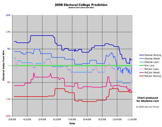
(More on the 2008 analysis can be found at the 2008 Electoral College Prediction page.)

In the 2008 chart above, the lower the lines were, the better off Obama was doing, the higher the lines, the better off McCain was. The nice thing here though is you can see the ebb and flow of the race over the course of the year. So you can tell McCain was doing well in the Spring, then sometime in May he was no longer the favorite to win, and with the exception of a few days right around the Republican convention, he was never ahead again. Then soon after the conventions were all over, McCain just collapsed and by the time we got to October, it was clear that it would take something remarkable happening for him to pull off a win.

Anyway, for 2012 I’ve redone some of the details of how this chart is constructed, hopefully improving readability and intuitiveness. We don’t have all that much data or action yet so far, things are just beginning after all, but here it is:
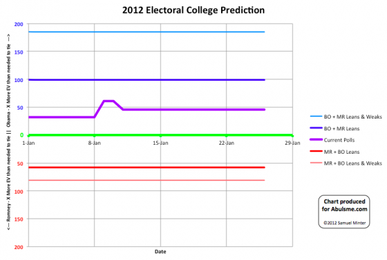
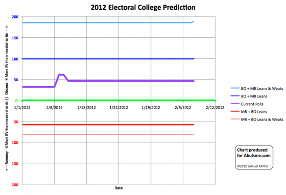
Chart from the Abulsme.com 2012 Electoral College Prediction page.

This time up is better for Obama, down is better for Romney.

The two wobbles on the center line so far are Florida flipping from Leaning Romney to Leaning Obama on January 9th, and North Carolina flipping from Leaning Obama to Leaning Romney on January 12th.

Since this is the first post of the year for this model, I’ll include here the full explanation of how to interpret this chart:

First of all, the current state of the race for each state (or congressional districts as well in the cases of Maine and Nebraska) is determined by looking at the average margin between the candidates in the last five polls in that area. In cases where five polls are not yet available, the final popular vote results in the 2004 and 2008 elections were used to “seed” the data.

States are then put into 3 categories.

  • Lean: 0% ≤ Candidate Lead < 5%
  • Weak: 5% ≤ Candidate Lead < 10%
  • Strong: Candidate Lead ≥ 10%

All “lean” states are for all intents and purposes too close to call, but for the chart above, we separate them.

The chart is divided into two halves.

  • Above the green line, the Democrat is winning with X more electoral votes than they need to tie. (So 269+X = their electoral vote total)
  • Below the green line, the Republican is winning with X more electoral votes than they need to tie. (So 269+X = their electoral vote total)

We show five lines, outlining five different scenarios showing the range of possibilities given the current polling.

  • Light Blue Line – The Democrat wins all states they are ahead in, but also flips the Republican’s Lean and Weak states.
  • Dark Blue Line – The Democrat wins all states they are ahead in, but also flips the Republican’s Lean states.
  • Purple Line – Each candidate wins the states they are ahead in, no states flip.
  • Dark Red Line – The Republican wins all states they are ahead in, but also flips the Democrat’s Lean states.
  • Light Red Line – The Republican wins all states they are ahead in, but also flips the Democrats Lean and Weak states.

We assume that states where a candidate is “Strong” have essentially no chance of flipping.

The light lines would represent a very unlikely sweep with a candiate massively exceeding what polling would indicate in a large number of states at the same time.

But “Lean” states are essentially all too close to call, in that a 5% lead is small enough that it can easily be affected by natural random variations in polls, or even excluding those sorts of effects, a 5% move in opinion is easily possible in just a few days given particularly effective campaigning by one candidate, or a particularly bad gaffe by the other, or simply by the effects of the news cycle. So essentially anything between the dark blue and dark red lines should be considered to be quite possible given the current state of polling, although of course results closer to the purple line (representing the actual current state of polling) are more likely than results close to the dark red or dark blue lines.

Edit 2012 May 30 15:53 UTC – Since this was posted, I was made aware of more older polls that should have resulted in New Hampshire starting off as a “Weak Romney” state instead of a “Lean Romney” state. The time series charts are corrected as of May 30. Further details of the New Hampshire correction are also located in that post.
Curmudgeon’s Corner: 2011-2012 Prediction Show, Part 1

In the latest Curmudgeon’s Corner…

Sam and Ivan talk about:

  • Review of 2011 Predictions
  • 2011 Scorecard
  • 2012 Election Predictions

Just click to listen now:

[wpaudio url=”http://www.abulsme.com/CurmudgeonsCorner/cc20120101.mp3″ text=”Recorded 1 Jan 2012″]

or

1-Click Subscribe in iTunes

View Podcast in iTunes

View XML Feed

Curmudgeon’s Corner: My Hair Hurts Too

In the latest Curmudgeon’s Corner…

Sam and Ivan talk about:

  • 9/11
  • Yahoo and AOL
  • Job Speech and Economy
  • European Protests

Just click to listen now:

[wpaudio url=”http://www.abulsme.com/CurmudgeonsCorner/CC20110911.mp3″ text=”Recorded 11 Sep 2011″]

or

1-Click Subscribe in iTunes

View Podcast in iTunes

View XML Feed

Curmudgeon’s Corner: The Mallcop Thing

In the latest Curmudgeon’s Corner… 

Sam, Ivan and Reb talk about:

  • A Kid Online
  • LulzSec
  • Debt Talks
  • Energy Efficiency

Just click to listen now:

[wpaudio url=”http://www.abulsme.com/CurmudgeonsCorner/CC20110626.mp3″ text=”Recorded 26 Jun 2011″]

or

1-Click Subscribe in iTunes

View Podcast in iTunes

View XML Feed

It Is Still Annoying

In the latest Curmudgeon’s Corner…

Sam and Ivan talk about:

  • Sleep
  • Repub Presidential Candidates
  • Flooding and Tornado and Death
  • Tablets
  • Data Breaches
  • Passwords
  • War Powers

Just click to listen now:

[wpaudio url=”http://www.abulsme.com/CurmudgeonsCorner/CC20110515.mp3″ text=”Recorded 15 May 2011″]

or

1-Click Subscribe in iTunes

View Podcast in iTunes

View XML Feed

Nothing on OBL

In the latest Curmudgeon’s Corner… 

Sam and Ivan talk about:

  • Skype 5
  • iPhone Location Stuff
  • Libya
  • Econ Update
  • Birthers

Just click to listen now:

[wpaudio url=”http://www.abulsme.com/CurmudgeonsCorner/CC20110501.mp3″ text=”Recorded 1 May 2011″]

or

1-Click Subscribe in iTunes

View Podcast in iTunes

View XML Feed

Well That is That I Guess