This is the website of Abulsme Noibatno Itramne (also known as Sam Minter). Posts here are rare these days. For current stuff, follow me on Mastodon

Categories

Calendar

November 2024
S M T W T F S
 12
3456789
10111213141516
17181920212223
24252627282930

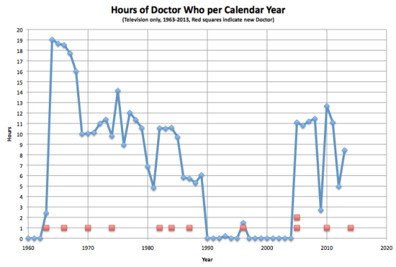
Hours of Doctor Who per Calendar Year (1963-2013)

Screen Shot 2014-07-26 at 17.05.30497

The first new Doctor Who of 2014 airs on August 23rd, less than a month away, with a new Doctor to boot.

So with that in mind, I present a chart I worked up showing just how much of the show there has been in the 50 year history of the show. As you can see, there has been a lot of variation over the years. To date, there were more hours in 1964 than in any other year, with 19 hours, 2 minutes and 12 seconds of Doctor Who. That record looks pretty secure.

(Source: Wikipedia)

100 Years of Context

With all the talk of demographic trends favoring the democrats I thought I would just pull some really long term past data and see what the trends look like.

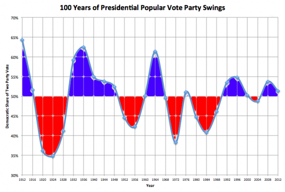
The chart above is the Democratic percentage of the Republican/Democratic popular vote. That is, it leaves out third parties, even though they were significant in some of these years. And even though I generally prefer looking at the electoral college in Presidential elections, for this purpose popular vote seemed better.

The one thing that immediately stands out to me is actually not a trend toward Democrats, but a “dampening” effect. The numbers were so much more volatile prior to 1976.

I’ll skip the big 1912 to 1924 swing because 1912 was an oddball election… the Republicans actually came in third behind the Democrats and Progressives.

But looking further on for examples, we went from Calvin Coolidge (R) blowing out John Davis (D) in 1924 by a 65.2% to 34.8% margin, to Franklin Roosevelt (D) crushing Alfred Landon (R) by a 62.5% to 37.5% margin only 12 years later. That is a LOT of people flipping from Republican to Democrat. Now, admittedly, there was a little thing called the Great Depression that probably caused that swing. But still, it is a HUGE number of people moving from one party to the other compared to what seems possible today.

A slightly more recent big swing… In 1964 Johnson (D) beat Goldwater (R) 61.3% to 38.7%. Only 8 years later in 1972, Nixon (R) beat McGovern (D) 61.8% to 38.2%. Again, there was a major event, the Vietnam War, that could explain this, but this still represents a HUGE number of people switching parties. Not just demographic trends, but people actively switching their support.

In addition to big swings, margins in general tended to be bigger.

From 1912 to 1984, 13 of 19 elections… over 2/3 of the elections… were won by margins greater than 10%. The last time that happened was Reagan’s 1984 win over Mondale. We have now gone 7 elections in a row where the elections were one by less than a 10% margin.

Of those 7 elections since Reagan, the margin was less than 3% three times. From Woodrow Wilson in 1912 to Ronald Reagan in 1984, there were also only three elections… out of 19 elections… with a margin under 3%. (That would be 1960, 1968 and 1976.) Elections this close used to be really rare. They aren’t the “norm” now, 1988, 1992, 1996, and 2008 were all won by more than 7%, but under 3% is certainly no longer rare.

Now what about that trend toward the Democrats? Now, looking at the full 100 years, the oscillation between the parties and the reduction in volatility is the biggest thing you notice, but you could argue that the politics and issues and how the parties were aligned was dramatically different prior to the 1970s. So, if you look selectively just at 1972 onward, you do see a trend toward the Democrats.

In the 70’s and 80’s you had big Republican wins and the only Democratic win was a squeaker.

In the 90’s and 00’s you had smaller Democratic wins, with the only Republican wins being a popular vote loss in 2000 which was won in the electoral college, and a narrow win in 2004.

If you change your starting point though, and look just since the 1990’s, the trend is (slightly) back toward the Republicans. Obama’s two wins were by smaller margins than Clinton’s wins.

The demographic trends DO seem to be against the Republicans at the moment given how party preferences have been breaking down by ethnic group. But…

The important thing to remember however is that parties change over time. The Republicans of 2012 are nothing like the Republicans of 1988. And the Republicans of 1988 didn’t look much like the Republicans of 1964.

How much any demographic trends affect future presidential races will depend a lot on the internal dynamics of both parties, and who they nominate, and if the parties start shifting around as they do periodically. If the Republicans figure out how to embrace rather than alienate the non-white groups that are growing rapidly, then they will be able to blunt or reverse any demographic trends.

Or we could have a major event like the Great Depression or the Vietnam war that returns us to the days of huge landslides for whichever party is NOT blamed for the bad event, with huge swings between the parties in short periods of times.

We’ve been in a period of relatively close elections, with relatively little volatility between elections. That seems to be unusual looking back at the last 100 years. It could be the new “normal” that lasts another 50 years. But it just as easily could be an anomaly, and we’ll return to “normal” soon.

As usual, past performance is not indicative of future results, but it is fun to look back at the longer term history for some context.
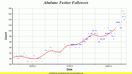
Looky There, Over 100

Of course, a good number of them are not real people. But hey, it is what it is.

Book Frequency

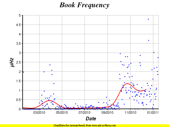
So, speaking of reading, just a quick graph. This represents the frequency at which I finish books. I used to keep track of pages per day, but now that a bunch of my reading is Kindle based, which has locations instead of pages, that really isn’t a measure I can use any more. So instead I look at the pace I am maintaining in terms of how quickly I am getting through books. Each day, I look at the fraction of a book I have completed, which is then converted into the overall book frequency.

As you can see, for most of the year the rate was very low… as I was going through a couple of dry boring and very long non-fiction books. But then, those books were out of the way, plus I moved to reading some (not all) of my books on Kindle. Importantly, this doesn’t just mean the Kindle device itself, but also other devices. So yes, I’ll use the Kindle device when I am going to be sitting down and reading for a little bit, when that is my prime activity. But if I’ve got even a minute or two while I’m waiting in line for a coffee or whatnot, I’ll pull out the Kindle app on my iPhone and start reading. Those are cases where I never would have been reading a book before.

Anyway, at this moment, I am trending somewhere near 1.35 ОјHz for my book frequency. Inverting that we get about one book every 741 ks. That could otherwise be expressed as one book every 8.57 days or 3.55 books per month. Now, some of you may read a lot more than that, which is of course great. But for me, given everything else occupying my time, this is a pretty good clip. I don’t think I’ve read at this pace in many many years…

Of course, as soon as one of those really long, dry, boring books ends up coming up in my book selection process then I may once again have one of those times where finishing a single book ends up taking many many months. I’m sure it will happen eventually. But for now, I’m enjoying reading a bit more than that.

Mood Cycles

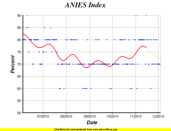
Another chart I thought was interesting. This looks at a “mood index” that I enter once per day. It is a purely subjective measure, where I just enter the first number that comes to mind, and try not to consciously think about it. Basically, 100 would be ecstatically happy to the point of uncontrollable glee, zero would be depressed to the point of not being able to function or move under my own power. As you can see, normally I’m in a pretty decent mood, in the 70 to 80 range on average with points outside that range a few times a month on either side. So these are variations within a fairly constrained range to begin with. But when you look at this chart on a six month range, where I then add a trend line smoothed over about an 18 day radius, suddenly you see what looks to be a clear monthly oscillation on top of the large scale mood trend.

It looks like, at least for the last six months, I have generally been happier and in a better mood in the first half of each month, and in a bit worse state of mind in the second half of the month.

Neat.

Sleepy Time

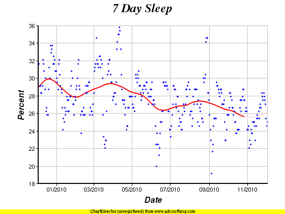
The percentage of my life spent asleep as it has changed over the last year. Down roughly from 29% (about 6 hours 58 minutes per night) to about 26% (about 6 hours 14 minutes per night) over the course of the last 365.242 days. The best was last December when I hit about 30% (about 7 hours 12 minutes per night) and the worst was in early November when I was at about 25.5% (about 6 hours 7 minutes per night). Those are of course from the general trend lines, as you can see, some specific data points have been significantly higher or lower than those trends. The data points themselves are not single nights, but rather represent daily samples of the trailing seven days.

Anyway, I thought it was an interesting chart. :-)

More Dangerous World

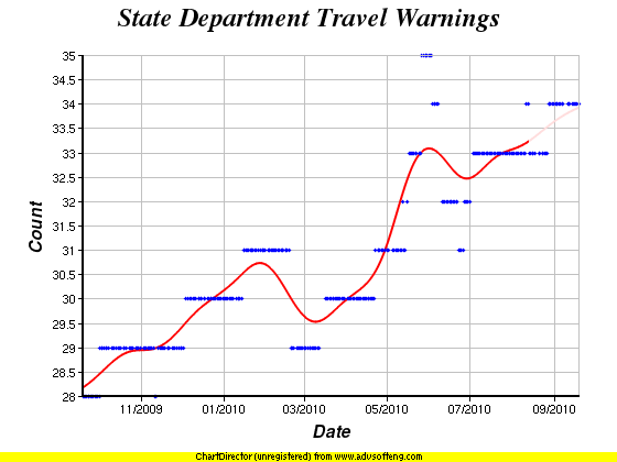
The chart above is the number of Current Travel Warnings from the US State Department over the last year. Just noting that the trend is upward. Of course, the trend has generally been upwards since the first time I looked at this back in 2004. Here is a chart showing that whole time period. Prior to 2009 though, I was only adding data very sporadically, for instance adding only 2 data points at all in the 2005-2008 time period. Since April 2009 though, I automated it to add one new data point every day, so the trends are much clearer.

Post Baby Sleep

Although the frequency has slowed, I still occasionally get people asking how I am sleeping what with a baby in the house and all, and everything everybody always says about no sleep when there is a new baby. I’ve been meaning for a long time to post about this, since at least October, but am just now getting around to it. Anyway, because I am certifiable and track everything, I can give some quantitative answers to the sleep question.

Here is a relevant chart:

annotatedsamsleep20091129wmonthlevelsmoothing

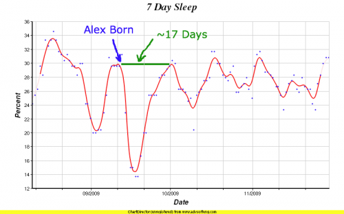
This is a chart with daily values of the percent of the previous seven days I spent asleep. (Click the chart for a larger version.)

Unfortunately I did not start tracking this number until August even though I had the capability to do so earlier. If I had started earlier we would have had a better baseline to do a longer term before and after comparison. In this chart I have used the smoothing factor for the trend line that I usually use for my one month charts, rather than what I would normally use to show the amount of time shown here. This allows me to show a little more responsiveness in the trend line to short term changes. For a current chart with my normal smoothing values, see here.

Anyway, if one looks at how much sleep I was getting immediately before Alex was born, it is at about the 30% level. That would be about 7.2 hours per day of sleep. You can clearly see the deep dive down to about 14% (about 3.4 hours per day). But this does not last very long. 17 days later I recover to the immediate pre-Alex level. Of course I don’t stay there for long. You can see I move up and down between about 24% (about 5.8 hours a day) and 31% (about 7.4 hours a day). If I had to hazard a visual guess at an average for October and beyond, I’d say about 27% (about 6.5 hours per day).

Because I only have the month or so of pre-Alex data though, it is hard to see if there is a distinct before and after longer term change. As you can see, I did have a pre-Alex peak of 34% (about 8.2 hours per day) that has not yet been equaled. But it impossible to say if that was an abnormal peak. Also, there was a dip down to 20% (about 4.8 hours per day) at one point when I was staying up late on a couple of personal projects. So the “normal” range may have been pretty wide to begin with.

So the 17 day “back to normal” recovery time is probably about the best estimate that can be made with this data. I’m still annoyed for not having tracked this metric for longer. I had the ability to do so starting approximately in February, but I didn’t. Oh well.

Now, this does show however that aside from the one peak in August, I’ve never been close to the 33% (8 hours a day) generally recommended sleep level, and I’m not very consistent at all in terms of how much I sleep. Oh well. I doubt I’m really all that atypical on that front, although I must admit I would probably enjoy it if I could get and keep my average closer to that 33% level.

Finally, and this is an important point, this is MY recovery time… but BRANDY was the almost exclusive source of food and was the one that was almost always the one who got up and stayed up nights with Alex when needed. So HER chart would look vastly different, and her sleep recovery time much longer, if it has even recovered yet. I can’t show any graphs of that though, as Brandy won’t let me hook her up to machines to monitor her at night. I have no idea why. :-)

Growing Boy

alexmass200910011628