This is the website of Abulsme Noibatno Itramne (also known as Sam Minter).
Posts here are rare these days. For current stuff, follow me on Mastodon
|
Since the last notable change, Jill Stein became the presumptive nominee of the Green party. So I folded in 4-way poll results that included her in AZ/NC/OH/NJ/GA/PA/FL/CT. I also added new polls in VA/WI/CA. Of all of these updates, changes only resulted from the additions in Virginia and Pennsylvania.
Interestingly, although Trump has been plummeting in the national polls the last few weeks (see Pollster and RCP), 4 out of the 5 state level category changes and 4 out of 4 tipping point changes here at Election Graphs since Trump became the presumptive Republican nominee have been in Trump’s favor.
I have been attributing this to the natural lag in the kind of state poll averages tracked here… but the trend has gone on long enough that there may be something else happening. It is actually starting to look like Clinton’s lead has been narrowing in a number of states, even while Trump has been falling further behind at a national level. This is an odd pattern. It will be interesting to see if it continues.
In the mean time, lets look at the latest example:
Virginia

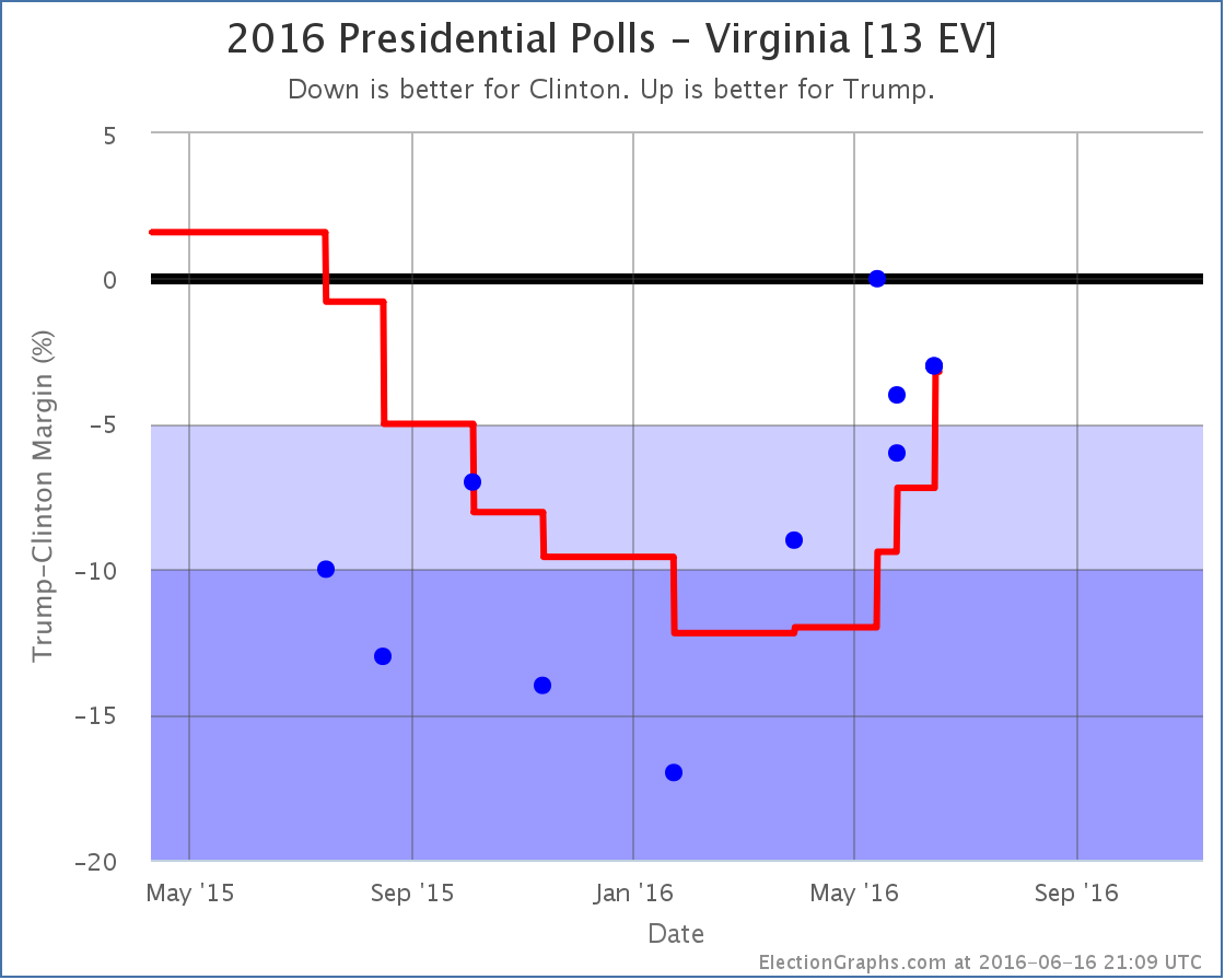
In Virginia on the eve of Trump becoming the clear winner on the Republican side he was behind by 12% in the Election Graphs average. With every poll since then, his position has improved. He’s now behind by only 3.2%. The most recent results were from June 13-15… well after the narrative of Trump’s collapse in the national polls was taking hold, and after weeks of Trump doing and saying things that seemed to be damaging his prospects nationally.
But yet the newest results have Trump down only 3% in a state where he had a poll showing him down 17% back in January. This trend does not look like a collapse. Quite the contrary. It does look like Trump is in a downward spiral in the national polls. But in Virginia specifically, he is doing better than he has since last August.
It seems strange that Virginia would be rapidly moving in the opposite direction than the national polls. Perhaps if we had weekly polls in Virginia we might have seen a different picture. Perhaps there have been large swings up and down that are just invisible because there have not been enough polls to show it. Maybe. But with the data we have, it really looks like Virginia has been on a Trumpward swing, despite the national trends.
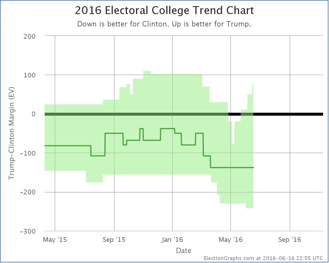
With Virginia now close, we now include Trump winning it in “Trump’s best case”. So a quick look at the national trend:

Aside from the one bump showing Clinton making Utah close, the trend here at the state level looks like Trump making a number of states closer. First Florida, then North Carolina, then Pennsylvania, now Virginia.
Trump isn’t flipping states, but he is making more states close. The national picture may look different, but at the state level, which is what actually determines the winner in November, there isn’t a Trump collapse visible yet. Trump is actually looking stronger.
Pennsylvania

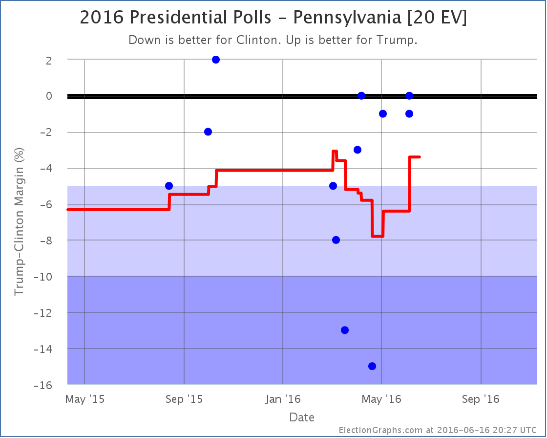
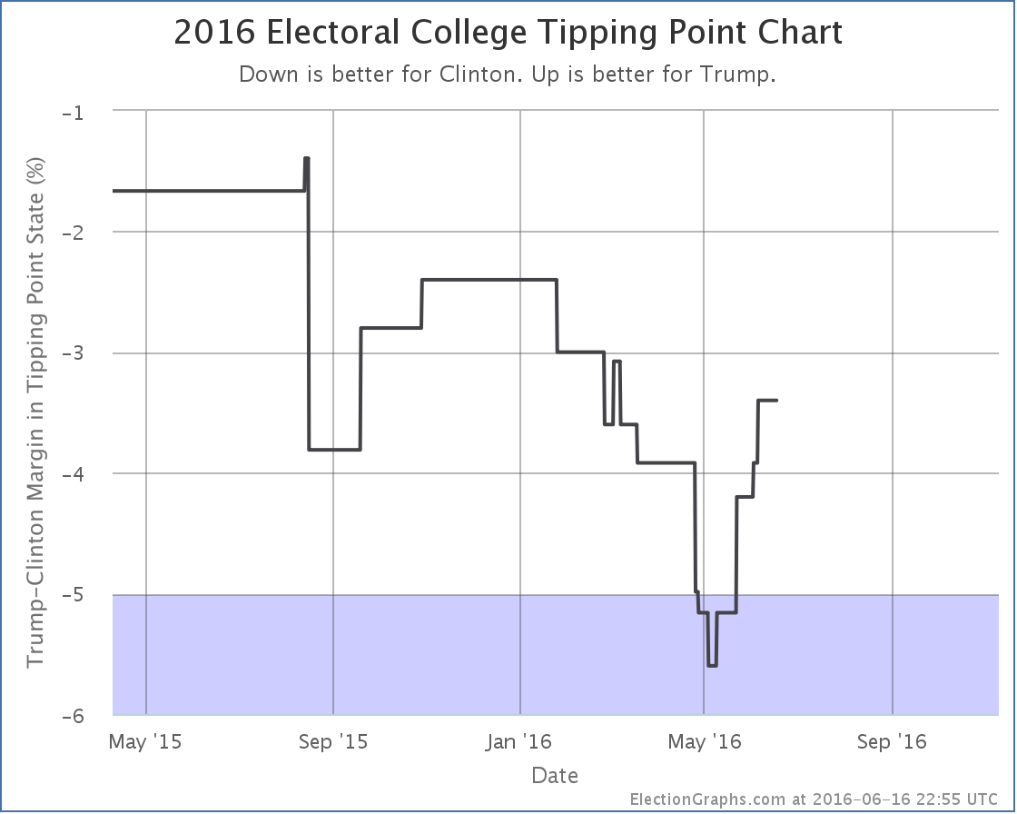
With Jill Stein now the presumptive nominee of the Green party, I added in a number of polls I had been tracking but not yet including in the analysis that included Jill Stein along with the major party candidates and Gary Johnson for the Libertarians. Among those was a poll in Pennsylvania showing a 1% Clinton lead over Trump. This did not change the status of Pennsylvania, which had already moved to Weak Clinton in the last update, but since Pennsylvania was the tipping point state, it moved that metric:

The tipping point state remains Pennsylvania, but the margin moves from a 3.8% Clinton lead to a 3.4% Clinton lead.
So with today’s updates, both Trump’s “best case” and his tipping point improve.
The downward trend in the national numbers may eventually show itself at the state level, but it hasn’t yet.
144.9 days until the polls start closing on Election Day 2016.
Note: This post is an update based on the data on ElectionGraphs.com. Election Graphs tracks both a poll based estimate of the Electoral College and a numbers based look at the Delegate Races. All of the charts and graphs seen in this post are from that site. Additional graphs, charts and raw data can be found there. Follow @ElectionGraphs on Twitter or like Election Graphs on Facebook to see announcements of updates or to join the conversation. For those interested in individual general election poll updates, follow @ElecCollPolls on Twitter for all the polls as they are added. If you find the information in these posts interesting or useful, please consider visiting the tip jar.
A couple of days ago, Utah moved from Strong Trump to Weak Trump in my classifications, so I speculated that Trump’s post-clinching bump might be over. But with the most recent batch of polls (from Pennsylvania, Florida and Connecticut) there is already another move in Trump’s direction. Remember that the picture given by trailing state poll averages will always “lag” the underlying situation a bit, but for the moment, the trend I track here still looks like it is moving in Trump’s direction.
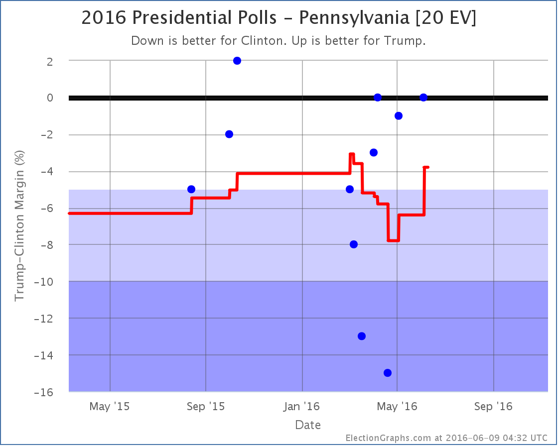
Lets look at the details. The state that changes status is Pennsylvania:

The range of poll results in Pennsylvania has been huge. From a 15% Clinton lead to a 2% Trump lead. With the addition of the latest poll, one of the two polls that showed Clinton up by more than 10% fall off the average, and therefore the average pops in Trump’s direction.This brings the average in Pennsylvania to a 3.8% Clinton lead. Clinton is still ahead, but it is once again close enough that I allow for the possibility of Trump pulling the state into his column.
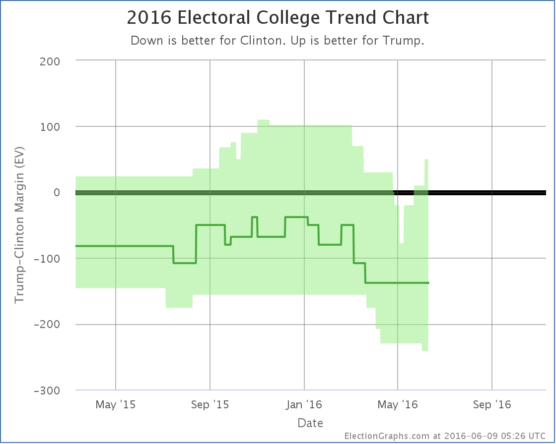
If Trump actually is able to get Pennsylvania, it is a big get. Pennsylvania has the sixth largest number of electoral votes. Adding Pennsylvania into Trump’s best case, the national trend now looks like this:

That spike in the upper right is Pennsylvania. In both electoral votes and the potential to make a difference in the race, Pennsylvania is more significant than Utah. If Clinton were to win Utah, it would be a surprise extra on top of an already large win, but a competitive Pennsylvania would potentially be very important to a winning path for Trump.
With Pennsylvania in the mix, if Trump won all the states where he leads, plus all the states where Clinton’s lead is less than 5%, Trump wins by a 50 electoral vote margin. This is his best “best case” since March.
Overall, despite Utah, and despite the fact the center “expected” line hasn’t moved, it looks like the overall trend here is still toward Trump.
The tipping point also moves with this change, and further boosts that impression:

The tipping point moves from a Clinton lead of 3.9% in Nevada to a Clinton lead of 3.8% in Pennsylvania.
Given Clinton clinching the Democratic nomination and the national polls already showing Clinton pulling ahead, an end to the Trump bounce and a beginning of a Clinton bounce is to be expected. But it isn’t showing up here yet…
152.7 days until polls start to close on election night.
Note: This post is an update based on the data on ElectionGraphs.com. Election Graphs tracks both a poll based estimate of the Electoral College and a numbers based look at the Delegate Races. All of the charts and graphs seen in this post are from that site. Additional graphs, charts and raw data can be found there. Follow @ElectionGraphs on Twitter or like Election Graphs on Facebook to see announcements of updates or to join the conversation. For those interested in individual general election poll updates, follow @ElecCollPolls on Twitter for all the polls as they are added. If you find the information in these posts interesting or useful, please consider visiting the tip jar.
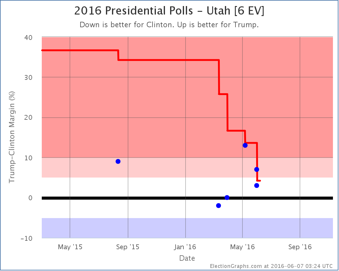
Since the last update there have been polls in New Jersey, California and Utah. The results in Utah are the ones that made a difference:

There are actually two new results logged in Utah, both from Gravis, covering the same time period. They asked the general election question twice. Once with just Clinton and Trump showing Trump leading by 7%, then again adding Johnson as a possibility, which reduces Trump’s lead to 3%. Rather than pick one or the other result, I include both.
It could be argued that this gives a single poll double weight in the average, but the way I think of it, this really is two separate results, measuring the election in different ways. So I chose to include both. This is arguable, and other people tracking poll averages may choose a different route. But this is the way I am doing it.*
In any case, these polls are within the range we have seen in all the polls this year. There is quite a bit of variability, but the one thing that is clear is that the Republican lead is much smaller than the 21% to 48% margins the Republicans saw in the 1996 to 2012 general elections. Since my poll averages are “primed” with the results of those five elections, it took awhile for the poll average to move from the huge Republican margin one would expect if Utah followed the pattern of the last few elections down to the 4.2% margin Trump now has. Put simply, this change was so large, a lot of evidence was needed before the average really believed it.
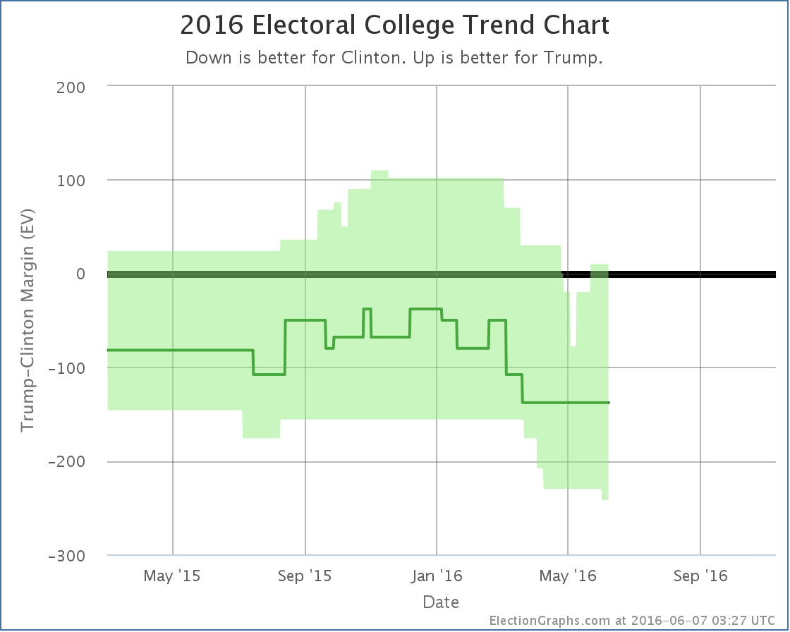
With Trump’s lead in Utah now less than 5%, it now goes into the Election Graphs “Weak Trump” category, which means it is a possible Clinton pick up. So her best case scenario improves:

That little nub at the bottom right represents the possibility of Clinton winning Utah.
Leaving out the states where one of the candidates is ahead by more than 10%, the center of the spectrum now looks like this:

There are a lot of states here that haven’t yet had a full five polls for our average (indicated by the parentheses). But the fact that Georgia, Arizona and Utah may be competitive for Clinton show that Trump may indeed be “redrawing the map”… just not in his favor.
The tipping point is only a 3.9% Clinton lead on the other hand, so it isn’t an insurmountable lead by any means. Trump could still win this if campaign events go his way.
But Utah a possible Democratic stretch goal? Wow. Utah!
For reference, the last time Utah went Democratic was the Lyndon Johnson landslide over Barry Goldwater in 1964. Now, I still wouldn’t bet on Clinton winning Utah. But that it is even close is still stunning.
The overall situation summary now looks like this:

So wait, is the Trump bounce over? Well, this is a move in Clinton’s direction, so it breaks the streak of movements in Trump’s direction that had lasted for about a month. So by that measure at least the “bump” may be over.
This is just one change though, it would be premature to say that the trend is now in Clinton’s direction. As usual, we need to wait for more polls…
154.8 days until the general election polls start to close. There will be plenty of movement between now and then. Stay tuned.
* For more notes on how polls including third and forth parties will be treated on Election Graphs, see the archive of @ElecCollPolls tweets from May 29th.
Note: This post is an update based on the data on ElectionGraphs.com. Election Graphs tracks both a poll based estimate of the Electoral College and a numbers based look at the Delegate Races. All of the charts and graphs seen in this post are from that site. Additional graphs, charts and raw data can be found there. Follow @ElectionGraphs on Twitter or like Election Graphs on Facebook to see announcements of updates or to join the conversation. For those interested in individual general election poll updates, follow @ElecCollPolls on Twitter for all the polls as they are added. If you find the information in these posts interesting or useful, please consider visiting the tip jar.
Edit 14:20 UTC – Fixed typo.
The national polls at this point show that Trump’s “bump” from clinching the nomination is most likely already over, and Clinton has started to gain ground again. You can see this in both the Pollster and RCP charts. Here at Election Graphs though we track the state level polls and model the electoral college.
Since in any given state there are fewer polls than are done at the national level, the state poll averages move more slowly, and therefore the national picture also reacts more slowly to changes in the state of the race. So while the national polls have seen the bounce come or go, we are still seeing improvement in Trump’s situation.
Since the last update about 9 days ago there have been polls added in New Mexico, Virginia, North Carolina, Oregon, Michigan, New York, New Jersey, New Hampshire, Georgia, California (x4), and Florida. The Florida one is the one that resulted in an overall change.

Basically, what now looks like an outlier poll from April showing Clinton with a huge 13% lead rolls off the average and so we have a pop in the Trump direction. Florida doesn’t change categories though. I had it classified as “Weak Clinton” before, and it is still “Weak Clinton” now.
But Florida was the tipping point state, the state that would have put Clinton over the top if you rank the states by how strongly they support one candidate over the other. So when Florida moves, so does the tipping point:

The tipping point moves from a 4.2% Clinton lead in Florida to a 3.9% Clinton lead in Nevada.
This means that while Clinton is clearly ahead, it would only take about 2% of people changing their minds (if those 2% were evenly distributed across the country) to flip the lead to Trump. You could get a similar result from the undecideds breaking disproportionately to Trump.
The national polls indicate Clinton is pulling further ahead again. We will quite possibly see that soon at the state by state level tracked here. But not yet. For now, the analysis here is still showing Trump gaining ground.
157.3 days until polls start to close on election night 2016.
Note: This post is an update based on the data on ElectionGraphs.com. Election Graphs tracks both a poll based estimate of the Electoral College and a numbers based look at the Delegate Races. All of the charts and graphs seen in this post are from that site. Additional graphs, charts and raw data can be found there. All charts above are clickable to go to the current version of the detail page the chart is from, which may contain more up to date information than the snapshots on this page, which were current as of the time of this post. Follow @ElectionGraphs on Twitter or like Election Graphs on Facebook to see announcements of updates or to join the conversation. For those interested in individual general election poll updates, follow @ElecCollPolls on Twitter for all the polls as they are added.
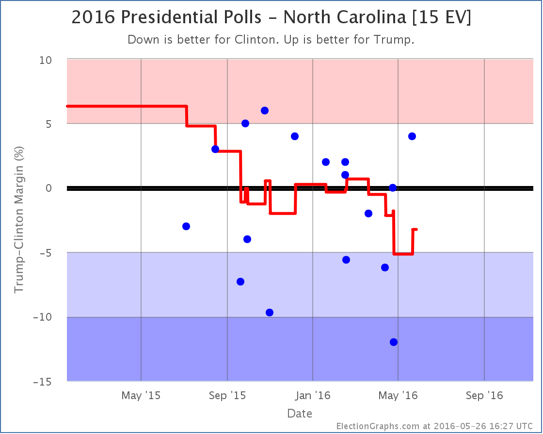
Now that the nominees are essentially certain, state level general election polling is ramping up quickly. It has only been a few days since the last update to my electoral college models, but there have already been polls in New Jersey, Virginia, North Carolina, California, Ohio, and Wisconsin. But of these, it was the new poll in North Carolina that made a difference.

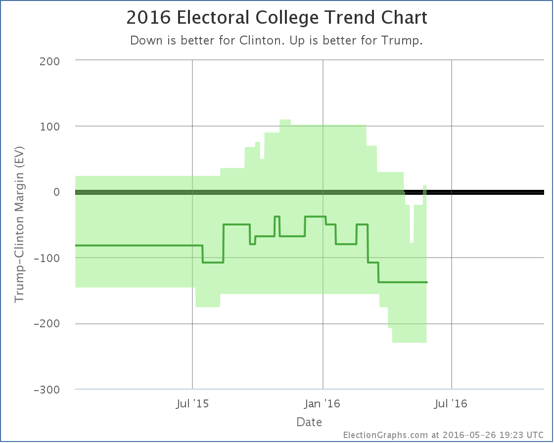
Trump gets his best individual poll result in North Carolina since last December, and the poll average moves from a Clinton lead of 5.2% to a Clinton lead of only 3.2%. With North Carolina once again within reach, Trump’s best case improves:

Now if Trump wins all the states he leads, plus all the states where Clinton’s lead is less than 5%, he squeaks out a 10 electoral vote win. Between this and Florida, this puts him back on the plus side for his “best case” after just under a month where even this rosy scenario was underwater for him.
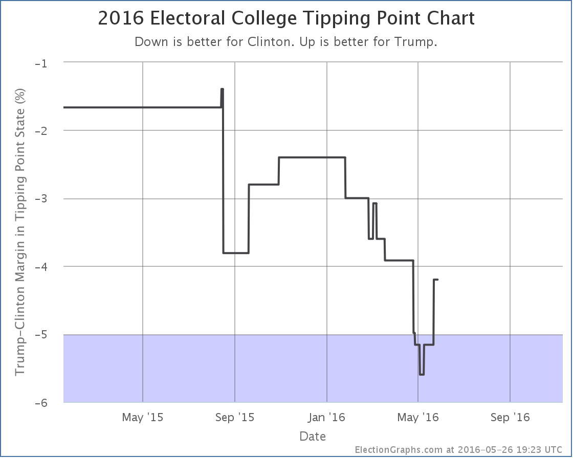
Since North Carolina had been the tipping point, that metric also moves:

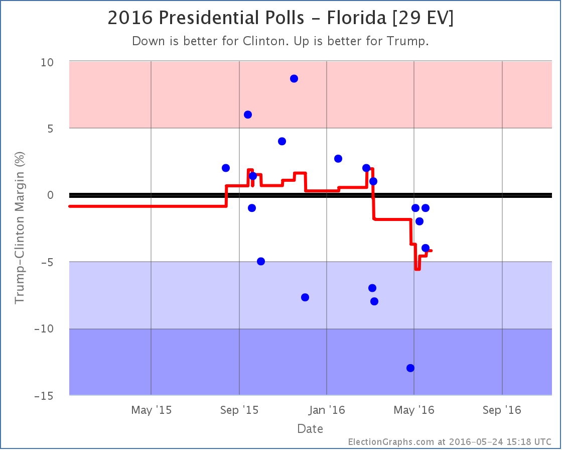
The tipping point state is now Florida, where Clinton leads by 4.2%.
From January to the beginning of May, there were 12 changes to the “bubble” and 8 changes to the tipping point. Only one of each category was in Trump’s direction. Overwhelmingly those months were a story of Trump’s position against Clinton deteriorating.
Since then we have two bubble changes and two tipping point changes, but all four have been moves in Trump’s direction. It is certainly looking like Trump hit bottom and is now bouncing back. The question is of course how far he bounces, and how long it lasts.
165.4 days until the polls start to close on election night.
Note: This post is an update based on the data on ElectionGraphs.com. Election Graphs tracks both a poll based estimate of the Electoral College and a numbers based look at the Delegate Races. All of the charts and graphs seen in this post are from that site. Additional graphs, charts and raw data can be found there. All charts above are clickable to go to the current version of the detail page the chart is from, which may contain more up to date information than the snapshots on this page, which were current as of the time of this post. Follow @ElectionGraphs on Twitter or like Election Graphs on Facebook to see announcements of updates or to join the conversation. For those interested in individual general election poll updates, follow @ElecCollPolls on Twitter for all the polls as they are added.
Edit 23:36 UTC to adjust sentence order in the first paragraph.
There has been a lot of recent press about new national polls of the Clinton vs Trump race. Nobody should look at individual polls of course, but there have been enough polls now to move the averages. RCP has Trump +0.2%. Pollster has Clinton +1.6%. Pollster includes more polls and has a more sophisticated methodology, but the core result is the same… a close Clinton vs Trump race, and much closer than what looked to be the case a few weeks ago.
So what do we see looking at the electoral college view? Well, first of all, keep in mind that individual states tend to be polled less often than we get national polls, and some states are polled more often than others. So a state by state view like the one here, at least at this stage in the cycle, will react more slowly to rapid changes than the national numbers. If there is a big national change, you simply have to wait long enough to there to be enough new polls in enough states to move the state averages and then the national summary.
Since the last time I posted about a national model change on May 11th, there have been new general election polls in Oregon, Louisiana, Georgia (x2), Utah, New Hampshire, Arizona, New Jersey, Tennessee, Indiana, Florida (x3), Virginia, California, and Ohio. Of all of these, only the Florida polls have made a difference in my national summary.

The three new polls, one of which was from early May but was only released a few days ago, all show Clinton ahead, but by less than 5%. This pulls Clinton’s lead back under 5%, specifically to a 4.2% lead.* The oldest poll in the average at the moment, showing a 13% Clinton lead, is now looking very much like an outlier, so it would not be surprising to see this look even closer when the next new poll is released.
This essentially reverses the changes from the May 11th update, and puts Florida back in play as a possible pick up for Trump.

With Florida a possibility again, if Trump wins all the states he leads, plus all the states where Clinton is ahead by less than 5%, we end up at Clinton 279, Trump 259 – A 20 electoral vote win for Clinton.
Since Florida was the tipping point state, this also moves the tipping point:

The new tipping point is North Carolina, where Clinton leads by 5.2%.
Trump’s “best case” is still to lose at the moment. But it is closer than it looked before.
So, the natural question here, especially given the national polls, is if this represents the end of the decline Trump has been suffering since January, and the start of a process where the state by state race starts looking as close as the national race polling averages would indicate.
The only real answer to that is that it is too soon to tell and we need to wait for more state polls to see if we see other states moving. But it would not be surprising if we see exactly that in the next few weeks.
With the results of both primary races essentially settled, but with Trump rapidly consolidating his party while Clinton is still dealing with Sanders, a tightening makes a lot of sense.
As Trump turns his attention to the general election, he will also presumably presumably do the traditional “pivot” to start courting voters that may have been turned off by his performance in the primaries. There have already been a number of moves in this direction.
We may have just seen Trump’s low point and the beginning of his rebound. Or this may be a blip. We shall see soon enough. The pace of new state level general election polls is quickening.
168.2 days until polls start to close on election night. A lot will happen in that time. Stay tuned.
* For anybody watching really carefully, because of the order in which I found these polls, two were added on Sunday and with those the chart showed a move from Strong Clinton to Weak Clinton on the 8th based on the poll that was taken in early May but released just last week, with a return to Strong Clinton on the 18th with a more recent poll. Since there was no net change from the addition of these two polls, even though they created a move back and forward on the charts, I did not do a post on Sunday. With a new poll added today that has the same middate in the field as the later of the two polls I added Sunday, the return movement that had been on the 18th was erased and there was now an overall change prompting this post. It looks odd that the movement on the chart is from the 8th, but I am not posting about it until the 24th, but the above is why.
Note: This post is an update based on the data on ElectionGraphs.com. Election Graphs tracks both a poll based estimate of the Electoral College and a numbers based look at the Delegate Races. All of the charts and graphs seen in this post are from that site. Additional graphs, charts and raw data can be found there. All charts above are clickable to go to the current version of the detail page the chart is from, which may contain more up to date information than the snapshots on this page, which were current as of the time of this post. Follow @ElectionGraphs on Twitter or like Election Graphs on Facebook to see announcements of updates or to join the conversation. For those interested in individual general election poll updates, follow @ElecCollPolls on Twitter for all the polls as they are added.
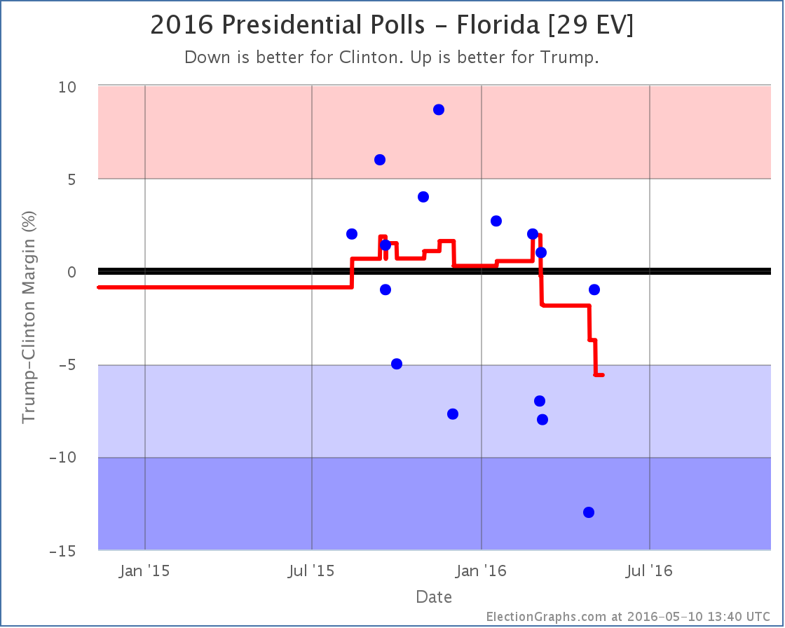
Since the last electoral college update there have been polls in West Virginia, New York, Georgia, Massachusetts, Florida, Ohio, Pennsylvania, and New Hampshire. Of all of these, only the one in Florida made a notable change to the overall picture of the election.
This was one of three Quinnipiac Swing State polls that were released on May 10th covering Florida, Ohio and Pennsylvania.
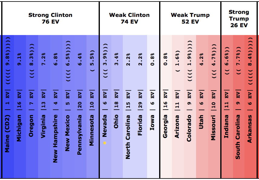
These polls got lots of press for showing a close Clinton vs Trump race in the three key states. But in both Ohio and Pennsylvania when you include the new polls in the average of the other recent polls, there was no change to the status of the states in the Election Graphs model. Ohio was and remains a “Weak Clinton” state… Clinton now leads by 3.4%. Pennsylvania was and remains a “Strong Clinton” state… Clinton now leads by 6.4%.
In Florida there was a category change, but despite the hype, the change doesn’t make the state look closer, instead it shows Clinton increasing her lead. Let’s look at this more closely.

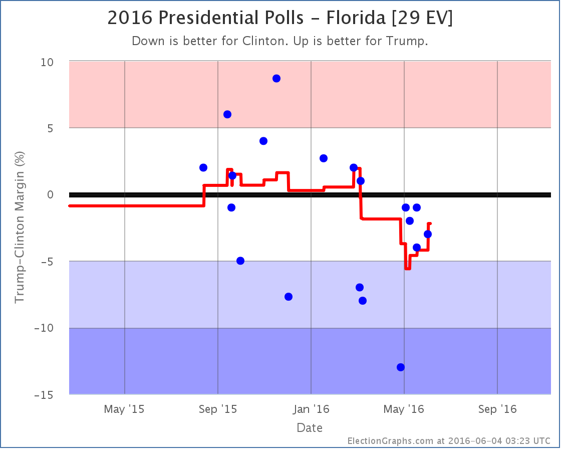
The new poll shows Clinton leading by only 1%, which is better for Trump than the previous average, which showed Clinton leading by 3.7%. So why did the average move toward Clinton instead of toward Trump? Well, to understand this, you need to look not at where the average was before, but instead at the polls being replaced in the average.
In this case the new Clinton by 1% poll replaced two polls*, one where Trump led by 2.7% in January, and the other where Trump led by 2.0% in February. So the average moves toward Clinton because even though the new poll was better than the recent average and the next most recent poll (which had Clinton +13%), it was worse than the older polls falling out of the average.
Looking at the dots for the individual polls, as well as the trend line, you can see that while the new poll does indeed show a close race, it now means that only one out of the last five polls in Florida show a Trump lead, while up until March you saw Trump leading many of the polls in Florida. He led in the average. The fact that people are now pushing “Trump is only 1% behind Clinton in Florida” as a good poll for Trump is actually an indication of the fact that he has fallen so much that this result is now unusually good for Trump. Back in early March it would have been completely unremarkable.
Looking at the average again, the line has been moving toward Clinton since March. With the Quinnipiac poll replacing the older polls where Trump was leading, Clinton’s lead in the state is up to 5.6%, which moves the state to “Strong Clinton” and takes Florida out of the list of states we give him in the “best case”.
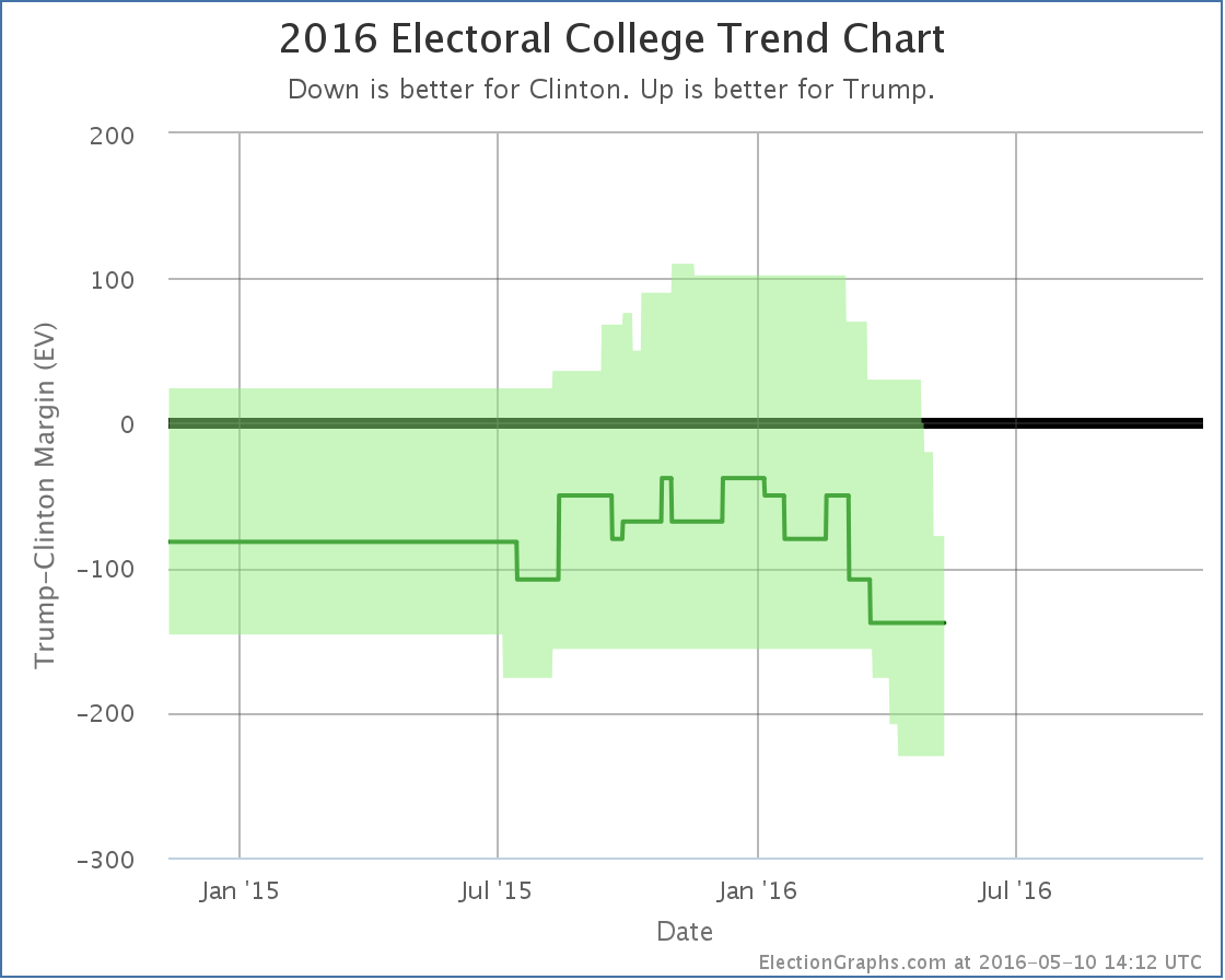
So nationwide, the new situation looks like this:


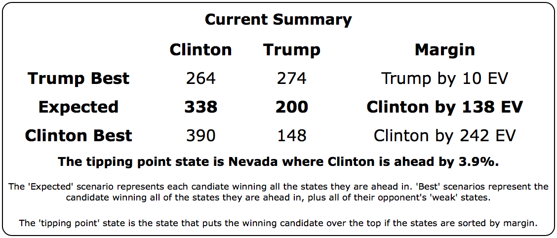
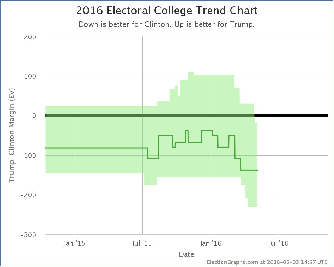
Without Florida, if Trump wins all the states he is ahead in, plus all the states Clinton is ahead by less than 5%, Trump loses by 78 electoral votes. This is a new low for Trump’s best case. The Trump deterioration that started in January continues.
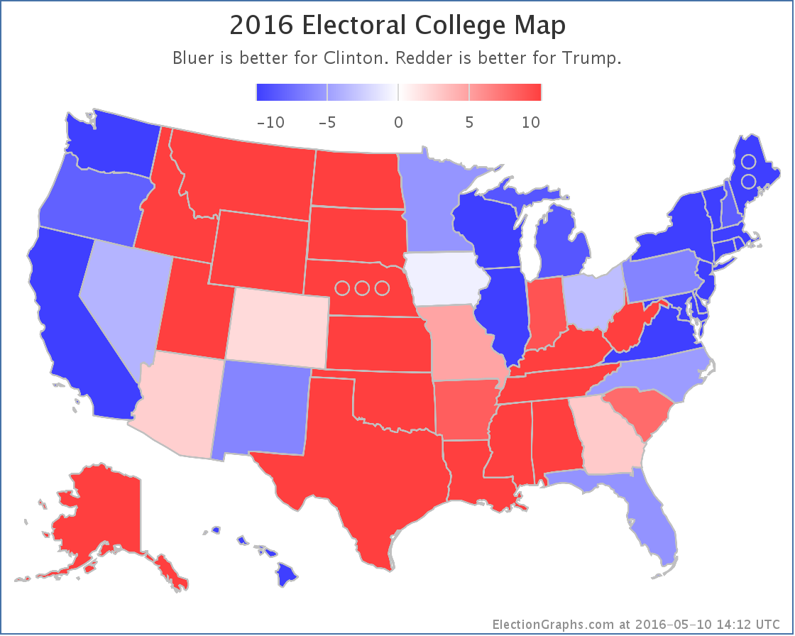
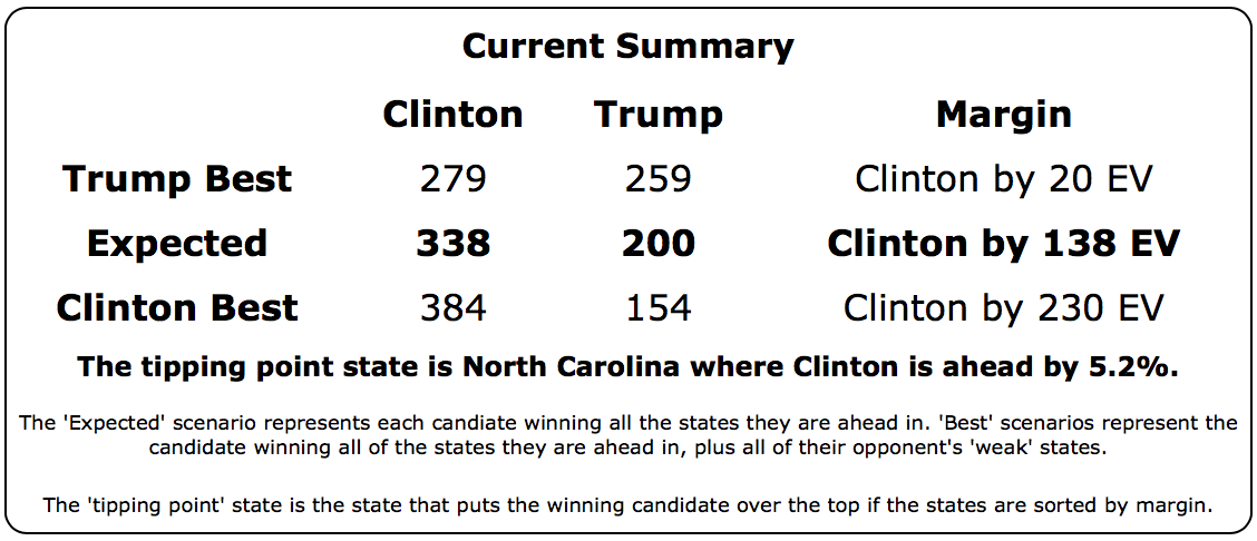
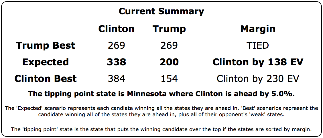
Having said that, while this looks like an easy Clinton win, when people start talking about a Democratic win of historic proportions, the evidence doesn’t yet support that. Looking now at the expected case rather than Trump’s best case… so each candidate just wins all the states where they lead in the poll average… you get Clinton 338, Trump 200… a 138 electoral vote win.
By comparison, Romney lost by 126 electoral votes and McCain lost by 192 electoral votes. So right now Trump is doing worse than Romney, but still better than McCain. This is a solid loss of course, but we are nowhere near the comparisons some people are making to a possible Mondale style loss. (Mondale lost by 512 electoral votes to Reagan).
Even Trump’s worst case right now (losing by 230 electoral votes) is only in the neighborhood of Dole’s loss to Bill Clinton (217 electoral votes) and not even in Dukakis territory (losing by 315 electoral votes to GHW Bush). And of course Trump’s best case, while still a loss, would be better than either Romney or McCain did. We are a long way from Mondale.
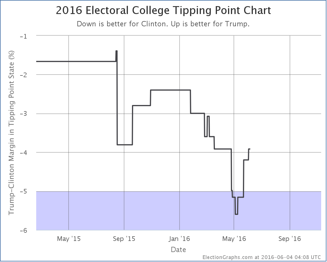
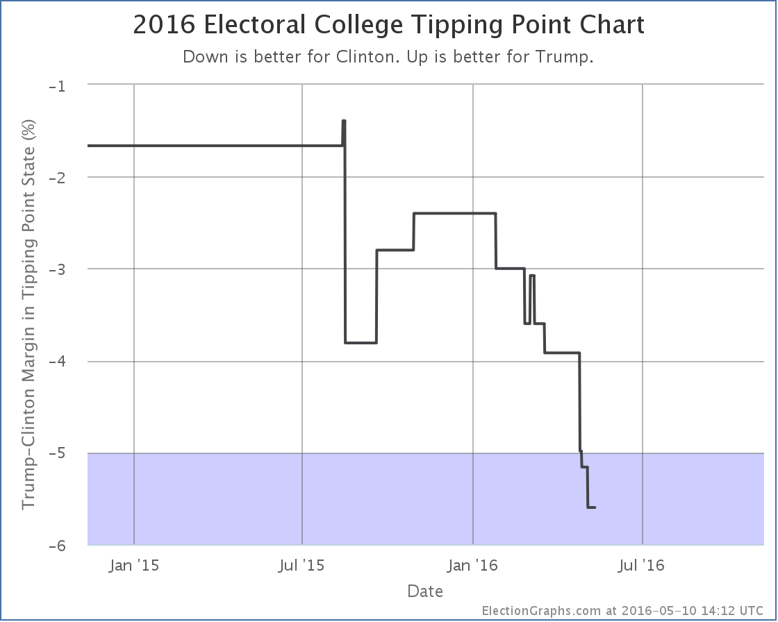
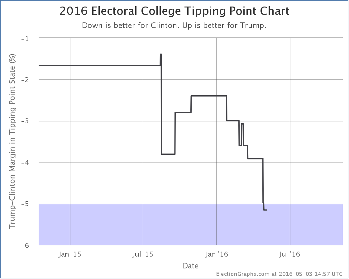
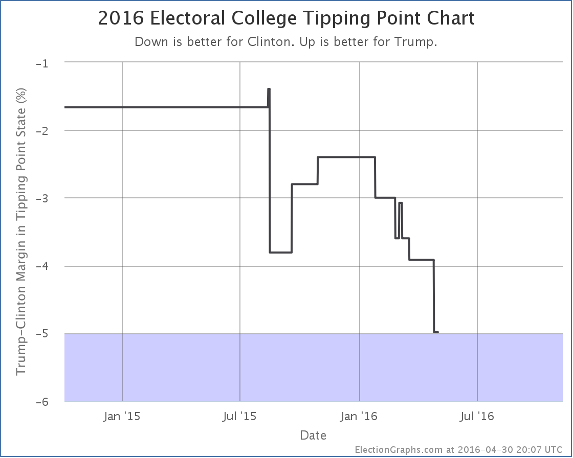
With the Florida change, the tipping point also moved, which gives a different view:

The tipping point is the margin in the state that would put the winner over the top. Right now it is Clinton’s 5.6% lead in Florida. What this means though is that you only need 2.8% of people to change their minds nationwide, and enough states flip that Trump would be winning. Given how divided the electorate is, that might actually be pretty difficult, but it doesn’t sound anywhere near as dire as the electoral college view. Changing the minds of 3% of Americans seems quite possible.
We have 181.8 days left until polls start to close on election day. Trump may be down right now, but there is still lots of time left. That may change. Do not be surprised if things tighten before election day… or if Clinton widens her lead further. There is still plenty of room for movement.
* The previous Clinton by 3.7% average was one of the cases where the Election Graphs poll average is based on six polls instead of the normal five. This happened because the five poll average resulted in a Clinton lead of exactly 5%. The primary purpose of the poll average on Election Graphs is not the average itself, but rather to categorize each state into one of the six categories… weak, strong, or solid for each candidate. 5% is the boundary between weak and strong, so additional older polls are pulled in as needed to get the average off the fence and put the average solidly in one category. In this case the one additional poll pulled the average back toward Trump and resulted in the 3.7% Clinton lead.
Note: This post is an update based on the data on ElectionGraphs.com. Election Graphs tracks both a poll based estimate of the Electoral College and a numbers based look at the Delegate Races. All of the charts and graphs seen in this post are from that site. Additional graphs, charts and raw data can be found there. All charts above are clickable to go to the current version of the detail page the chart is from, which may contain more up to date information than the snapshots on this page, which were current as of the time of this post. Follow @ElectionGraphs on Twitter or like Election Graphs on Facebook to see announcements of updates or to join the conversation. For those interested in individual general election poll updates, follow @ElecCollPolls on Twitter for all the polls as they are added.
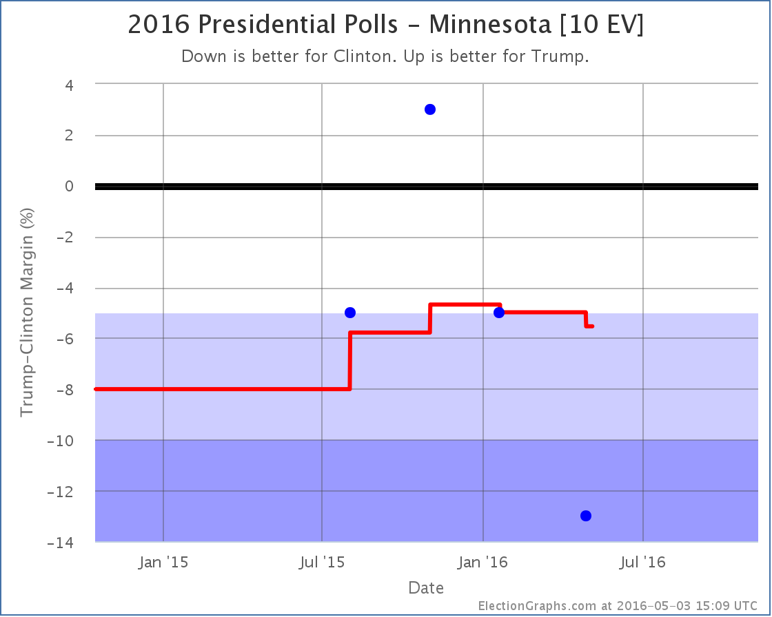
It has only been a few days since the last Electoral College update but there have already been polls added for Ohio, Indiana, California, Florida and Minnesota. A couple of these made differences to the ElectionGraphs.com models, so lets take a look…
Clinton vs Trump

Minnesota has been lightly polled. The average still is padded with the 2012 election results. But with this addition, Clinton’s lead is now 5.5%, which puts the state out of the “Weak Clinton” category and into “Strong Clinton”. For the ElectionGraphs.com model that means for now we now assume that even in a very favorable case, Trump will not win Minnesota.
In the last update Trump’s best case was already an electoral college tie. So, with Minnesota out of the picture…


So yes. Trump’s best case… winning all the states where he leads in the polls, plus all the states where Clinton leads by less than 5%, is now to lose to Clinton by 20 electoral votes.
Now, it is important to mention that even though I call this Trump’s “best case”, it is the best case as of right now, with the polls we have today. It is May. We have months to go before the general election. A lot can change. So this doesn’t mean Trump can’t win. It just means that if today’s polling averages held, he couldn’t win.
The tipping point (the percentage you would have to move all the state polls to flip the winner) also moved toward Clinton:

All this together means that Trump is now very far behind Clinton. She has the clear advantage. A big advantage. Trump has a lot of work to do if he wants to catch up and be in a winning position by November. It is not impossible, but it will require changing a lot of minds.
Clinton vs Cruz
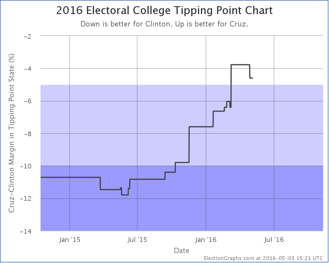
Oh yeah, Cruz is still in it too Cruz was still in it when this last batch of polls was taken, and he did badly as well. The latest poll in Florida didn’t change the categorization of Florida, but since Florida was the tipping point state it moved the tipping point:

Given the state of the nomination races though any combination other than Clinton vs Trump appears to be completely academic now, absent some catastrophic unexpected event.
188.8 days until polls close on election day 2016.
Note: This post is an update based on the data on ElectionGraphs.com. Election Graphs tracks both a poll based estimate of the Electoral College and a numbers based look at the Delegate Races. All of the charts and graphs seen in this post are from that site. Additional graphs, charts and raw data can be found there. All charts above are clickable to go to the current version of the detail page the chart is from, which may contain more up to date information than the snapshots on this page, which were current as of the time of this post. Follow @ElectionGraphs on Twitter or like Election Graphs on Facebook to see announcements of updates or to join the conversation. For those interested in individual general election poll updates, follow @ElecCollPolls on Twitter for all the polls as they are added.
Since the last post here on the Electoral College back on April 19th there have been new polls in Maryland, Wisconsin, North Carolina (x3), Pennsylvania, New Hampshire, Indiana, and Arizona. Today the latest in Arizona and North Carolina make a difference to the ElectionGraphs.com estimates. There are two state category changes for Clinton vs Trump and one for Clinton vs Cruz. All three of these changes favor Clinton.
Clinton vs Trump
Maybe everything is going Trump’s way in the primary campaign right now, but things are heading in the opposite direction for the general election.

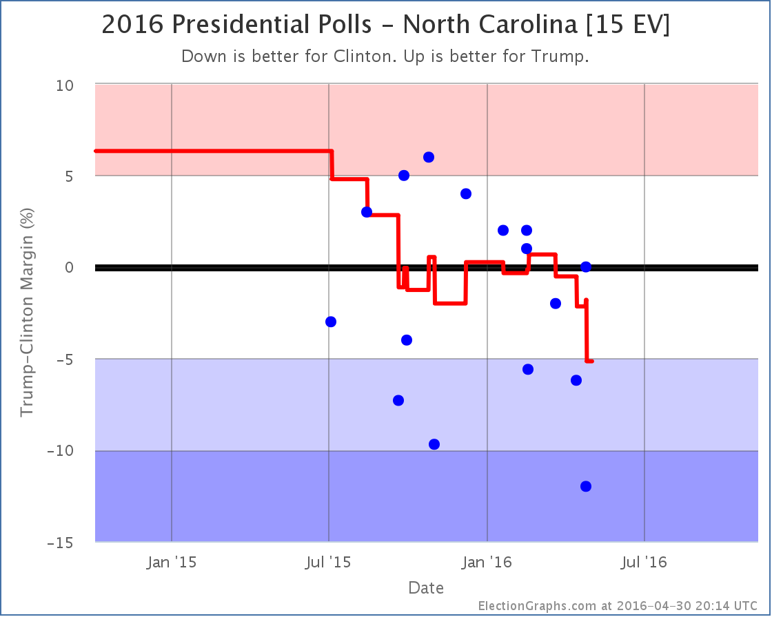
For quite a few months, the Clinton vs Trump poll average in North Carolina just bounced back and forth between Clinton and Trump. But as of now, the best Trump has done in the five most recent polls is a tie. The average has been trending downward since mid-March. The average is now a 5.2% Clinton lead. With that, North Carolina moves from “Weak Clinton” to “Strong Clinton”. This makes North Carolina blue enough that it isn’t considered a possible Trump pick up in the model any more.

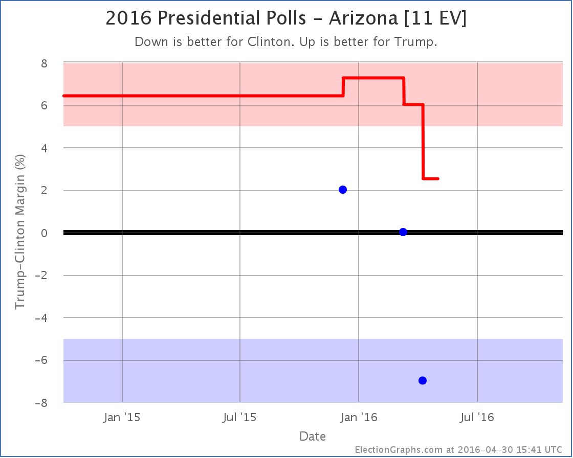
Arizona has been very lightly polled. There have only been three polls of Clinton vs Trump so far. So the average still includes the 2008 and 2012 election results. Each of the polls so far has been worse than the last for Trump though. The average now is only a 2.5% lead for Trump. With that, it is a “Weak Trump” state that is within reach for Clinton.
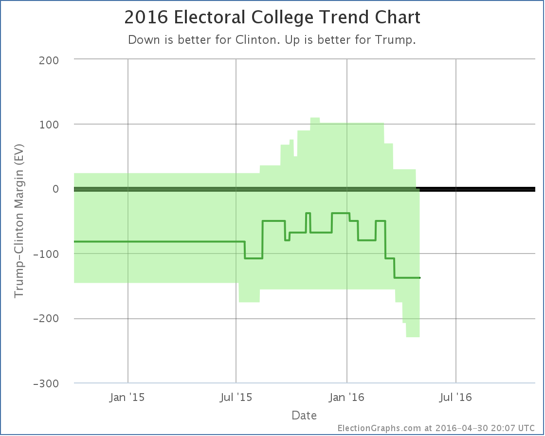
With these two changes, the overall trend in the expected range of possibilities looks like this:

With North Carolina’s movement, the tipping point moved in Clinton’s direction as well:

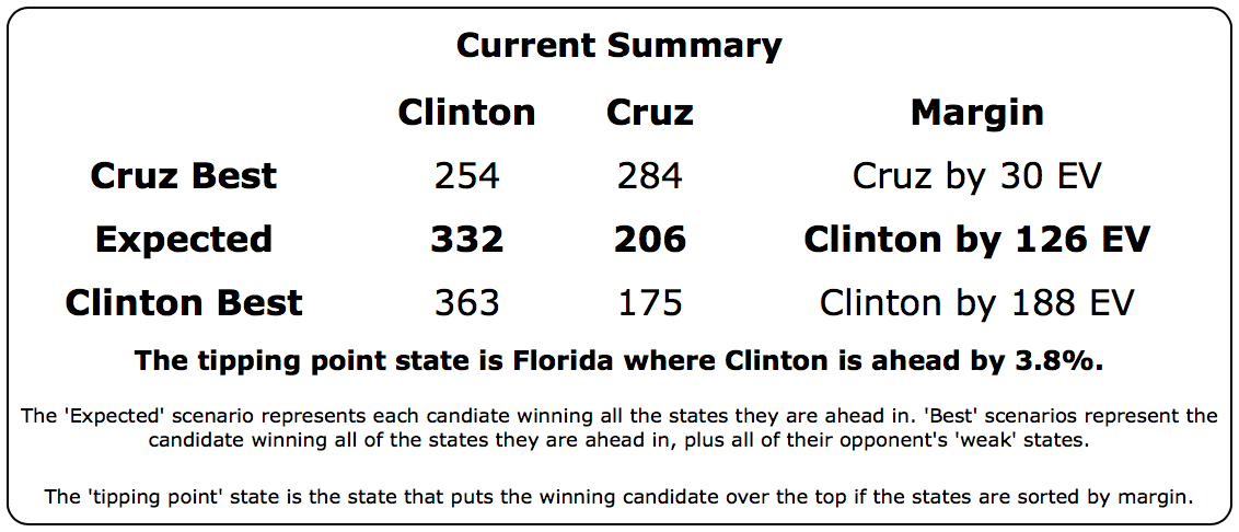
The downward trend that started around the New Year for Trump is continuing. The current summary now looks like this:

Yes, Clinton’s best case is better than it was with Arizona as a possible pickup.
But look at Trump’s current best case.
It is a 269 to 269 electoral college tie.
Can you even imagine a Clinton vs Trump race thrown into the House of Representatives? Wow.
Of course that won’t happen. But just like a contested convention, an electoral college tie is the kind of thing that gets political junkies excited. :-)
The bottom line on Clinton vs Trump is that after peaking around the New Year, Trump has been declining ever since. He is now at the point where if you give him not only all the states he is ahead in, but also the ones where Clinton is ahead by less than 5%, he only gets to a tie.
Things will undoubtedly change as both parties transition from primary mode to general election mode. The primary season has been very bad for Trump in terms of general election polling. The types of things he has been saying and doing that are winning him the Republican nomination are at the same time souring the general election voter against him.
The question is if he can turn that around once he is the official nominee. (Assuming nothing surprising happens to stop that of course.)
Clinton vs Cruz
Oh yeah, Cruz is still in this too.

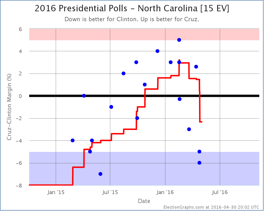
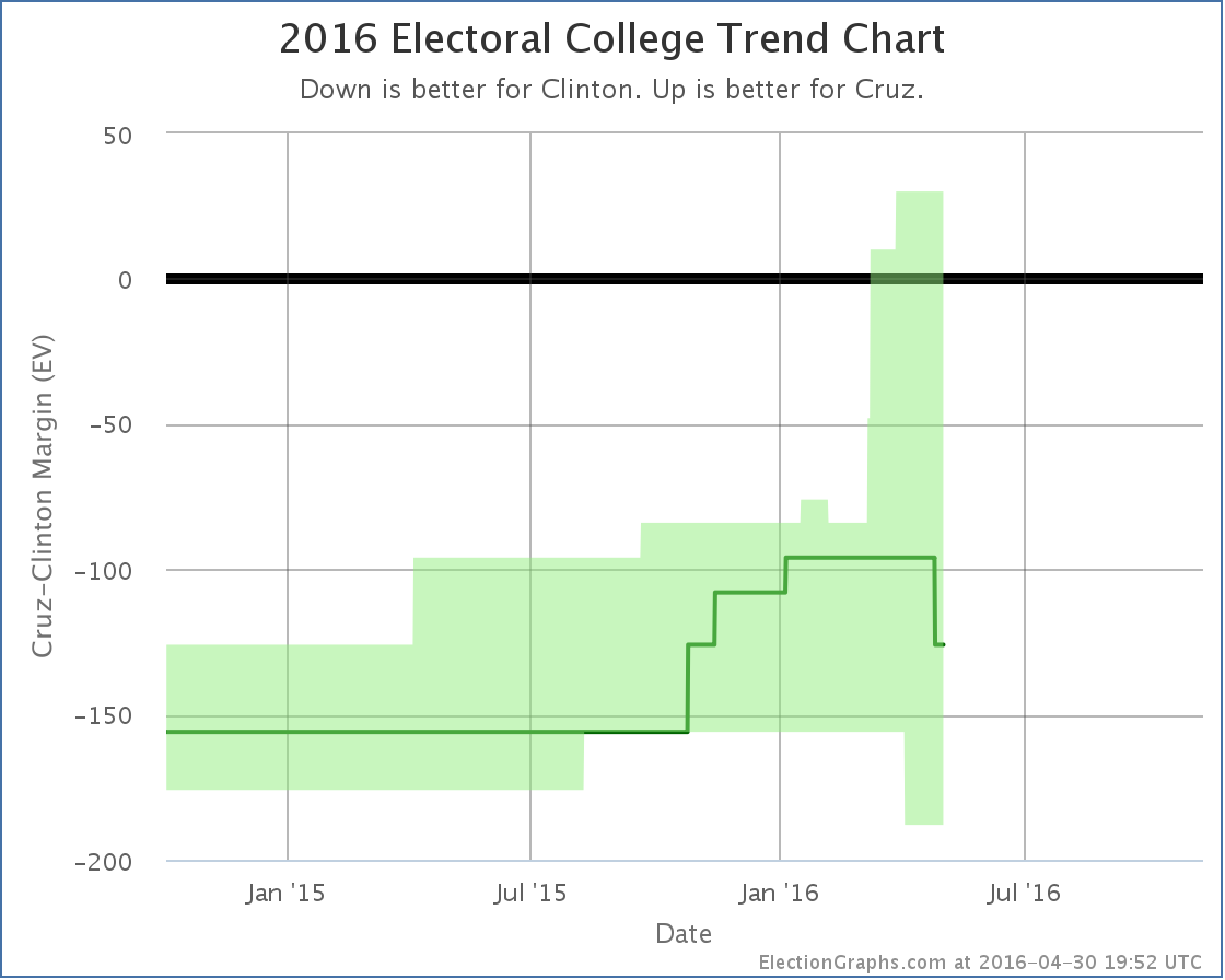
Cruz had been doing better and better in North Carolina. Until mid-March. Since then things have been moving against him. With this update, the lead in the state flips back to Clinton. This moves Cruz’s “expected case”:

The new summary looks like this:

Notice that in all four of the key metrics, the expected case, the two best cases, and the tipping point, Cruz is doing better than Trump against Clinton.
Of course, Trump is on track to be the nominee and Cruz is not, absent some sort of coup at the convention via a rules change, a last minute Trump implosion, or something like that. Republican voters do not seem to be prioritizing “electability” this time around.
191.8 days until polls start closing on election day though. A lot will change between now and then. So we shall see…
Note: This post is an update based on the data on ElectionGraphs.com. Election Graphs tracks both a poll based estimate of the Electoral College and a numbers based look at the Delegate Races. All of the charts and graphs seen in this post are from that site. Additional graphs, charts and raw data can be found there. All charts above are clickable to go to the current version of the detail page the chart is from, which may contain more up to date information than the snapshots on this page, which were current as of the time of this post. Follow @ElectionGraphs on Twitter or like Election Graphs on Facebook to see announcements of updates or to join the conversation. For those interested in individual general election poll updates, follow @ElecCollPolls on Twitter for all the polls as they are added.
[Update 04:10 UTC to add the “Maybe everything is going Trump’s way…” sentence.]
[Update 04:52 UTC to add in some inexplicably missing words where a sentence stopped before it was complete.]
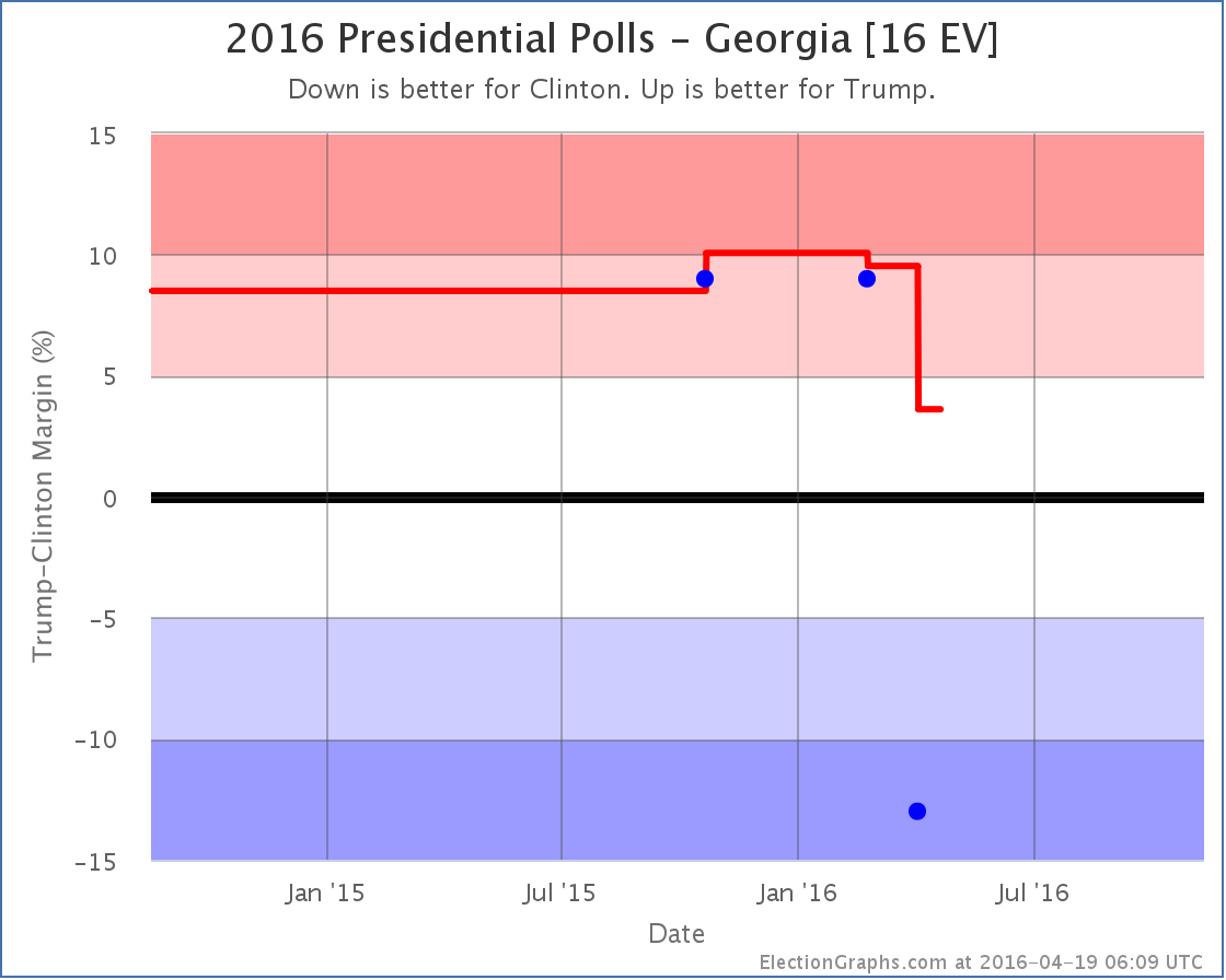
Since the last update on the Electoral College picture there have been polls in Wisconsin, California (x2), Mississippi, Virginia, Pennsylvania (x2), Maryland (x2), New York (x5), Connecticut, Massachusetts, New Jersey, Utah, and Georgia. The only one of these that resulted in a change in the overall 2016 electoral college summary was the poll in Georgia.
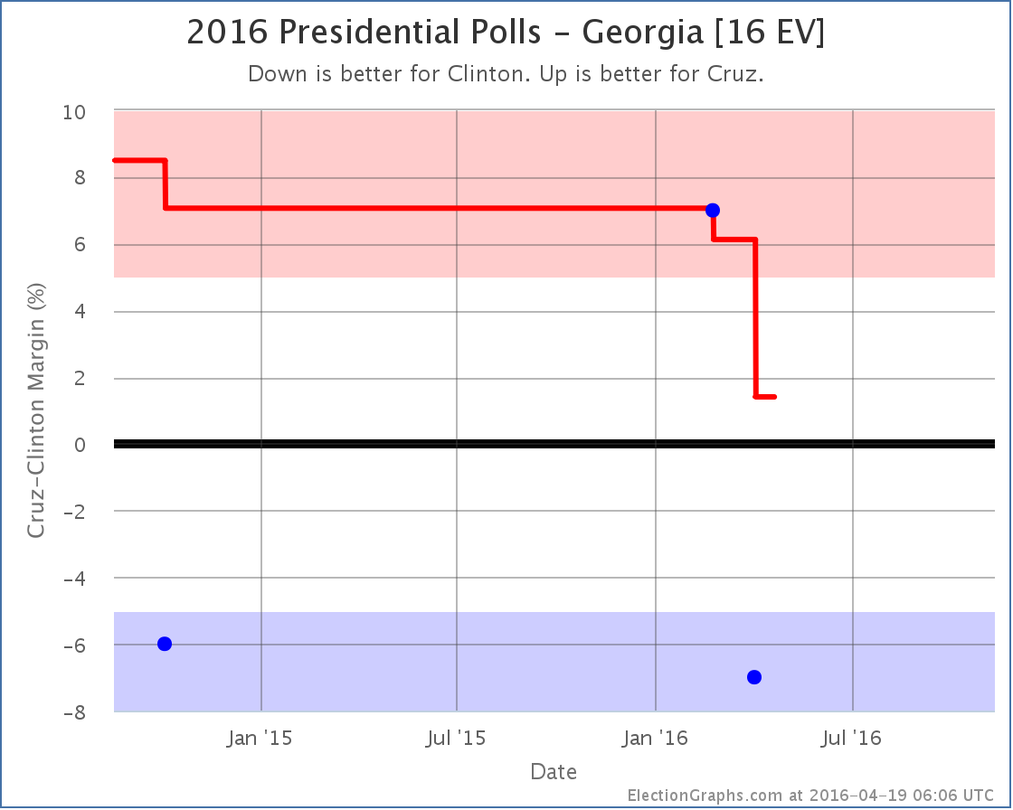
That poll was bad news for both Trump and Cruz. It showed both of them losing to Clinton. We don’t pay attention to individual polls of course, we look at the averages. But in both cases adding in this new poll drops the Republican lead in Georgia to less than 5%, which means that Georgia may be in play for Clinton this year. Georgia hasn’t been blue since 24 years ago when it voted for another Clinton in 1992.
Lets look specifically at the two match-ups here:
Clinton vs Trump

Georgia has been sparsely polled. It was not particularly expected to be a swing state. For Clinton vs Trump we only have three polls and so are still using the 2012 and 2008 election results to fill in the poll average. This new poll represents a really large move from the others as well, so there is a potential that future polls will show it to be an outlier.
But with those caveats, we now only have a 3.6% lead for Trump, which is close enough that we include picking up Georgia in Clinton’s “best case”.


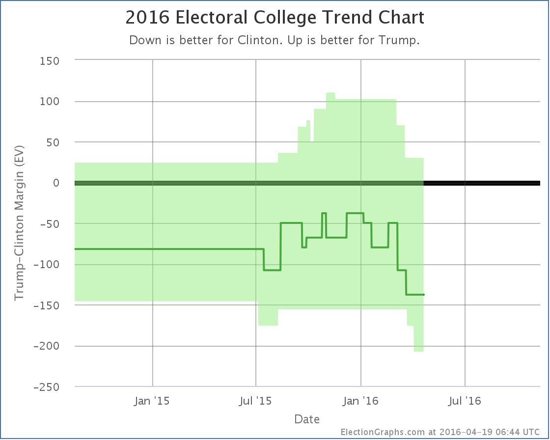
Clinton’s best case, where she wins not only the states she is ahead in, but also picks up the states where she is currently less than 5% behind… that would currently be Colorado (1.9% Trump lead), Georgia (3.6% Trump lead), and Missouri (4.7% Trump lead)… is now a 208 electoral vote win. The last time the margin was that large was when Bill Clinton beat Bob Dole with a 220 electoral vote margin in 1996.
Keep in mind however that this is Clinton’s best case. The “expected” result is a narrower 138 electoral vote win. That is in between Obama’s win in 2012 (126 electoral votes) and his win in 2008 (192 electoral votes).
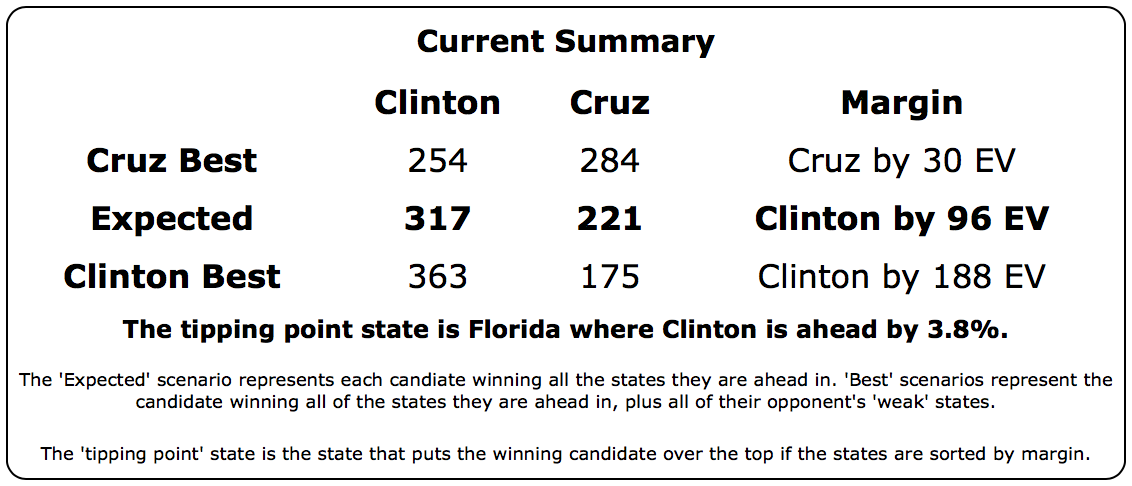
Trump’s best case, where he picks up all six of the weak Clinton states (North Carolina, Iowa, Florida, Ohio, Nevada, and Minnesota) is still to pull out a 30 electoral vote win.
The downward trend in Trump’s general election polling that started in January continues. The questions are “How far does he fall before he bottoms?” and “Can Trump rebound after that?”.
Assuming he is the nominee of course.
Time to look at the other contender:
Clinton vs Cruz

Like Clinton vs Trump, there have only been three polls of Clinton vs Cruz, but in this case one of the three is much older. We’re still filling the average with the 2012 and 2008 election results as well.
With the new poll, Cruz’s lead in Georgia is down to only 1.4%. Unlike the Clinton vs Cruz case we actually have two polls showing a similar result, so the case that this is just an outlier is a little weaker.
In any case, the average now shows Georgia as a close state.


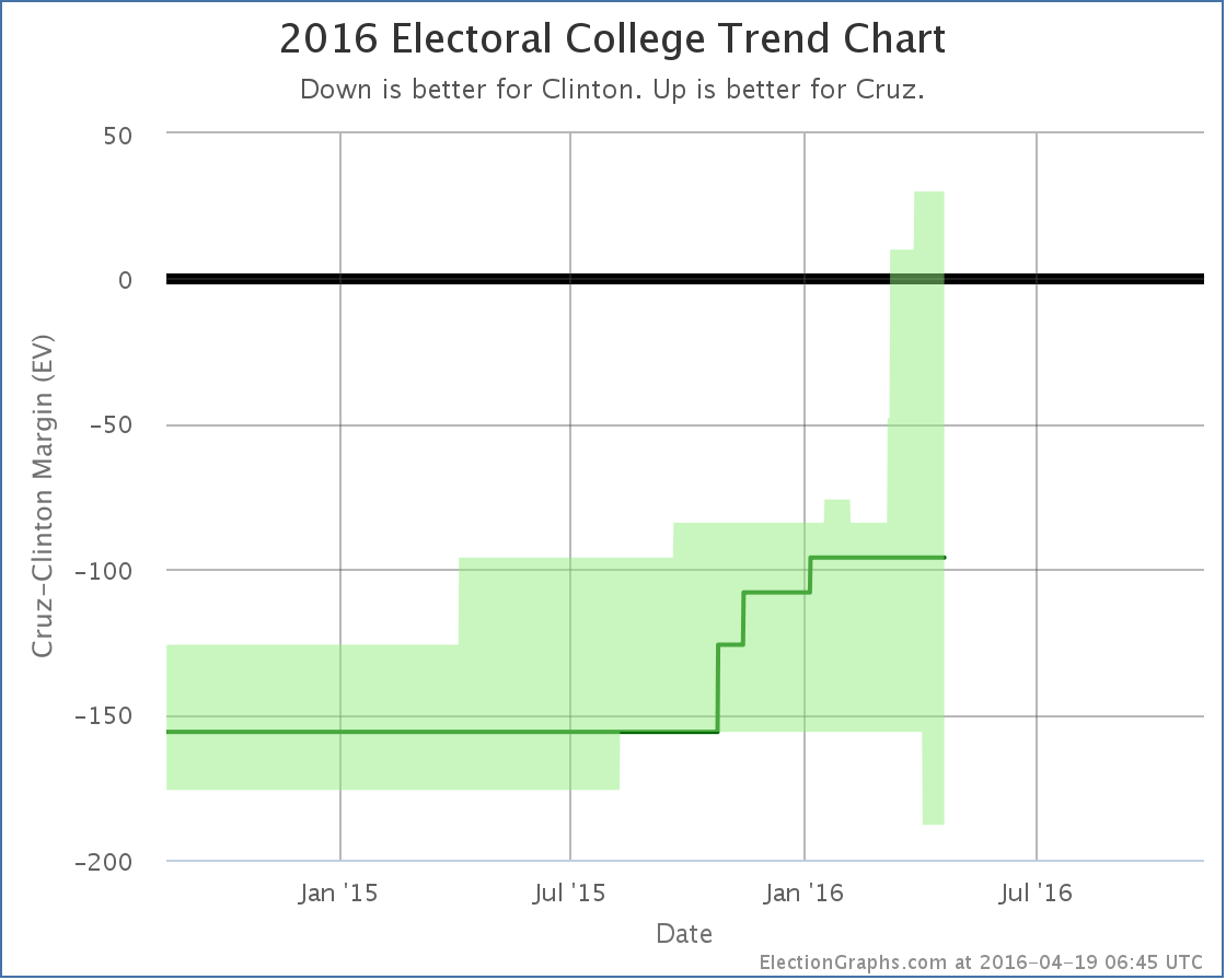
Clinton’s best case here improves to winning by 188 electoral votes.
Comparing Cruz and Trump, Cruz is doing better in the tipping point metric, in his worst case, and his expected case. He and Trump tie in their best case, with the narrow 30 electoral vote win.
Cruz’s trend has also generally been an improving trend. Today’s change is actually notable for being only the third decline for Cruz in my summary in the last year.
This decline then brings up the opposite question than the one we asked about Trump. Rather than asking when we will reach a bottom, with Cruz the question is when he will peak.
203.4 days until the general election polls start to close.
Note: This post is an update based on the data on ElectionGraphs.com. Election Graphs tracks both a poll based estimate of the Electoral College and a numbers based look at the Delegate Races. All of the charts and graphs seen in this post are from that site. Additional graphs, charts and raw data can be found there. All charts above are clickable to go to the current version of the detail page the chart is from, which may contain more up to date information than the snapshots on this page, which were current as of the time of this post. Follow @ElectionGraphs on Twitter or like Election Graphs on Facebook to see announcements of updates or to join the conversation. For those interested in individual general election poll updates, follow @ElecCollPolls on Twitter for all the polls as they are added.
|
|
