This is the website of Abulsme Noibatno Itramne (also known as Sam Minter).
Posts here are rare these days. For current stuff, follow me on Mastodon
|
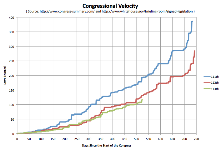
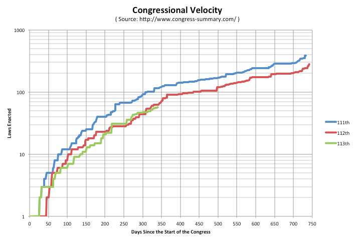
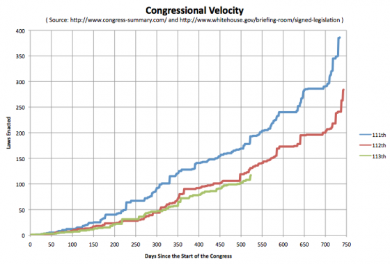
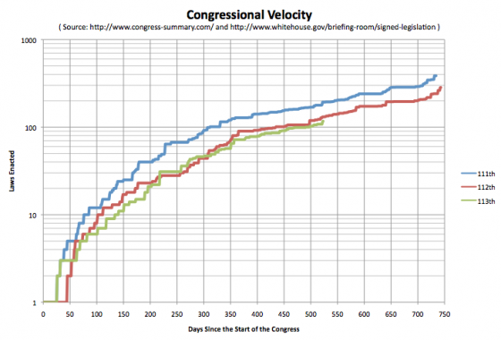
This is the latest in a series of quarterly posts comparing the legislative output of the last three congresses. The last update was in March. Once again, the 113th is behind the pace of the 112th… but not actually by all that much. As of June 10th, President Obama has signed 117 laws from the 113th Congress into law. At the same point in the 112th there had been 131 laws enacted, and in the 111th there had been 193.
Here are the charts:
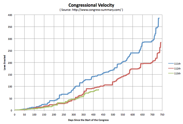
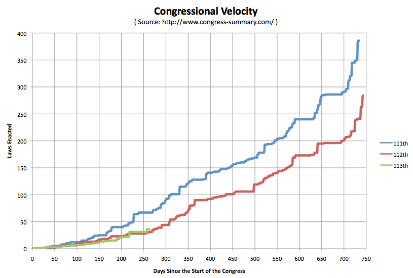
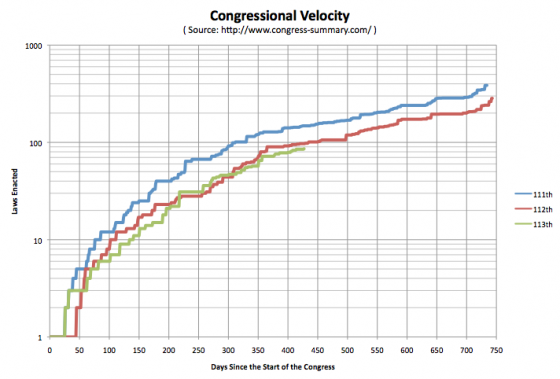
This is the latest update for the series of posts I have been doing on how the current congress compares to the last two in law making velocity. The last post was in December. Depending on your views on such things, enacting more laws may be better, or enacting fewer laws may be better. In any case, the 113th congress is continuing to succeed at enacting fewer laws than either of the two previous congresses. As of the last law currently listed at my source at Congress Summary, which was a reauthorization of the National Integrated Drought Information System signed into law by Obama on March 6th, the 113th has passed and Obama has enacted 86 laws. At a comparable time in the cycle, the 112th had enacted 97 and the 111th has enacted 148.
Here are the charts:

[Edit 16:23 UTC to fix a capitalization issue.]
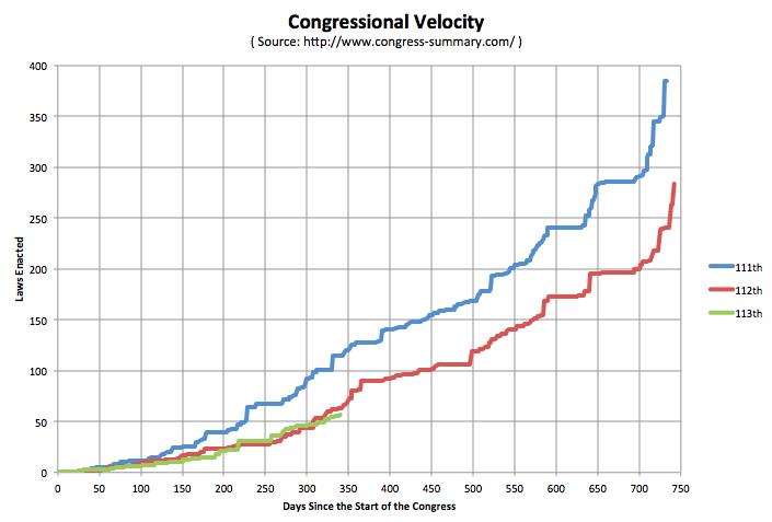
Just a quick update to my earlier posts from June and September on how many laws have been enacted by the 113th Congress in comparison to the 111th and 112th Congresses. From August 9th to November 6th, a period of 90 days, the 113th had actually enacted more laws than the 112th Congress had at a comparable time in the 2 year cycle. But Starting November 7th, the 113th fell behind the 112th again. As of the most recent legislation congress-summary.com lists as having been passed (extending the Undetectable Firearms Act of 1988 for 10 years, signed by the president on December 9th) the 113th has enacted 57 laws compared to the 63 the 112th had passed. (The 111th was up to 115 at this point.)
The 113th is a little behind the 112th at the moment, but actually they have been tracking each other pretty closely so far. It will be interesting to see if the gap widens in the next three months, or if the 113th catches up with the 112th again.
Anyway, this isn’t perhaps the best measure of Congressional productivity in the world, and depending on who you talk to, Congress passing fewer laws might be either bad or good. But it is still a fun data series to track.
Here are the charts:


It has been a bit over 3 months since I did my last “Congressional Velocity” comparison between the 113th congress and the 112th (and 111th) back in June. So time to do it again.
Specifically though, I was prompted by reading an article by Ezra Klein about the current congressional standoffs headlined “John Boehner’s Congress is a train wreck“. It seems like it probably is. I have no quibbles about that, but Klein also included this bit:
The data tells the same story. So far, the 113th Congress has passed 36 public laws. For comparison, the 112th Congress — the least productive Congress since we began keeping records — passed 283 public laws. At this rate, the 113th Congress is on track to be, by far, the least productive Congress on record.
And here I quibble. Not in the way Boehner does, saying this isn’t a good metric. But just to point out that actually, at this very moment, the 113th is actually AHEAD of where the 112th was at the comparable time. Lets look at the charts:
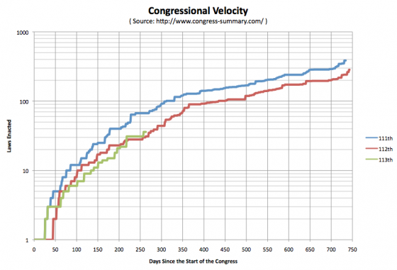
The 113th WAS on pace to be slower than the 112th… until August 9th, when the president signed 9 bills into law, and the 113th pulled ahead. The 113th has kept that “lead” since then.
Unless there were some laws signed in the last few days that aren’t posted on the White House website or my usual source at congress-summary.com yet, as of September 22nd, the 113th Congress is responsible for 36 public laws, while at the same point in 2011, the 112th had only managed 31.
Now, they may well fall behind again, they aren’t THAT far ahead after all. Certainly neither the 113th or 112th are anywhere near where the 111th was (67 by this point). But for the moment, “At this rate, the 113th Congress is on track to be, by far, the least productive Congress on record.” isn’t actually quite right. The 112th was slightly worse at this point in the cycle.
At least on this particular metric.
[Minor corrections and wording changes 06:30 UTC.]
First of all, I promised to report back after the electoral college vote, just to give the real final results, but I didn’t. There were no “faithless electors” this time around, as fun as that always is, so the end result was as expected from election night. Obama 332, Romney 206.
Now on to the analysis of the accuracy (or lack there of) of my five poll averages:
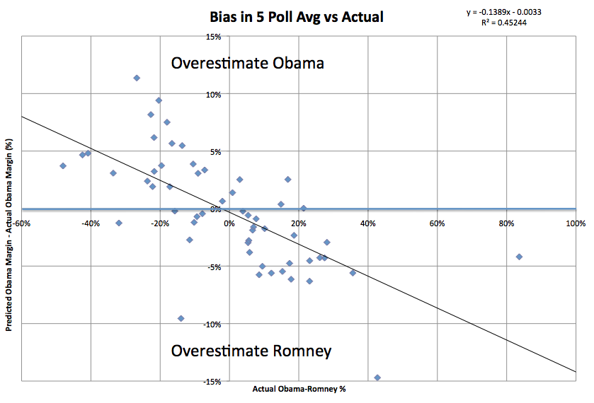
While my analysis predicted 56 of 56 jurisdictions correctly (50 states, DC, ME & NE congressional districts), this is not the whole story. It is worthwhile to also look at the comparison between the final five point averages and the actual popular vote margins in each of these jurisdictions. Here is what you find:
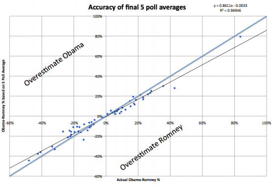
There is no clear overall bias toward either Obama or Romney. The overall count gives 25 jurisdictions where my 5 poll average overestimated Obama’s support, and 31 jurisdictions where my 5 poll average overestimated Romney’s support. If anything, on an overall basis then, there is a slight bias in favor of Romney. But that isn’t the real bias here.
Lets look at this again partitioning based on who won.
- Romney won 27 jurisdictions. Of those, 7 overestimated Romney’s support, while 20 overestimated Obama’s support.
- Obama won 29 jurisdictions. Of those, 5 overestimated Obama’s support, while 24 overestimated Romney’s support.
So the overwhelming pattern here is that although there are clearly exceptions, in general, the polls overrepresented the support level of the person who lost the state.
In other words, the polls are not biased toward either candidate. The polls are biased toward showing a CLOSER RACE than the actual results.
The trend can been seen even more clearly if you subtract out the actual results, leaving only the deviation or bias:

If the polls were very generally right, you would expect a horizontal line very close to zero.
If there was a direct bias for one candidate or another you would expect a horizontal line, above zero for an Obama bias, below zero for a Romney bias.
We see positive to the left and negative to the right though, meaning the bias is generally toward the underdog, whoever that is. (In other words, again, a bias toward a closer race.)
More than that though, the less close the race is, the greater that bias is. It isn’t just that races that are less close are polled less often and so are generally further from the right answer, but rather the bias toward making it closer increases too.
In Hawaii, where it was clear Obama was going to win by very high margins, the polls overestimated Romney by 14.7%! (Polls said Obama would win by 28%, Obama actually won by 43%.)
Similarly, in West Virginia, where it was clear Romney was going to win by very high margins, the polls overestimated Obama by 11.4%! (Polls said Romney would win by 15%, Romney actually won by 27%.)
Those were the two worst states in terms of accuracy of the five poll average. Rounding out the worst five are Alaska (R+9.6%, a big exception to the trend… where there were no polls at all and the 5 poll average was based on the 2004 and 2008 elections), Tennessee (O+9.4%), Kentucky (O+8.2%).
The best five were: Maine-1 (O+0.03%), Texas (R+0.2%), Virginia (R+0.2%), Washington (O+0.4%), Georgia (R+0.4%).
Now, in the end, the degree to which each candidate wins (especially in the states they are way ahead in) doesn’t really matter. We have a winner take all system, so this bias actually makes a lot of sense in terms of how pollsters work. Having the margin wrong doesn’t matter much in these kinds of races, only the winner matters (and the poll averages were all correct on that front). Also of course, close races are more interesting, and people are more likely to commission polls if it looks closer… so the biases all make sense.
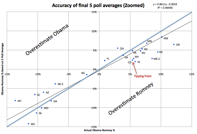
But lets take a closer look at the states that were even remotely in contention, where the margins were under 15%. That actually includes a lot of places I wouldn’t really consider “close” but it gives a good number to look at:
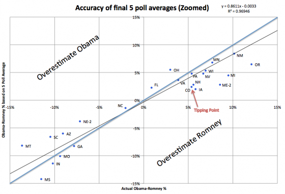
Now, I had categorized using “Strong Romney”, “Weak Romney”, “Lean Romney”, “Lean Obama”, “Weak Obama”, “Strong Obama”. Lets look at how things stacked up in terms those categorizations… specifically the “lean” states.
You can see from the chart above, that even among the states near the “tipping point” where you would think polling would be most robust, the error is significant. The tipping point is of course on Obama’s side, since he won. But what we see is that of states that the last five poll average identified as “Lean Obama”… that is, Obama ahead, but with a margin under 5%… so close enough you could conceivably think Romney might take it… only TWO actually ended up with margins under 5%. That would be Florida and Virginia.
On the other hand, the five poll average identified each of these states (and one congressional district) as “close”, but in fact it was pretty much an Obama blow out:
|
5 Poll O-R |
Actual O-R |
Bias |
| Colorado |
2.4% |
5.5% |
R+3.0% |
| Pennsylvania |
4.8% |
5.4% |
R+0.6% |
| New Hampshire |
2.8% |
5.6% |
R+2.8% |
| Iowa |
2.0% |
5.8% |
R+3.8% |
| Nevada |
4.8% |
6.7% |
R+1.9% |
| Maine-2 |
2.8% |
8.6% |
R+5.8% |
| Michigan |
4.5% |
9.5% |
R+5.0% |
There was only one state with the opposite pattern… that is, the five poll average indicated Obama with a healthy safe lead of more than 5%, and the actual results were a win by less than 5%. That would be Ohio. The 5 Poll average had Obama ahead by 5.5%. In actuality he won by only 3.0%
On the Romney side, there were less close places to look at. There were no cases where the five poll average classified something with Romney having a greater than 5% where it ended up being closer than that. There was ONE case where the five poll average showed a close race where it really wasn’t. That would be Nebraska-2, where the five poll average showed only a 3.8% lead. In fact, Romney won Nebraska-2 by 7.2%.
The lesson in all this for 2016? Probably just that “Lead under 5%” isn’t enough to actually think that a state has a real possibility of going either way, that it is really up for grabs. Especially if the form of bias evident here (bias toward the races looking closer than they really are) repeats next time around, which I think is a reasonable assumption.
Some tighter criteria is needed. Maybe just a narrower percentage lead, but maybe also something else. Perhaps an actual history of the lead bouncing back and forth, or the actual current set of polls including results going both way.
Of the five closest states based on actual results (Florida, North Carolina, Ohio, Virginia, Colorado) only Florida had even one of the last five polls indicating the opposite winner (although North Carolina and Colorado had last minute polls showing a tie). Of course five results showing a lead of 0.1% should probably be considered differently than 5 results showing a lead of 4.9%.
The more mathematically proper thing would probably be to take into account the margins of errors on each poll, and come up with an actual probability of the result being on the opposite side than the simple five poll average. There is a place for more complicated models (and I love them!) but part of the point of my analysis is that you can come up with results that are essentially just as good through very simple models with no fancy stuff, just simple averages.
If we went by a rule saying we would only consider a state to be a true toss up if at least one of the last five polls showed a different result, then on election eve 2012, the only Toss-Up state would have been Florida.
I have yet to decide what I will do in 2016, but considering Florida to be the only true toss-up seems closer to the truth than the analysis that put the seven entities in the table above (and NE-2) in the toss-up category.
This analysis is also posted on my Election 2012 Wiki where you can see the original analysis as well.
OK… now to start setting up the 2016 analysis… :-)
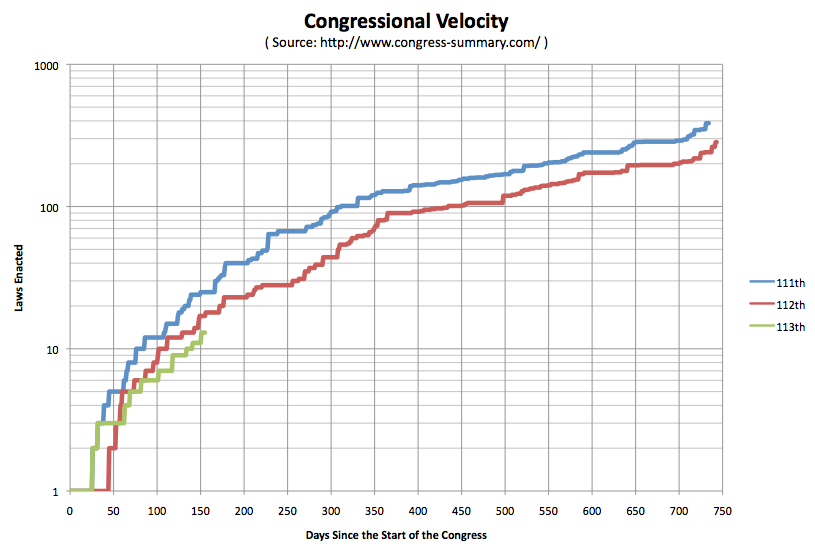
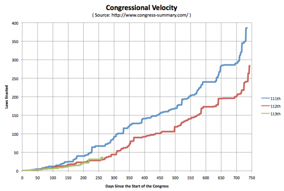
In our annual predictions show for 2013 one of the items Ivan and I disagreed on was if the 113th congress would enact laws at a higher or lower velocity than the 112th. (Enact of course meaning passed by both houses of Congress and signed by the President.)
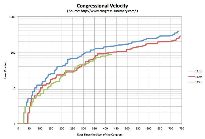
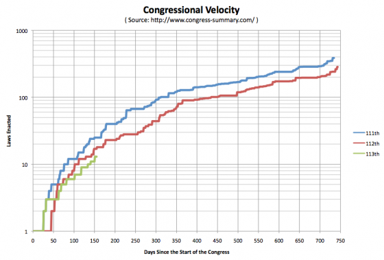
So I have started to track that. Here are the charts so far (one with a linear scale, one with a log scale to better show the early detail):
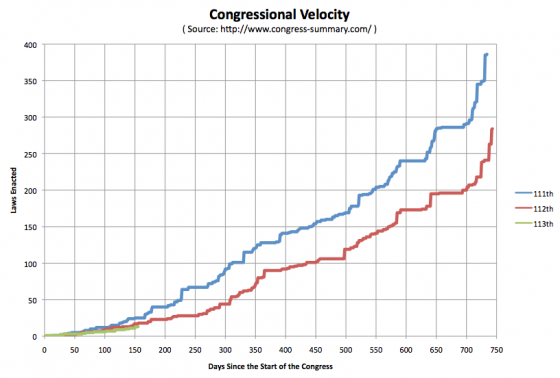
Minus any new laws recently signed that might not have made it to my source at congress-summary.com yet, as of 155 days into each of the three Congresses (that would be June 7th of the first year in all three cases) we have the 111th having 25 laws enacted, the 112th having 17 laws enacted, and the 113th having 13 laws enacted.
It is interesting to note the somewhat similar patterns in the shapes of the curves, indicating that although the velocity may be different, there seems to be a nice pattern to how Congress ramps up, when it takes breaks, when it speeds up and does more, etc. Bursts around holidays and in the lame duck period, lulls during the summer, bigger lull in the run up to elections, etc. (Of course, to really examine this, you’d need to look at more than 3 congresses, the similarities may not bear out with robust scrutiny.)
So far I am correct in my prediction that the 113th would enact fewer laws than the 112th. But there is still plenty of time before the end of the year for this to change and for Ivan to be proven right instead.
At the moment I am not making any statement on if that is a good or a bad thing. :-)
Like many people, after I heard the news about the school shootings in Connecticut, I spent time watching the news come in, I spent time reading about it, and I was very emotionally effected by the whole thing. I admit I cried. Each time I thought about it, I couldn’t help thinking about the families, and imagining the incredible pain if something like that were ever to happen to my own family. It was an incredibly sad day.
At the same time though, I hear the repeated “we must do something!” calls, and while I emotionally empathize with them, I also get very frustrated. Because as tragic as this all is, there are a few things to remember, and if you are going to look rationally at these kinds of things, especially if you are going to start talking about laws and political solutions, then you need to step back a bit.
So lets start:
28 people killed at one time is NOT worse than 28 people killed separately. It is more visible. It is more shocking. I have heard it said that when multiple people are killed together it has the same emotional impact as if that number of people SQUARED had been killed separately. So 28 people killed together has the emotional impact of 784 people killed separately. Perhaps so, but in the end, 28 people are still dead either way.
Yes, it was horrible that 28 people were killed yesterday, and it was horrible that most of them were children. But every year there are over FIFTEEN THOUSAND people killed violently in the United States. And over SEVEN HUNDRED of them are children under 14. (Source: DOJ)
As dramatic and disturbing as the deaths of those 28 people are, it is a drop in the bucket compared to the overall rate at which people are getting murdered in the United States. (And according to the DOJ only about 1 in 2000 homicide incidents involve 5 or more victims and 95% of all homicides have only a single victim.)
If you are going to set policy to try to reduce violent death, if you try to craft a policy that is specifically structured to address statistically rare mass killings, then even if you succeed in reducing the frequency of THESE events, you will not actually be optimizing for reducing TOTAL violence and therefore you would NOT be doing the best you could for the public.
So what does the violent death rate look like? Using numbers from violentdeathproject.com:
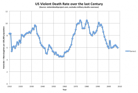
Dramatic improvements were made throughout the 1990’s. Since then, with the exception of the peak from 9/11 in 2001, the violent death rate has been essentially flat. (The most recent data here is 2008, as these things have a bit of lag. There is evidence for a further DROP since then, although that second source includes fewer deaths in their numbers than VDP since VDP includes manslaughter as well as homicide.)
So while there is still TONS of room for improvement… The US rate of 6.1 per 100k is horrible compared to most of the rest of the developed world… 1.9 per 100k for Germany, France and Canada; 1.3 per 100k for the UK; 0.8 per 100k for Japan… things HAVE generally been moving in thew right direction in the last couple of decades. You are less likely to be killed violently now in the US than any time in almost 50 years. You have to go back to the mid-1960’s to be better off than today.
That does NOT mean that we should not try to do better… that we should not be looking at ways we might be able to reduce the US violent death rates to the levels in the UK or Japan… or better. We absolutely should. We should not by any means accept the idea that the US is just more violent and that is OK.
But it does mean when you hear breathless comments about how out of control things are, and how desperate the need is for “immediate action”, you should take a deep breath and look at things in the larger context.
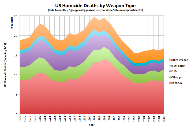
Now, the next thing to look at is type of weapon used. The conversation has immediately turned to gun control, but should it?
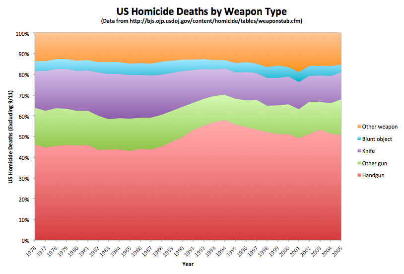
Lets look at two relevant charts, this time the source of the data is the Bureau of Justice Statistics at the DOJ. Unlike the VDP data, these only include homicides (not manslaughter), and exclude 9/11.
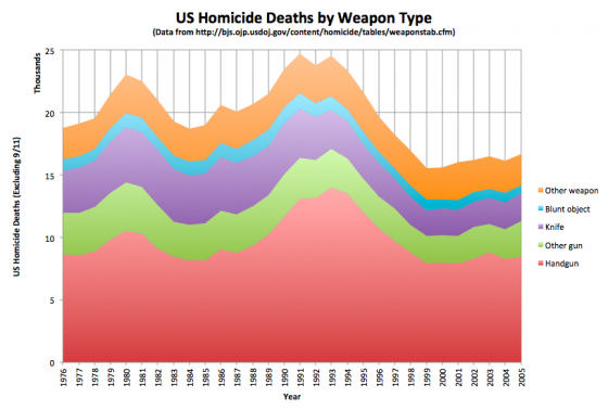

These two charts show the same data, but one with absolute numbers, and the other as a percentage of total homicides.
It stands out immediately that about 2/3 of US Homicide deaths are indeed committed with guns. That is an extraordinarily high number. The only real change here seems to be an reduction in the number of murders committed with knives over the time frame shown, both in absolute and percentage terms. (Anybody know why that happened? Why are knives less popular than they were?)
This seems to indicate that if you want to reduce the overall homicide rate, targeting gun violence is actually a pretty good place to start.
There is of course the argument that if guns were not available, or at not as easily available, that many of those murders would still happen, people would just use different weapons. And of course even with restrictions, anybody who really wanted a gun could still get one.
Both of these points are true. But because the percentage of violent deaths by gun is so high, even if a small percentage of the homicides did not happen because the perpetrator couldn’t get easy access to their weapon of choice, it would make a significant difference to the overall rate.
Of course, that doesn’t say what actual policies might or might not help. It is quite easy to construct policies that are very restrictive, but have no actual effect on public safety, or which may actually reduce safety when you take everything into account. (See, for instance, TSA policy at airports and how people driving more after 9/11 caused an increase in highway deaths.)
So even if you do engage in gun regulation, you need to be careful about what you do in order to ensure that you actually are effective at changing anything regarding the violent death rate. And perhaps more importantly, that you don’t also introduce significant and unacceptable restrictions in personal freedom that have other negative side effects.
But a perhaps even more salient point, the most effective way to reduce the overall rate of violence may have NOTHING to do with restricting weapons of any sort. Rather, I have seen some arguments that massively increasing availability and access to mental health support would have an even bigger effect. Easily available inpatient care to those who need it of course, but even more than that, just options and support for those who are in stressful situations that could escalate, or to those with conditions that make them more likely to react violently to provocations.
So even though additional gun control MAY be an effective part of a plan to help improve the violent death rate, any discussion about this sort of issue should not be exclusively about gun control, or about reacting to “mass killings”. Anything that is done needs to take a broader perspective, looking at the overall violent death rate and long term trends. Any knee jerk reaction that is highly focused on a specific incident, or even types of incidents, is very likely to be ineffective or even counter productive at solving the larger problem.
[Edit 2012 Dec 12 20:36 to correct a place where I accidentally said “drug” instead of “gun”. That’s a whole different can of worms, although of course drug policy also has an effect on the death rate.]

Earlier this week, Andrew Sullivan had a series of posts exploring trends in Texas that may eventually make it a swing state. (Part 1, Part 2, Part 3) This prompted me to wonder what the actual numbers were and what the trend might look like.
Demographic trends may well cause changes in the electoral balance in Texas at some point in the future, but looking at actual historical election results shows no such trend so far.
Similar to the chart I did of national trends on Sunday, the chart above shows the Democratic proportion of the two party vote (ignoring third parties) over the last 100 years, this time just for Texas. Over this timescale, clearly the trend is from a very reliable Democratic state prior to 1950 to a solid Republican state since 1970.
Looking just since 1970, one could argue that the trend is fairly flat, but if you look at how winning Democratic presidents have done, you see that Clinton did not match Carter’s numbers (Carter actually won Texas in 1976) and then Obama has not matched Clinton’s numbers. Each winning Democratic president has done worse in Texas than the one before.
Now, one could say that Obama did better in Texas than Kerry or Gore, and that would be quite true. But it seems like that is more just a factor of being a winning candidate, and thus having higher levels of support overall.
And in the most recent timeframe you can look at, Obama 2012 didn’t do as well as Obama 2008.
There may be underlying demographic trends that will eventually favor Democrats in Texas, but they haven’t actually started to bend the curve there quite yet.
But wait! There is another way of looking at this!
I hinted at it when I mentioned that the winning Democratic candidates (Obama, Clinton, Carter) got a boost compared to the losing Democratic candidates (Kerry, Gore, Dukakis, Mondale) just by virtue of being winners.
You can correct for this by looking at how Texas voted relative to the national vote rather than just looking at Texas in isolation. If you take the Democratic percentage of the two party vote in Texas, and subtract from that the Democratic percentage of the two party vote nationwide, you get a measure of how much more (or less) Democratic Texas is than the country at large. With this, you get the following chart:

I’ve left out the red and blue coloring this time because it clutters up the image, but this chart is a lot less noisy. You still see a very clear trend with Texas becoming less Democratic and more Republican over the last 100 years (compared to the rest of the country).
In this view however you CAN see an inflection point at the 2000 election. Up until 2000 Texas was clearly getting more Republican (compared to the rest of the country) with almost every election. Then that trend seems to stop.
In 2000 Texas was 11.2% more Republican than the nation.* Each election since then the difference between Texas and the national average has been slightly less. In 2004 Texas was 10.3% more Republican. In 2008 it was 9.6%. And in 2012 the preliminary numbers have it at 9.4%.
At that rate Texas still has a LONG time to go until it is really close to the national numbers. But with this view, you actually do see a trend with Texas’s Republican lean (relative to the rest of the country) decreasing slightly over the past few elections.
* I’m being slightly sloppy with language here, to be more correct I would say that the Democratic proportion of the 2 party vote was 11.2% less in Texas than the Democratic proportion of the 2 party vote nationwide.
Note: Data from uselectionatlas.org.

With all the talk of demographic trends favoring the democrats I thought I would just pull some really long term past data and see what the trends look like.
The chart above is the Democratic percentage of the Republican/Democratic popular vote. That is, it leaves out third parties, even though they were significant in some of these years. And even though I generally prefer looking at the electoral college in Presidential elections, for this purpose popular vote seemed better.
The one thing that immediately stands out to me is actually not a trend toward Democrats, but a “dampening” effect. The numbers were so much more volatile prior to 1976.
I’ll skip the big 1912 to 1924 swing because 1912 was an oddball election… the Republicans actually came in third behind the Democrats and Progressives.
But looking further on for examples, we went from Calvin Coolidge (R) blowing out John Davis (D) in 1924 by a 65.2% to 34.8% margin, to Franklin Roosevelt (D) crushing Alfred Landon (R) by a 62.5% to 37.5% margin only 12 years later. That is a LOT of people flipping from Republican to Democrat. Now, admittedly, there was a little thing called the Great Depression that probably caused that swing. But still, it is a HUGE number of people moving from one party to the other compared to what seems possible today.
A slightly more recent big swing… In 1964 Johnson (D) beat Goldwater (R) 61.3% to 38.7%. Only 8 years later in 1972, Nixon (R) beat McGovern (D) 61.8% to 38.2%. Again, there was a major event, the Vietnam War, that could explain this, but this still represents a HUGE number of people switching parties. Not just demographic trends, but people actively switching their support.
In addition to big swings, margins in general tended to be bigger.
From 1912 to 1984, 13 of 19 elections… over 2/3 of the elections… were won by margins greater than 10%. The last time that happened was Reagan’s 1984 win over Mondale. We have now gone 7 elections in a row where the elections were one by less than a 10% margin.
Of those 7 elections since Reagan, the margin was less than 3% three times. From Woodrow Wilson in 1912 to Ronald Reagan in 1984, there were also only three elections… out of 19 elections… with a margin under 3%. (That would be 1960, 1968 and 1976.) Elections this close used to be really rare. They aren’t the “norm” now, 1988, 1992, 1996, and 2008 were all won by more than 7%, but under 3% is certainly no longer rare.
Now what about that trend toward the Democrats? Now, looking at the full 100 years, the oscillation between the parties and the reduction in volatility is the biggest thing you notice, but you could argue that the politics and issues and how the parties were aligned was dramatically different prior to the 1970s. So, if you look selectively just at 1972 onward, you do see a trend toward the Democrats.
In the 70’s and 80’s you had big Republican wins and the only Democratic win was a squeaker.
In the 90’s and 00’s you had smaller Democratic wins, with the only Republican wins being a popular vote loss in 2000 which was won in the electoral college, and a narrow win in 2004.
If you change your starting point though, and look just since the 1990’s, the trend is (slightly) back toward the Republicans. Obama’s two wins were by smaller margins than Clinton’s wins.
The demographic trends DO seem to be against the Republicans at the moment given how party preferences have been breaking down by ethnic group. But…
The important thing to remember however is that parties change over time. The Republicans of 2012 are nothing like the Republicans of 1988. And the Republicans of 1988 didn’t look much like the Republicans of 1964.
How much any demographic trends affect future presidential races will depend a lot on the internal dynamics of both parties, and who they nominate, and if the parties start shifting around as they do periodically. If the Republicans figure out how to embrace rather than alienate the non-white groups that are growing rapidly, then they will be able to blunt or reverse any demographic trends.
Or we could have a major event like the Great Depression or the Vietnam war that returns us to the days of huge landslides for whichever party is NOT blamed for the bad event, with huge swings between the parties in short periods of times.
We’ve been in a period of relatively close elections, with relatively little volatility between elections. That seems to be unusual looking back at the last 100 years. It could be the new “normal” that lasts another 50 years. But it just as easily could be an anomaly, and we’ll return to “normal” soon.
As usual, past performance is not indicative of future results, but it is fun to look back at the longer term history for some context.


Just before 18:00 UTC today, Florida was finally “called” for Obama. Absent any faithless electors, this makes the final electoral college results Obama 332, Romney 206.
As those of you following my electoral college tracking this year know, not only was that the final state of my “Current” line on election day, but it is also by far the most common location of the race in the daily updates covering the whole year. As I’d said quite a few times, 332-206 just seemed to be where this race “wanted” to be. Sometimes events would move the polls slightly further in Obama’s direction, sometimes slightly further in Romney’s direction, but 332-206 seemed to attract the race like a magnet, and things would revert back to this state. When things “reverted to the mean” this is where they went.
Also of course, looking at the daily updates going back to January, Romney was NEVER ahead in this electoral college analysis… or any other electoral college analysis. Aside from a few days in October where Romney was threatening to take the lead (but never did) the question was never if Obama would win, but rather by how much. But yet reports are that the Romney campaign, and Romney himself, were shocked by the fact that they lost. They really truly did not believe the overwhelming consensus from the pollsters.
I guess to some degree to run a national campaign like this you HAVE to make yourself think you are winning, but still…
One final point. There are quite a few more complicated models out there doing electoral college analysis. They provide potentially more detail and more kinds of insight than mine, but part of my point in doing this exercise is that even a very simple “last five poll” average can get you very good results. The marginal value from added complexity doesn’t really seem to get you that much more. This isn’t to say that there isn’t value in that complexity. There is. And if I had more time, I’d certainly be tempted to make a more complex method of analysis myself.
But the simple average still got 56 out of 56 right. (That would be the 50 states plus DC, plus the congressional districts in Maine and Nebraska.)
That ain’t bad.
Note added Nov 11 00:25 UTC: I have some final clean up to do on it yet, but the archival wiki page with all the information from this general election season is here. The earlier wiki archiving the primary season is here.
Edit Nov 11 00:34 to change some awkward wording.
|
|