This is the website of Abulsme Noibatno Itramne (also known as Sam Minter). Posts here are rare these days. For current stuff, follow me on Mastodon

Categories

Calendar

November 2024
S M T W T F S
 12
3456789
10111213141516
17181920212223
24252627282930

Electoral College: Clinton vs Bush now “best polled” combination for 2016

Some new polling was added today from PPP in North Carolina. It didn’t change the status of any state for any of the top five “best polled” candidates, nor did it change the tipping points for any of those. However, it did move Clinton vs Bush ahead of Clinton vs Paul in the metric I use to measure how good the polling is for the various candidate combinations. This means that Clinton vs Bush is now the default view when you go to election2016.abulsme.com.

Now, this does NOT necessarily mean that Clinton and Bush are the front runners in their respective primary races… although there is a strong argument that they are… it just means that there is currently better state by state polling data for this particular combination than any of the others.

Given this, I thought a quick overview of the Clinton vs Bush combination was in order.

Screen Shot 2015-02-05 at 02.58.16706

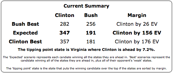
So, as with all the other “top five” Republicans against Clinton, Bush is behind, even in the “Best Case” where you give him all of Clinton’s weak states.

chart-5

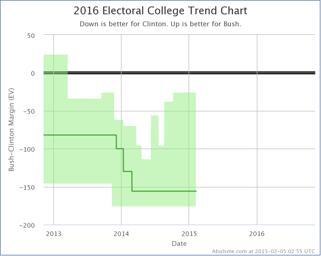
But, unlike some of the others, Bush’s “best case” has been steadily improving since last spring.

And while it hasn’t happened yet, there are two states right on the verge of flipping and improving his expected case as well…

chart-6

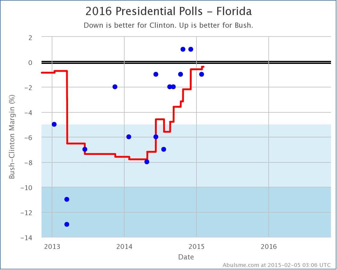
Florida, with 29 electoral votes, considered by many a “must win” for any Republican path to victory, has been trending strongly away from Clinton and toward Bush since bottoming out in the first part of 2014. Currently Clinton’s lead is 0.4% in my average. One more good poll for Bush, and Florida will move into his column.

chart-7

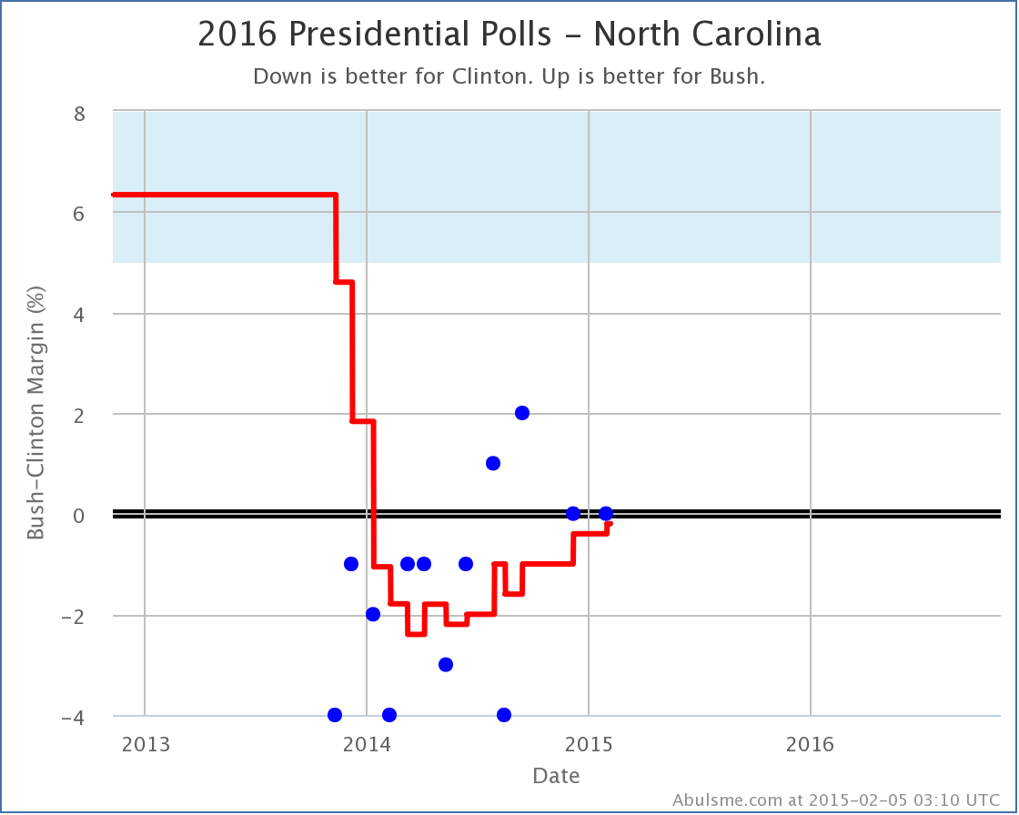
Ditto with North Carolina with 15 electoral votes, where Clinton’s lead is a minuscule 0.2%. Both these states are really neck and neck, but the trend has been in Bush’s direction in both.

Do not be surprised if these flip and Bush’s “expected case” starts moving in his direction soon.

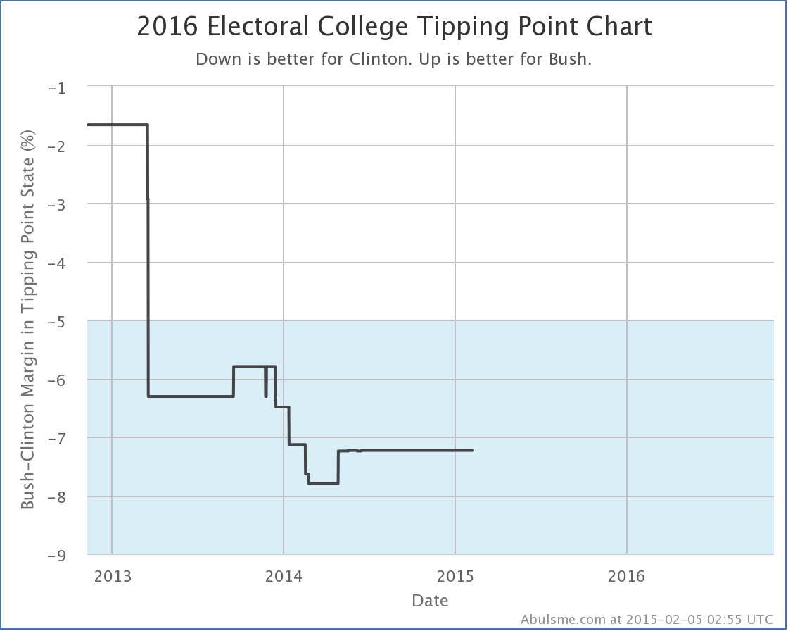
Of course, to actually win, a lot of states need to move. The “tipping point” measures this.

chart-8

No significant movement here recently. Does this move Bush isn’t moving all the states he needs to? Maybe. But more likely, there just hasn’t been much new polling in the states near Bush’s current tipping point.

To start seeing movement in the tipping point for Clinton vs Bush, we need some new polls in states like New Hampshire (last poll in November), Wisconsin (last poll in April), Virginia (last poll in March), Minnesota (last poll in June) or Colorado (last poll in July).

The age of the polls in these states shows just how far away we still are from having a large enough volume of state level polling to have a good “real time responsive” sort of take on the situation. At this stage, polling is still slow and sparse in most states, and you have to interpret things accordingly.

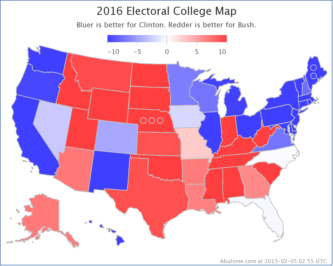
Now, you can’t give a summary without the traditional map. So here is the current Clinton vs Bush map…

chart-9

And finally, here is how that looks as a spectrum of the states broken down into the various classifications:

Screen Shot 2015-02-05 at 03.32.45313

So there is our new “best polled” candidate combination… for the moment…

@ElecCollPolls tweets from 2015-02-04 (UTC)

Electoral College: Paul, Christie, Huckabee all weaken vs Clinton

Today’s poll update was the addition of the Quinnipiac Swing State Poll, which included Florida, Ohio and Pennsylvania. Within the five “best polled” candidate combinations, this caused three changes worthy of note here. All three were moves toward Clinton and away from the Republicans.

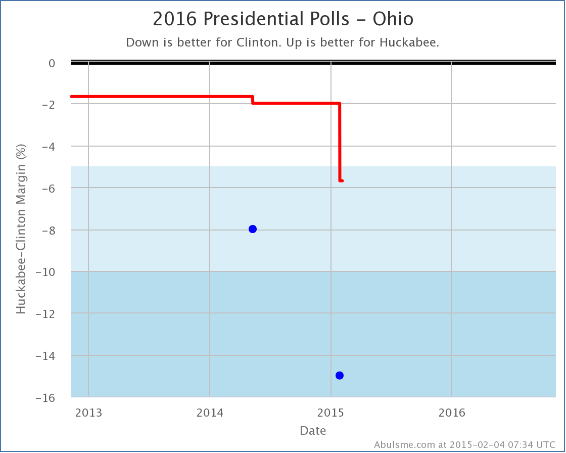
First up, since it is the only one that actually involves changing the electoral summary for a candidate pair… Clinton vs Huckabee.

chart

This is only the second time Clinton vs Huckabee in Ohio has been polled, but both new polls pull the state more toward the Democrat than the average of the last five presidential elections (which gave a 1.7% Dem advantage). This latest Ohio poll pulls the five poll average to a 5.7% lead for Clinton, which takes the state out of the “Weak” category which I allow to swing back and forth between the candidates to produce the “Best Case” scenarios for each candidate.

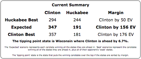
With the loss of Ohio from the list of “Possibles”, Huckabee’s “best case” moves from Clinton by 14 EV, to Clinton by 50 EV.

Screen Shot 2015-02-04 at 7.41.53

Of the five “best polled” candidate combinations, Clinton vs Huckabee is still #5 with much less comprehensive polling than Paul, Bush and Christie, so this may still be overstating where Huckabee would really be if more states were more fully polled.

The next two changes don’t actually change the Expected or Best cases for candidates, but rather are just changes to the “Tipping Point”. The tipping point essentially describes how much polls would have to move nationally (assuming an even distribution of movement in all states) to change who has the lead in the electoral college… in other words, how far ahead or behind the candidate is overall.

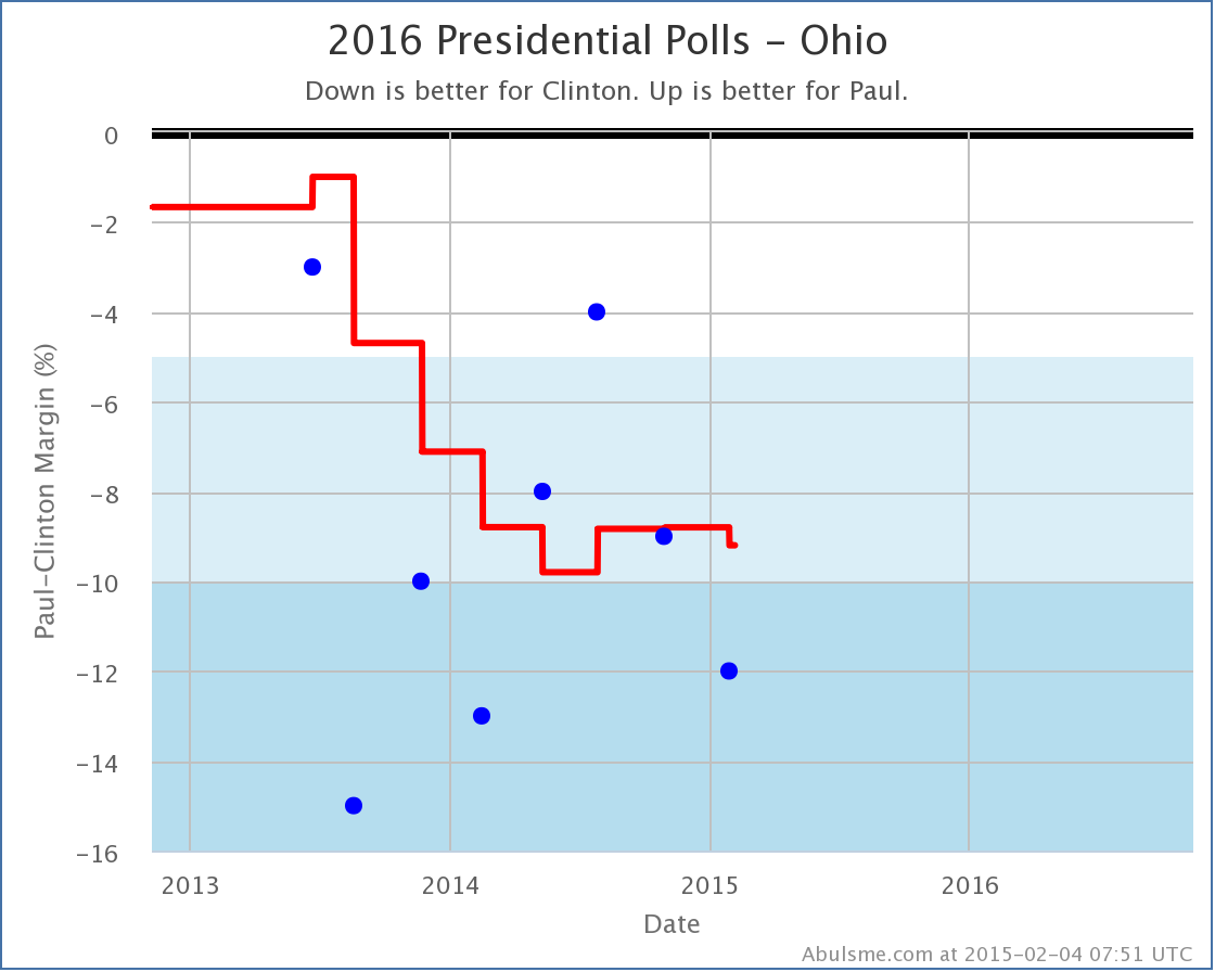
So next up is Clinton vs Paul:

chart (1)

With the new poll, Paul moves from being behind 8.8% in Ohio, to being behind 9.2% in Ohio. Both of these are in the “Strong Clinton” category, so there is no category change here, but Ohio was the tipping point state in this contest, and so any movement in this state will generally mean movement in the tipping point.

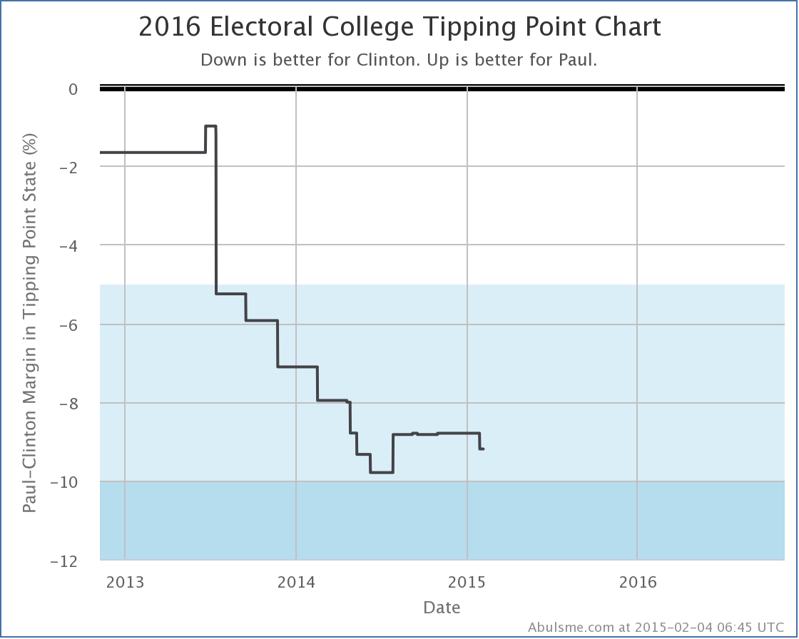
chart (2)

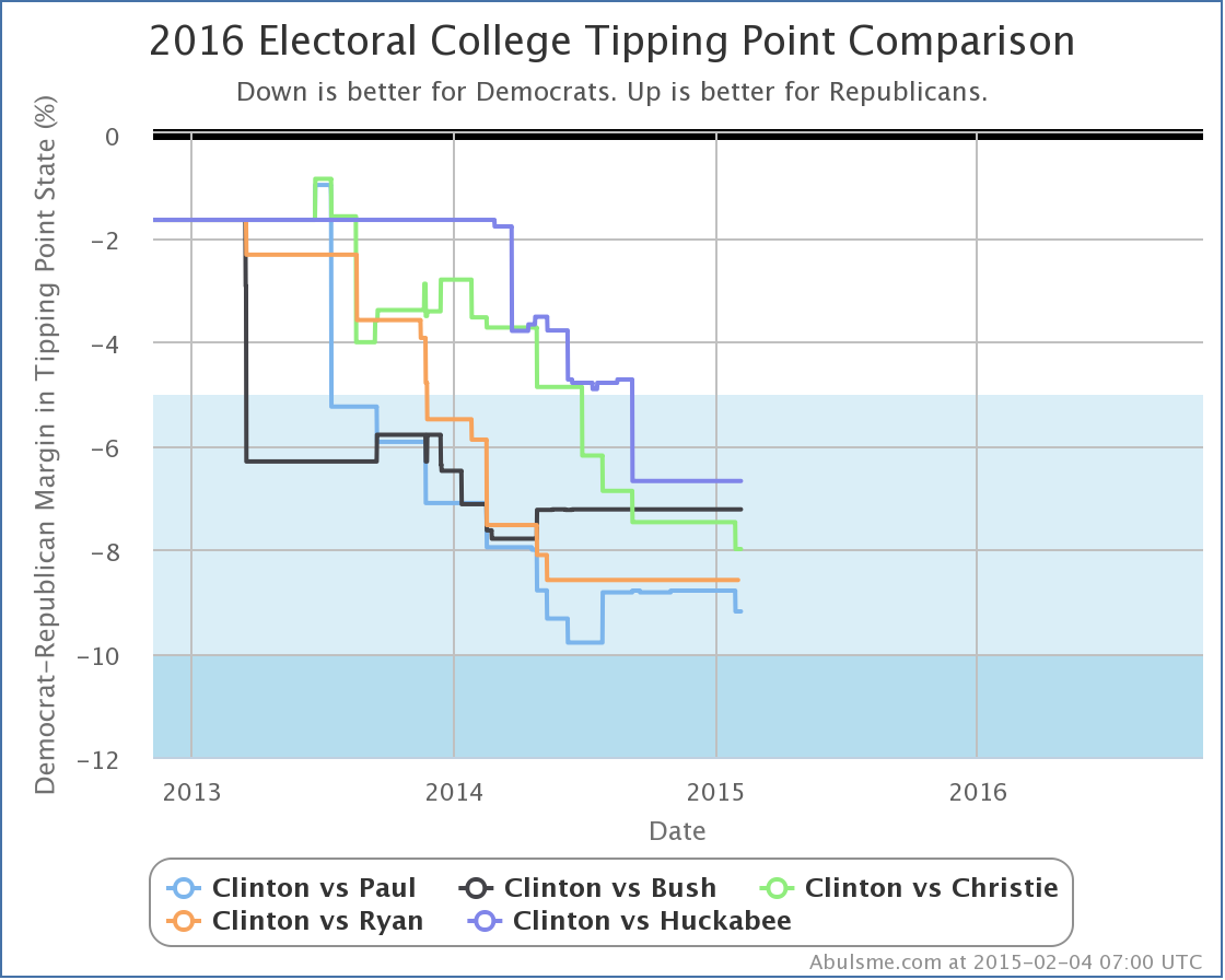
As you can see, the Clinton vs Paul tipping point has been between an 8% and 10% Clinton lead for most of the last year, so this isn’t breaking any new ground. The trend before last summer on this chart was basically just the process of getting enough polls to have a good view of this candidate pair, so things have essentially just been pretty flat since then. The new change doesn’t really change that, although I’m sure Paul would still rather see this line go in the other direction. (Well, if Paul was looking at my charts, which he isn’t. :-) )

Finally, Clinton vs Christie. This time, the changes in two states were relevant:

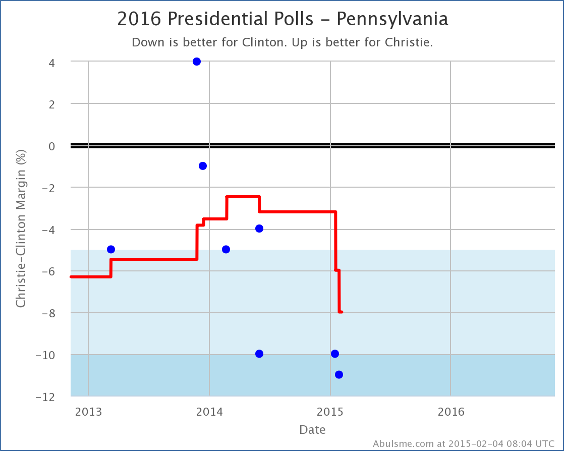
chart (3)

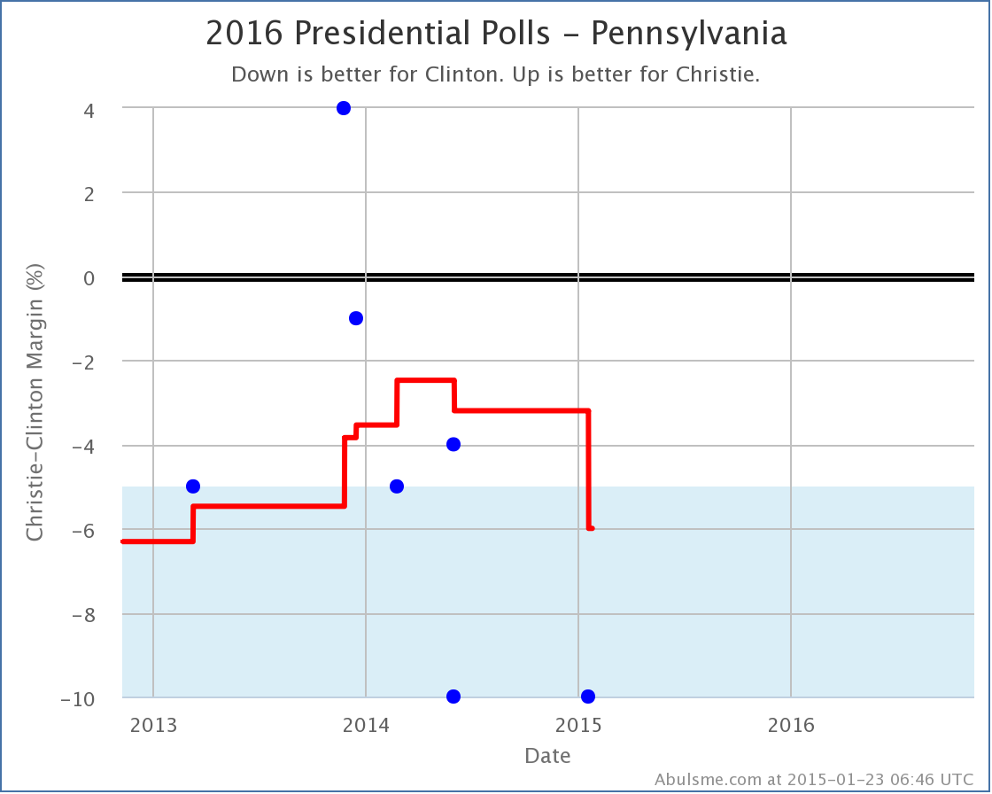
Last week I talked about Christie fading in Pennsylvania. The new polls today reinforce that trend, further worsening Christie’s position in Pennsylvania. It dropped him from being behind by 6.0% to being behind 8.0%, which pushed Pennsylvania past the previous tipping point of 7.5% in Minnesota.

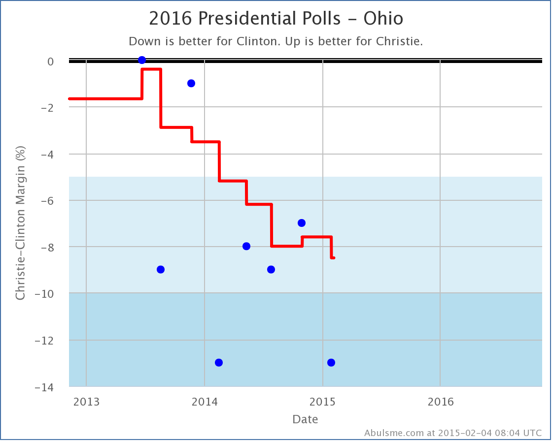
chart (4)

Now, Ohio also moved away from Christie with today’s polls (from Clinton by 7.6% to Clinton by 8.5%). If it hadn’t, Pennsylvania would have pushed past Ohio too, which would have had a different result for the Tipping Point.

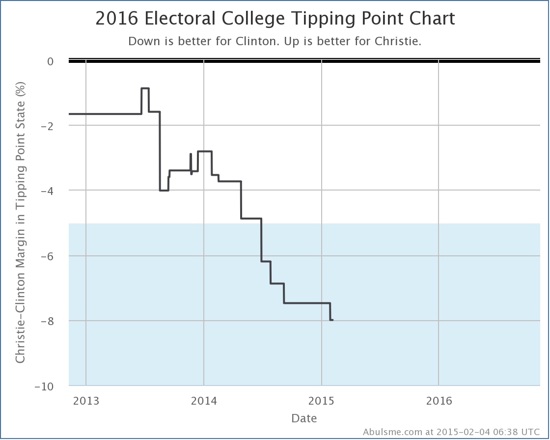
In the end, the tipping point for Clinton vs Christie moved from Clinton by 7.5% in Minnesota, to Clinton by 8.0% in Pennsylvania.

chart (5)

Unlike Clinton vs Paul, with Clinton vs Christie we’ve basically just been seeing a continued trend away from Christie and toward Clinton. Christie has not been faring well lately on this front.

Before closing up, lets look at a couple of the comparison charts between the five best polled candidate pairs.

chart (6)

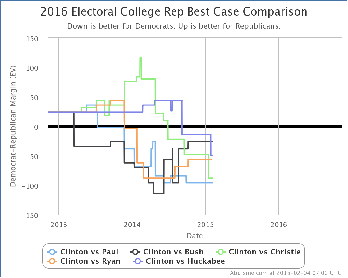
With Huckabee’s decline in best case, the Republican with the best best case against Clinton is now Bush, but that Best case is still losing by 26 electoral votes. (And the expected case if Bush did NOT manage to flip all the Weak Clinton states is Bush losing by 156 electoral votes.)

The worst best case versus Clinton is still Paul, losing by 96 electoral votes even if you give him all the Weak Clinton states. (Paul’s expected case is a bit better than Bush though, only losing by 138 electoral votes.)

chart (7)

It looks a little different in terms of tipping point, with Huckabee doing best this time (behind by 6.7% in Wisconsin). Paul still in the rear here, behind by 9.2%.

Now, as people keep pointing out, and I will too, polls this far out from the election are NOT PREDICTIVE. All of the charts I’ve shown above say NOTHING about what the actual results in November 2016 will be. NOTHING.

However, that does NOT mean they are meaningless, or that they should be ignored. (Or why am I bothering with all this?) No, polls right now still give you a sense as to where things stand TODAY, which while it won’t tell you who will win 643 days from now, it DOES tell you how much work the candidates who are currently behind have to do in order to flip things. (Alternately, how much wiggle room the candidate in the lead has available as buffer against mistakes they might make.)

So, yes, pay attention to the polls. Even now. Just don’t make the mistake of believing that just because Clinton is way ahead of everybody now that necessarily means that will still be the case in a year and a half, when the polls DO start having some predictive power.

PS: There was also a tipping point change today for Clinton vs Romney but even with today’s new polls, Clinton vs Romney is still only the 20th best polled candidate combination, and with Romney declaring he isn’t going to run after all, he’s no longer as likely to climb the ranks as I thought a few weeks ago. If I had to guess as to the next change in the “Top Five” it would be Clinton vs Rubio (currently #7, but Rubio actively talking about being a candidate) replacing Clinton vs Ryan (currently #4, but Ryan having said he won’t run).

Edit 10:11 UTC – Added “Electoral College” prefix to title for consistency.

@ElecCollPolls tweets from 2015-01-23 (UTC)

Electoral College: Christie fades in Pennsylvania

Polling in the last couple months has been a bit slow. Prior to the 2014 elections, there had been a lot of polling piggy backing on Senate polls. Not so much since the election. But finally, with the batch of polls I processed today, for the first time since I launched the Election 2016 site in November, there has been a change worth a blog post!*

Namely, looking at the Clinton vs Christie combination, with the addition of a PPP poll released on Thursday, Pennsylvania has slipped from “Weak Clinton” to “Strong Clinton”:

chart

(Click through on the image for more details on the specific polls, etc.)

Now, you’ll notice there haven’t been all that many polls here. The five poll average at the moment covers 1.1 years. That is a long time. But even with this small number, you can see that in late 2013, Christie appears to have had a bit of a spike, making Pennsylvania look like a close state, with one poll even showing Christie ahead. But the more recent polls show Clinton with a healthy lead, and the 5 poll average now has Clinton with a 6.0% lead.

Now, this still leaves Christie looking better in Pennsylvania than the other 4 combinations that are “best polled” nationally:

chart-2

(Again, click through on the image for more detail.)

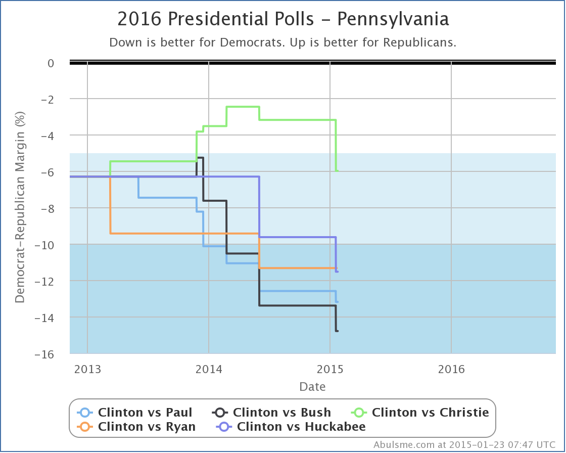
Paul, Bush, Ryan and Huckabee all trail Clinton by more than 10% in Pennsylvania. So I guess Christie still has that.

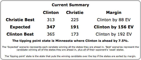
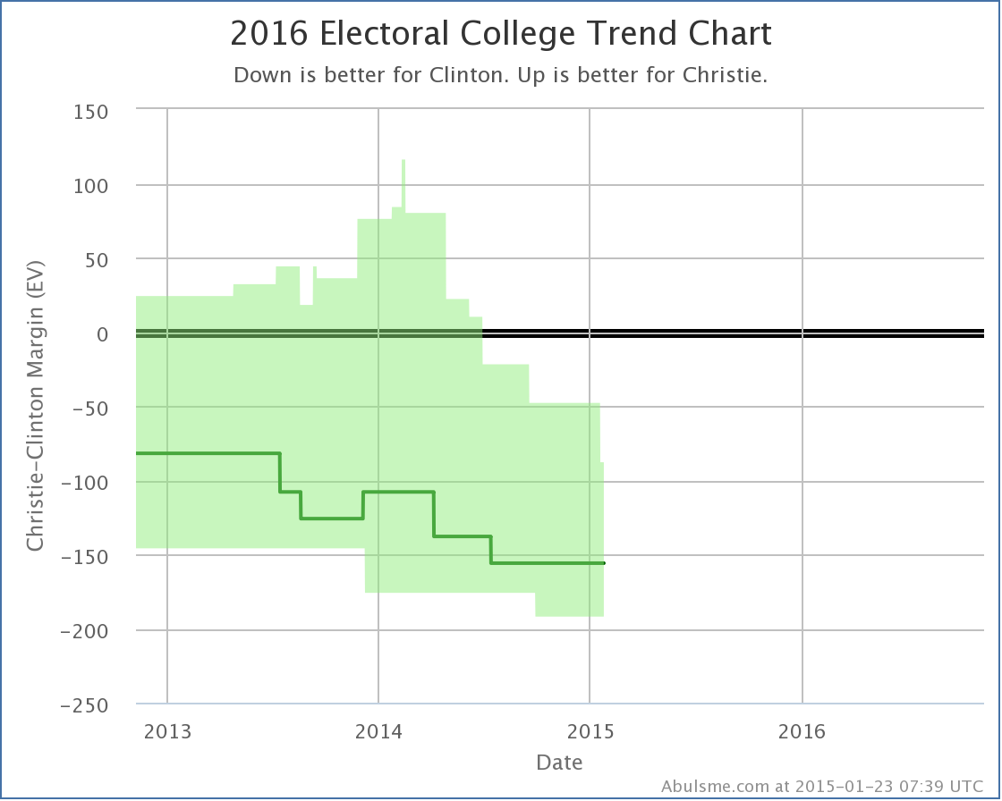
Looking at what this means nationally, with Pennsylvania taken out of the “possible” category for Christie… at least for now… the summary for Clinton vs Christie looks like this:

Screen Shot 2015-01-23 at 09.09.44481

After Christie’s best case peaked at winning by 116 electoral votes back in February 2014, the trend has been downward, and the new change just continues that:

chart-3

(Once again, click through on the image for… oh, never mind… you get how that works now, right?)

A lot of the “movement” here is still polling catching up with reality, but it does seem like Christie continues to fade, and so far he has not been able to reverse his fortunes. There is of course still a long time until we even get to the Iowa caucuses, let alone the 2016 election, but Christie isn’t doing all that great at the moment.

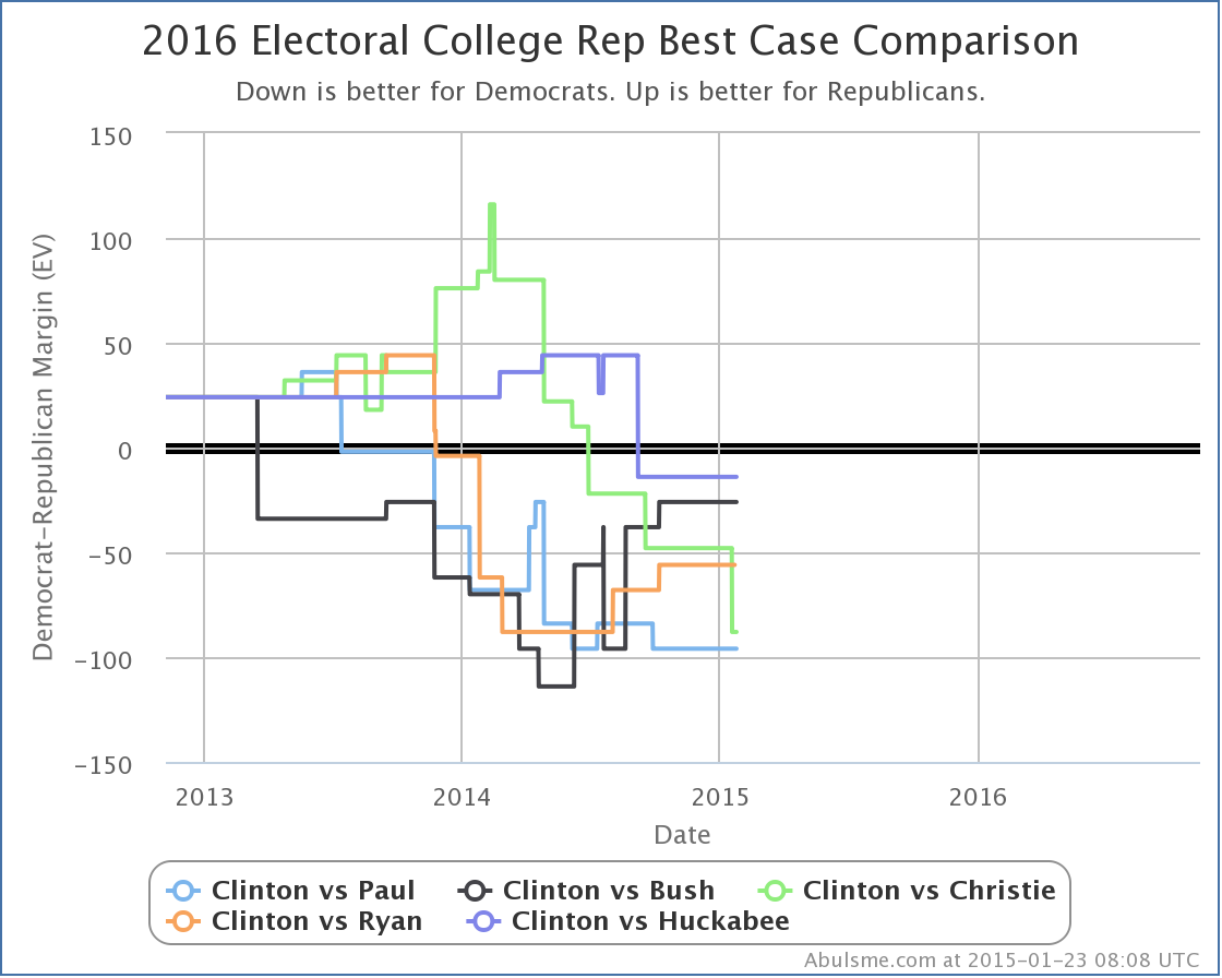
Since it is Christie’s “best case” that changed with the latest update, lets also take a quick look at the Republican best cases for all of the best polled combinations:

chart-4

Wow, that looks messy. You’ll note that at the moment none of the five Republicans win against Clinton, even if you give them all of the close states. It looks like Huckabee actually has the best best case, but Huckabee is also the least well polled of the five, so take that one with a grain of salt. Otherwise, in terms of their best cases, in the last six to nine months while Christie’s situation has deteriorated vs Clinton, Bush and Ryan have improved theirs, and Paul has been basically flat.

Of course, Ryan has taken himself out of the race at this point. And Romney seems to have jumped in. As I described last week, as new polls are released Clinton vs Ryan should drop off the “Top 5 Best Polled” list and Clinton vs Romney will probably rise onto it. But not yet. Clinton vs Ryan is still #4 at the moment. The two additional polls for Clinton vs Romney since last week (one in NJ and one in PA) have moved Clinton vs Romney from the 21st best polled combination all the way up to… the 20th best polled combination. Still quite a ways to go. And still very sparse data. But if Romney is serious, the polls will come soon enough.

Stay tuned…

* For the moment, I consider a change to be “worth posting” if it involves one of the five best polled candidate pairs and it either changes one of the “summary” stats (the expected margin, the Republican best case margin, the Democratic best case margin), or there is a change to the tipping point margin of at least 0.1%. Of course, ALL changes in the summary, the tipping point margins, state categorizations, and even individual polls, for all candidate combinations, are posted at @ElecCollPolls for those interested in all those details.

@ElecCollPolls tweets from 2015-01-16 (UTC)

@ElecCollPolls tweets from 2015-01-15 (UTC)

Electoral College: A Note on Field Changes

There has been polling going on about the 2016 election since the 2012 election. (Actually, earlier, the first state level 2016 matchup poll in my database is from May 2012.) For most of that timeframe, the pollsters have been polling people who they deemed likely to run. Candidates were not for the most part outright declaring their intentions one way or another, and even when they seemed to, sometimes they were not believed.

That is now changing rapidly. While “formal” announcements that candidates are running 100% for sure for realsies may yet be a little further out, we now have candidates being pretty explicit that they are “exploring the possibility” or “considering” or whatnot, and we have a few that are being more and more definitive that they will not be running. Now, many of the people who are looking like they are running may decide not to after all before we get to the Iowa caucuses. And some of the ones saying they won’t run may change their minds. But we are starting to get a much better sense of who is in and who is out.

So, for instance, in the last couple weeks, we’ve had Romney making strong moves indicating he is in, while Ryan has stated that he has decided not to run. So why does the top of my 2016 Electoral College Analysis look like this?

Screen Shot 2015-01-15 at 17.41.57152

Clinton vs Ryan is listed right there, but Clinton vs Romney is not. Why is this? Ryan is not running, shouldn’t he be dropped? Romney looks like he is running, and a number of polls on the Republican nomination show him in the lead at the moment, shouldn’t he be here?

The short answer is that I show the five “best polled” candidate combinations at the top of the page, and there is a lot of polling on Clinton vs Ryan (52 state level polls in my database) while there have been very few so far on Clinton vs Romney (only 4 state level polls in my database).

As pollsters start deciding to poll Clinton vs Romney more, and Clinton vs Ryan less (or not at all), this list of the five best polled combinations will update automatically and Clinton vs Ryan will drop off and Clinton vs Romney will very likely move onto this list. I choose not to hand edit this list by who seems to up or down in the primary polls at the moment, instead, I’ll let the fact that pollsters will show more interest in candidates that seem more likely to win take care of that. But it will take a little time for that to catch up, since actual polls have to be done first.

Of course, I also provide the drop downs, so anybody who wants to see any combination at all can go look. But the top five really are the ones that have decent polling, and beyond that there really isn’t a lot to see.

(Note: Once we actually get to the primaries and caucuses and have actual delegate counts, I will probably keep the five “best polled” list, but instead of defaulting to the best polled combination in terms of what I show on the rest of the page, I’d default to the delegate leaders in both parties… probably. Of course, there is a good chance these will match.)

Now, even for most of you who have already read the above, this is probably enough information. You can consider yourselves done now…

OK… for those few of you (if any) that want more detail and are still here…

I am trying to show the “best polled” combinations, which isn’t necessarily the same as the “most polled”. There are a number of ways one could calculate this, and none are perfect. I chose one way in particular, and it isn’t perfect either, and it certainly has its flaws, but it does the job well enough for these purposes.

Namely, my whole site is based on looking at a “5 poll average” for each candidate pair in each state. In certain cases this can actually include more than 5 polls to break various sorts of ties I care about. But these polls cover a certain amount of time.

For instance, right now if you look at Clinton vs Paul in North Carolina you’ll see that the average currently include five polls, which span the last 5.0 months. (The oldest poll in the average is from August 16th, just about 5 months ago as I’m making this post.)

As a contrast, if you look at Cuomo vs Perry in Vermont you’ll see that it has NEVER been polled, which means I pull in the last five general elections in Vermont as an approximation. That means the oldest data included in the average here is from November 6th 1996, so the average goes back 18.2 years.

States where this timespan is low are better polled than those where it is high. By the time we get to the election in 2016, I expect to see many close states with timespans measured in days.

But, if 2008 and 2012 are guides, some of the less contentious states may not get polled at all, or maybe just have one poll in the whole cycle. After all, everyone knows the Democrat is going to win DC by a huge margin, and the Republican is going to win Nebraska’s 3rd congressional district by a huge margin, and there aren’t that many electoral votes there either, so why bother?

Given that polling is concentrated in close states (and to some degree in big states even if they aren’t particularly close) and close states matter a lot more if you are trying to determine the electoral college outcome, I didn’t want to just average the timeframes of the 50 states (plus DC and 5 congressional districts).

So I decided to do a weighted average of the timeframes, weighted by the inverse of the absolute value of the margin. Since my method doesn’t allow exact ties in the averages, I don’t have to worry about division by zero, although really close states will have a very strong influence on the average.

So, for example, a really close state with a margin of 0.1% would get a weight of 1000, while something like DC (average margin of 80.3% over the last five presidential elections) would only get a weight of about 1.2. Using these weights, I construct an average of the 56 jurisdictions with electoral votes.

There is also the possibility of further weighting this by electoral college strength, I didn’t do that though. Isn’t this already complicated enough to explain?

In any case, from this you get a number from which you can compare how well various candidate pairs have been polled so far. Lets look at this for the top 25 candidate pairs:
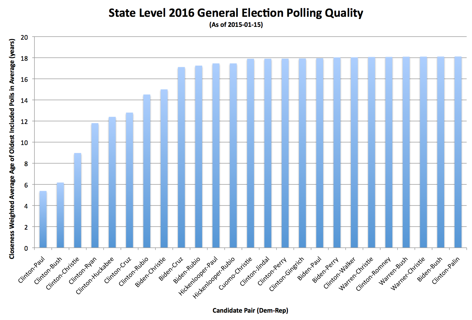
Screen Shot 2015-01-15 at 17.41.24639Click through on the image for a bigger version if desired.

The lower this number is, the better polled the combination has been. Candidate combinations that have not been polled at all will show up at 18.2 years at the moment.

You can see that Clinton vs Paul is best polled (5.4 years), with Clinton vs Bush right behind (6.2 years). Then we have a gap until Clinton vs Christie (9.0 years). Then another gap before Clinton vs Ryan (11.8 years), Huckabee (12.4 years) and Cruz (12.8 years). At this point we’re past the top five and you can tell we’re relying quite a lot on old elections and less and less on actual polling of these candidates.

The first non-Clinton combination comes in at #8: Biden vs Christie (15.0 years).

Where is Clinton vs Romney in this? #21. 18.1 years. Just BARELY better than no polling at all.

Hickenlooper vs Rubio has better polling by this metric than Clinton vs Romney. (#11, 17.5 years).

Looking at specific polls, there is only ONE poll for Hickenlooper vs Rubio, but it is in Colorado where the margin is 0.7%. Clinton vs Romney has been polled once each in New Jersey (margin 14.6%), New Hampshire (margin 3.3%), Iowa (margin 2.8%) and Florida (margin 1.1%). While some of those are close, they are less close, so lower weight is given to those.

There are NO states where Clinton vs Romney has a full five poll average (that would of course be impossible with only four polls).

By contrast, Clinton vs Paul has full five poll averages not including any old general election results in New Jersey (Clinton+22.4%), Pennsylvania (Clinton+12.6%), Florida (Clinton+11.3%), Virginia (Clinton+10.6%), Ohio (Clinton+8.8%), Michigan (Clinton+8.6%), New Hampshire (Clinton+6.1%), Iowa (Clinton+5.7%), North Carolina (Clinton+0.2%), Colorado (Paul+2.0%), Kentucky (Paul+4.2%), Kansas (Paul+6.8%) and Alaska (Paul+7.4%).

Bottom line, we can’t say much about a Clinton vs Romney matchup on a state by state level yet, there just hasn’t been enough polling yet. That will probably change rapidly over the next few months if Romney goes all in. And Ryan will fall off. And the “top five” list will otherwise adjust appropriately to changes in the field.

If you do look at Clinton vs Romney you will of course see something. The little polling there is has improved Romney’s “best case” from winning by 24 electoral votes to winning by 44 electoral votes. In this, he does better than any of the Republicans currently in the Top 5 best polled… but it is based on so little data, it is too early to make anything of it at all. You are still basically looking at the last five presidential elections, not any real Clinton vs Romney trend.

This is why I show only the Top 5 as highlighted combinations. Polling quality drops off very quickly, once you get much beyond that, you’re not looking at real data yet. This is also why while all changes will show up in the @ElecCollPolls twitter feed, I’ll only be posting analysis here when something significant changes in the status of one of the top five candidate combinations.

Well, not counting this post. :-) But I wanted to explain why Ryan is showing up, while Romney is not, and why even if we start getting some status changes in states for Clinton vs Romney, I most likely won’t start talking about them much until that combination has enough polls to show up on the top five best polled. Until then, we don’t really have a decent picture of what is going on in this sort of state poll based analysis.

Edit 22:15 to add more links and to change the “Clinton vs Romney has lower quality polling than” example from Hickenlooper vs Paul to Hickenlooper vs Rubio, so I would have an example that didn’t include any candidate showing up in the top five pairings.

Edit 2015-01-17 22:30 to correct Clinton vs Paul results in Colorado. It is Paul+2.0%, not Clinton+2.0% as previously stated.
@ElecCollPolls tweets from 2015-01-03 (UTC)

Congressional Velocity (December 2014 Update)

Standard Into:

This is the latest in a series of quarterly posts on congressional legislative output. I started these in June 2013 in response to a flurry of commentary about how the 113th congress was lagging behind in output compared to previous congresses. Now, it is fundamentally debatable if passing fewer laws is a good thing, a bad thing, or just a completely meaningless number since of course the impact of laws varies widely. I’m guessing in reality, it is a pretty meaningless number.

But I noticed that in many of these debates, there was a lack of rigor in the ways these numbers were used. For instance, it seemed common to compare the current number of laws passed in the 113th, to the TOTAL passed in the 112th or 111th. Or maybe talking about the “pace” at which legislation was being passed as if there was an expectation that this would continue linearly. Never did I hear a comparison that actually looked specifically at where the previous congresses had been at the same point in the cycle. So I made one.

Now the new stuff:

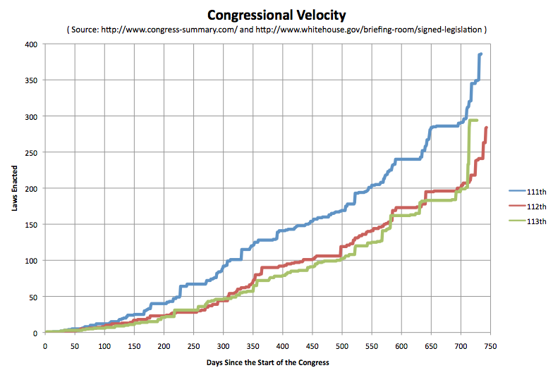
Bottom line, although the 113th Congress lagged slightly behind the 112th congress for most of its existence, with only a handful of short periods being ahead, on December 16th the president signed 32 bills into law, and the 113th pulled ahead of the 112th. Then on the 18th the president signed 51 more bills. On the 19th he signed 10 more. With all this activity the 113th left the 112th in the dust in terms of laws enacted.

So all the hand wringing about how little this congress got done (by this metric at least) in the end just disappears in a flurry of legislative activity during the lame duck congress. Now, as usual, many of these bills aren’t all that consequential, thus the caveats in the first paragraph. Never the less, the 113th matched and exceeded its predecessor in terms of number of laws enacted, and in fact even came close to the 111th.

The totals for each of the three congresses on the 727th day of their existence (Dec 31st for the 113th and 111th, Dec 30th for the 112th):

  • 111th: 349 bills passed and signed into law by the president
  • 112th: 239 bills passed and signed into law by the president
  • 113th: 294 bills passed and signed into law by the president

In both the 111th and 112th congresses, there were additional laws from that congress signed by the president well into January… even after the next congress took office on January 3rd. I’ll of course keep an eye out to see if that happens again, but with the big flurry of signing in mid December and congress not in session since then, it seems unlikely there will be much, if any, of that this time around.

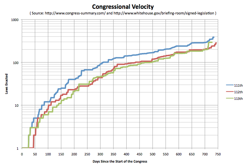
Here are the graphs:

Screen Shot 2014-12-31 at 20.17.38026

Screen Shot 2014-12-31 at 20.18.00517

Next up, we’ll see how the 114th does!