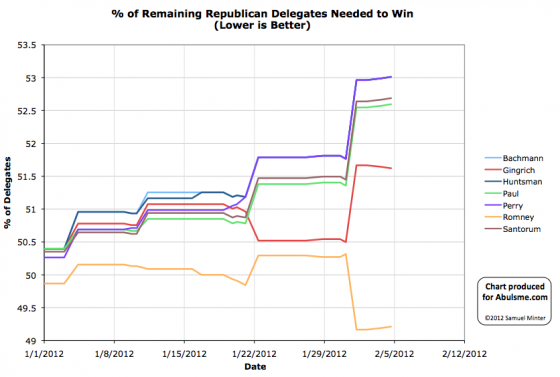
Chart from the Abulsme.com 2012 Republican Delegate Count Graphs page.
This is not a repeat from yesterday. DCW reports yet another superdelegate coming out for Gingrich. If he continues to pick up a superdelegate every day he’ll, uh, still be way behind.
In any case, the Nevada caucuses are happening today, so we’ll see bigger changes in the charts soon… by all reports though, Romney’s lead in Nevada is pretty large though. But it is proportional rather than winner take all, so just how each of the four do will matter to the delegate race… but Romney will still be ahead.

Your graphs are a challenge to read, perhaps a quick intro paragraph as to what the meaning is? and maybe altering not only color but also line-type would help :) how is Perry leading the pack, isn’t he out of the race now?
The details on what this graph means were posted on the first post in the series, and repeated in a couple of the subsequent mosts, and given in detail on the page linked immediately below the chart.
Bottom line, the main thing that makes this particular graph different is that it is NOT a graph of how many delegates each candidate has. Instead, it is the percentage of the remaining delegates they need to get in order to cinch the nomination. So, as it says on the chart, LOWER is better. When it hits zero, the candidate has cinched the nomination. If it goes to 100, the candidate has been mathematically eliminated. (Both excluding delegates changing their minds, breaking their pledges, etc.)
So Perry (and the other candidates with no delegates who have dropped out) are at the top, as they are furthest away from cinching the nomination. (I keep everybody on the graph who was in the race as of January 1st.)
As for different line types, I’m a very big non-fan of anything other than solid lines. So color it is.
Oh, perhaps a couple links too:
The actual page that these posts are just commentary for when there are changes:
http://wiki.abulsme.com/2012_Republican_Delegate_Count_Graphs
The first post where I spent some time talking about why this graph:
http://www.abulsme.com/2012/01/03/and-so-it-begins-2012-republican-delegate-count-graphs/
The post where I compared a bit to four years ago:
http://www.abulsme.com/2012/01/21/2012-republican-delegate-count-more-pre-sc-shuffling/
And just in general, all of these, so you can catch up. :-)
http://wiki.abulsme.com/2012_Republican_Delegate_Count_Graphs
OK, I added more words to the wiki, and to the standard paragraph I always include under the graphs, starting with today’s update. :-)