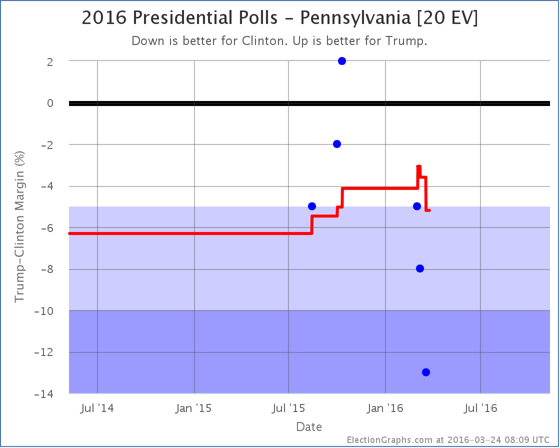
New general election polls in Wisconsin and Pennsylvania since the last update but the one that makes a difference is Pennsylvania:
After a few months in “Weak Clinton” territory, the polling average in Pennsylvania returns to “Strong Clinton” with Clinton now leading Trump by 5.2%. That is just barely out of the “close” category, but you have to draw the line somewhere. For the categorization on ElectionGraphs.com, only states where the margin is under 5% are considered states that could go either way.
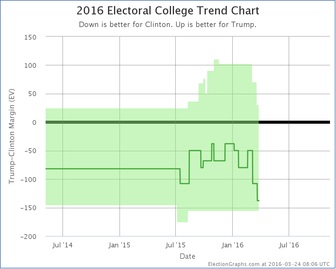
So, Trump’s “best case” where he wins all the close states gets weaker:
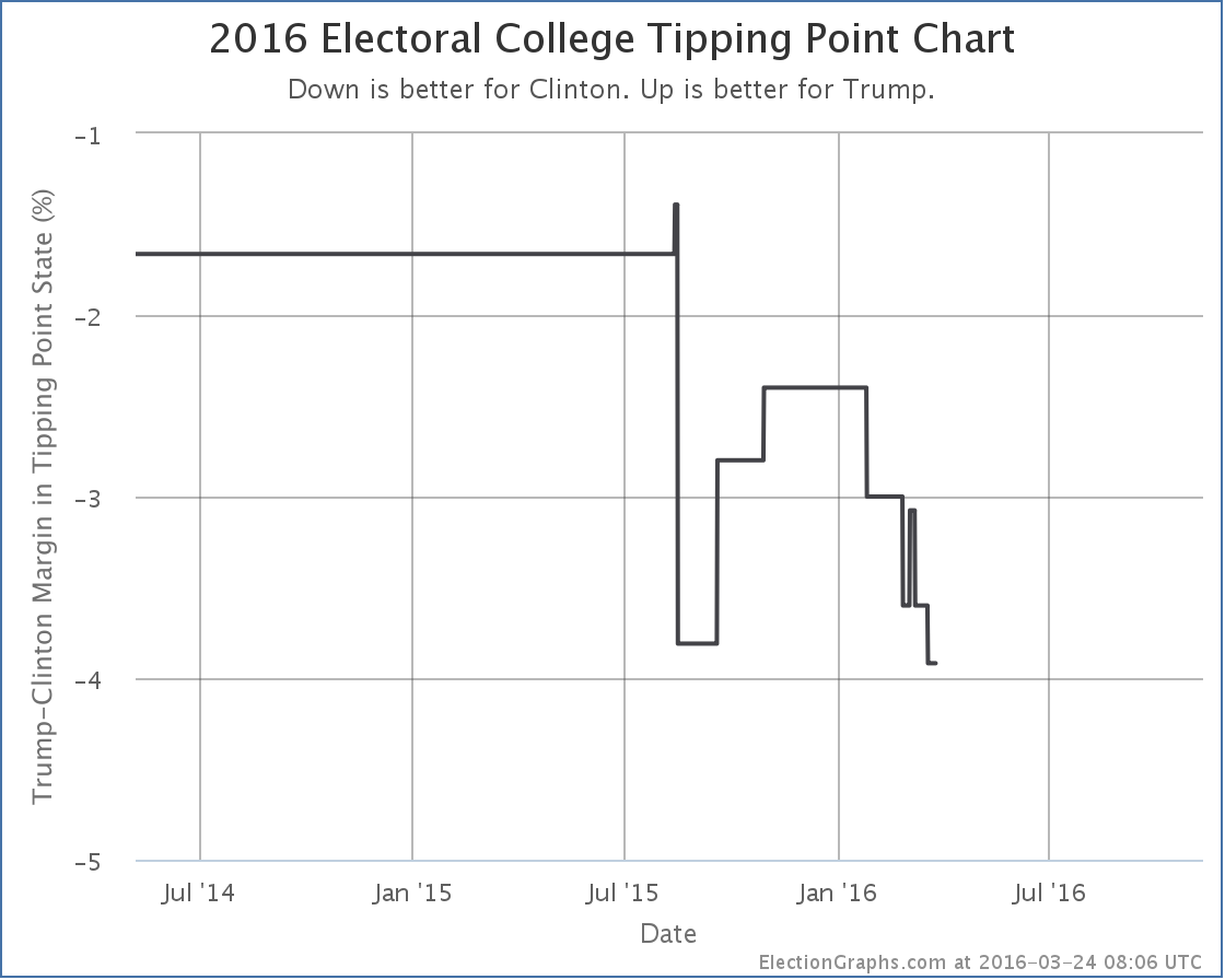
And since Pennsylvania was the tipping point in Clinton vs Trump, the tipping point moves toward Clinton as well:
With this change added, the impression of Trump peaking against Clinton in January and being on a decline ever since is reinforced. With a couple of exceptions, almost every change since then has been in Clinton’s favor.
It is almost as if the things that have propelled Trump to the top of the GOP race may simultaneously be turning off general election voters. Go figure. Who would have guessed?
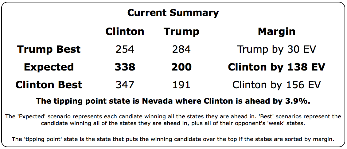
The new overall summary of the Clinton vs Trump race is below:
If Trump wins all the close states, he still wins. This is still a race, and Democrats should not get complacent.
But things have not been moving in Trump’s direction for the general while he has been fighting for the GOP nomination… which is still by no means locked up. If Trump wants to win in November and not just in July at the Republican convention, at some point he needs to do the pivot to the general election. Right now it looks like the earliest that can really happen is June, and quite possibly not until July… assuming the nomination doesn’t go to someone else at a contested convention.
The longer it takes for Trump to get to the point where he can make a big change in direction to try to appeal to general election voters, the weaker he is likely to be in November.
229.3 days until polls start closing on election day.
Note: This post is an update based on the data on ElectionGraphs.com. Election Graphs tracks both a poll based estimate of the Electoral College and a numbers based look at the Delegate Races. All of the charts and graphs seen in this post are from that site. Additional graphs, charts and raw data can be found there. All charts above are clickable to go to the current version of the detail page the chart is from, which may contain more up to date information than the snapshots on this page, which were current as of the time of this post. Follow @ElectionGraphs on Twitter or like Election Graphs on Facebook to see announcements of updates or to join the conversation. For those interested in individual general election poll updates, follow @ElecCollPolls on Twitter for all the polls as they are added.


.@Link_Me_T @NateSilver538 My latest category change was in PA. This cycle “interesting” is an understatement. :-) https://t.co/eJd6fVYjEc
I find all your posts fascinating, but hunger for the “how” behind them, as well as a little more on how to read them…
Does the FAQ help? If not, I would be happy to answer any specific questions. And maybe add them to the FAQ. :-) http://www.abulsme.com/2014/11/05/electoral-college-2016-coverage-faq/
On how to read them, the “tour” might be even better: http://www.abulsme.com/2014/11/05/electoral-college-a-tour-of-the-2016-site/
Leslie Donaghy liked this on Facebook.