Just a small number of delegates, but we did finally get results from the Democrats Abroad primary that was held earlier in the month:
Sanders 9, Clinton 4.
With this change alone, Sanders did get a high enough percentage of delegates (69.2%) that his “% of remaining delegates needed to win” would have improved. But there were other delegate changes in the six days since the last primary results as well.
The last Democratic post was done while many delegates from Florida and Illinois were still to be determined, because for some reason those states were super slow and it took about two days for everything to be settled. That info was added to that post as an update, but for completeness here, from those final updates, Clinton gained 85 more delegates and Sanders added 43. In addition there were superdelegate updates. Net superdelegate change was Clinton +5, Sanders +0.5. The half delegate is from a Democrats Abroad superdelegate, who only gets a half vote.
With all that, the Democrats Abroad results are actually overwhelmed by the other updates and the new totals are:
Clinton 1644, Sanders 882.5, O’Malley 1
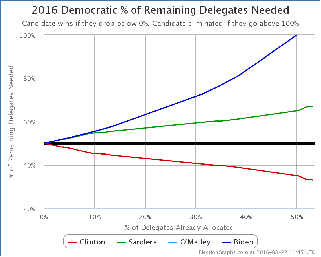
Translating that into the all important “% of remaining delegates needed” graph:
As of now, Clinton needs 33.03% of the remaining delegates to win. Sanders needs 67.06%.
That includes superdelegates of course, and superdelegates can change their minds. If Clinton superdelegates defect to Sanders, Clinton would need more and Sanders would need less. Such defections have been very rare so far however. If they do start to happen, you’ll see it in these charts.
Until then though, this is where we sit. Up next: Arizona, Utah and Idaho.
[Update 2016-03-23 01:34 – Superdelegate scan, Net Sanders +1]
Note: This post is an update based on the data on ElectionGraphs.com. Election Graphs tracks both a poll based estimate of the Electoral College and a numbers based look at the Delegate Races. All of the charts and graphs seen in this post are from that site. Additional graphs, charts and raw data can be found there. All charts above are clickable to go to the current version of the detail page the chart is from, which may contain more up to date information than the snapshots on this page, which were current as of the time of this post. Follow @ElectionGraphs on Twitter or like Election Graphs on Facebook to see announcements of updates or to join the conversation. For those interested in individual general election poll updates, follow @ElecCollPolls on Twitter for all the polls as they are added.

I don’t understand why Biden is on these graphs. Was he ever a candidate?
He had several superdelegate endorsements early on before he announced he was out. So if you look really closely at the graphs back in the second half of last year, you can see his line separate for a little bit before going back to nothing. Each of his superdelegates flipped to Clinton shortly after he made his announcement. To see this more obviously, look at date axis version of the chart and check out the % of delegates and how much better to win charts. The Biden line is still easy to see as a separate entity in those. In the others, you can’t really see it separately any more. http://electiongraphs.com/2016dels/delbydate.php
RT @abulsme: [Blog Post] Democrats: Sanders wins Democrats Abroad https://t.co/QRynA8Y4WO
On the version of my charts on http://electiongraphs.com/ (rather than the ones in the blog post which are just static images) you can also mouse over the chart and see what the numbers were in the past, even on the charts where the Biden line is hard to see. So you can tell (for instance) that he maxed out at a whopping 3 superdelegates in September and October of 2015. :-)