- 00:16:37 Retweeted @scott_kerr 2016-09-16 12:01:03 Boy writes to Lego after losing a mini-figure.
Lego's customer service department should run the world. https://t.co/6iz0dS1gvu
- 02:07:56 [Blog Post] Electoral College: Trump Close Enough to Smell Victory https://t.co/TlN6Yp2hEv
- 02:14:47 Retweeted @SheldonRichman 2016-09-18 15:34:19 Carl Bernstein reports that Bill Weld is considering dropping out if he thinks Johnson-Weld will help elect Trump. #JohnsonWeld2016
- 11:38:19 Retweeted @mikememoli 11:28:12 Asked on Fox how to prevent radicalization of Americans, Trump suggests problem is "freedom of expression," magazines that show bomb-making
- 11:43:44 Retweeted @NYCMayorsOffice 11:30:23 Wanted: Ahmad Khan Rahami, 28 year old male, is being sought in connection with the Chelsea bombing. 1-800-577-TIPS https://t.co/WLm9XSDUpj
- 16:09:49 Hey @benchmarkpol, any chance you are available for a short interview about your election tracking for my podcast? Would love to have you.
- 19:13:45 Retweeted @MachinePix 18:58:51 Cutting a rubber band ball with a water jet. https://t.co/MN7gfOGVpd
- 19:50:57 Reading – Blame Millennials for President Trump (James Kirchick) https://t.co/04ERr4EQAE
- 22:04:34 Retweeted @hominidviews 20:09:18 Man…when did Republicans become such unbelievable cowards?!?
#GOP #bedwetters #wimps #tcot https://t.co/HHuQQv7epZ - 22:49:53 Reading – Thieves Helped Crack the Chelsea Bombing Case, Sources Say (Weiss/Rizzi/Kapp/Gardiner) https://t.co/kLkR0CsHSa
- 23:05:00 Reading – PunditFact: A Case Study In Fact-Free Hackery (Sean Davis) https://t.co/j3fyVqRG72
- 23:15:46 Reading – House panel looking into Reddit post about Clinton's email server (Katie Bo Williams) https://t.co/hm0sbjy0p6
|
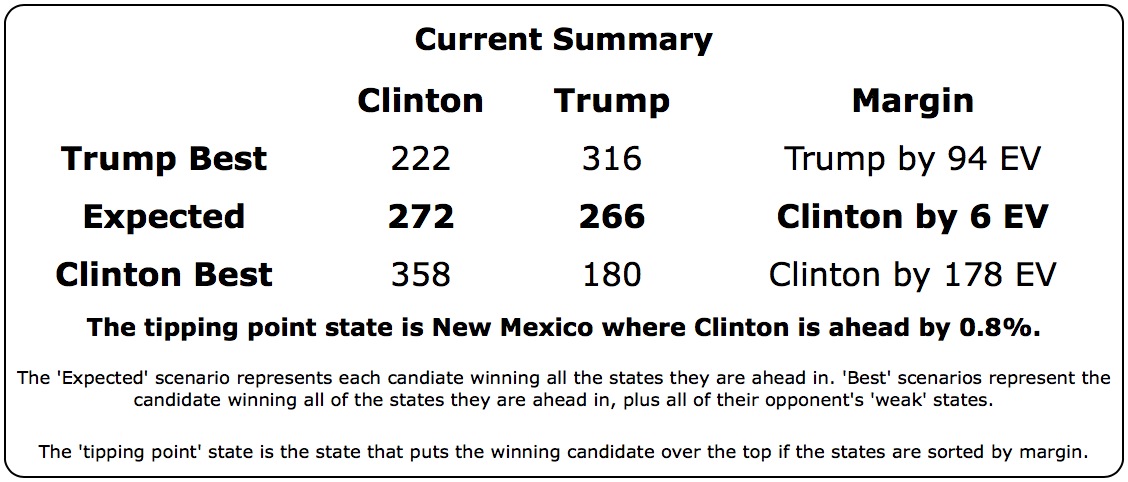
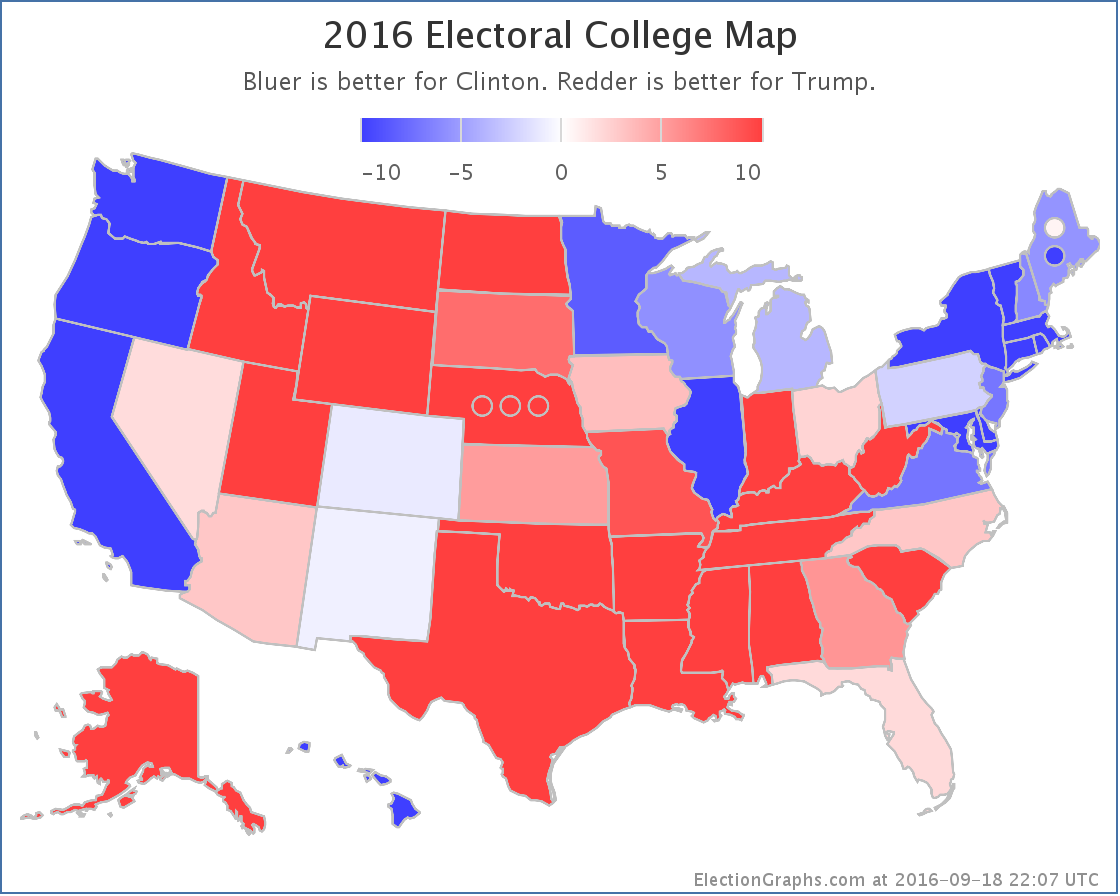
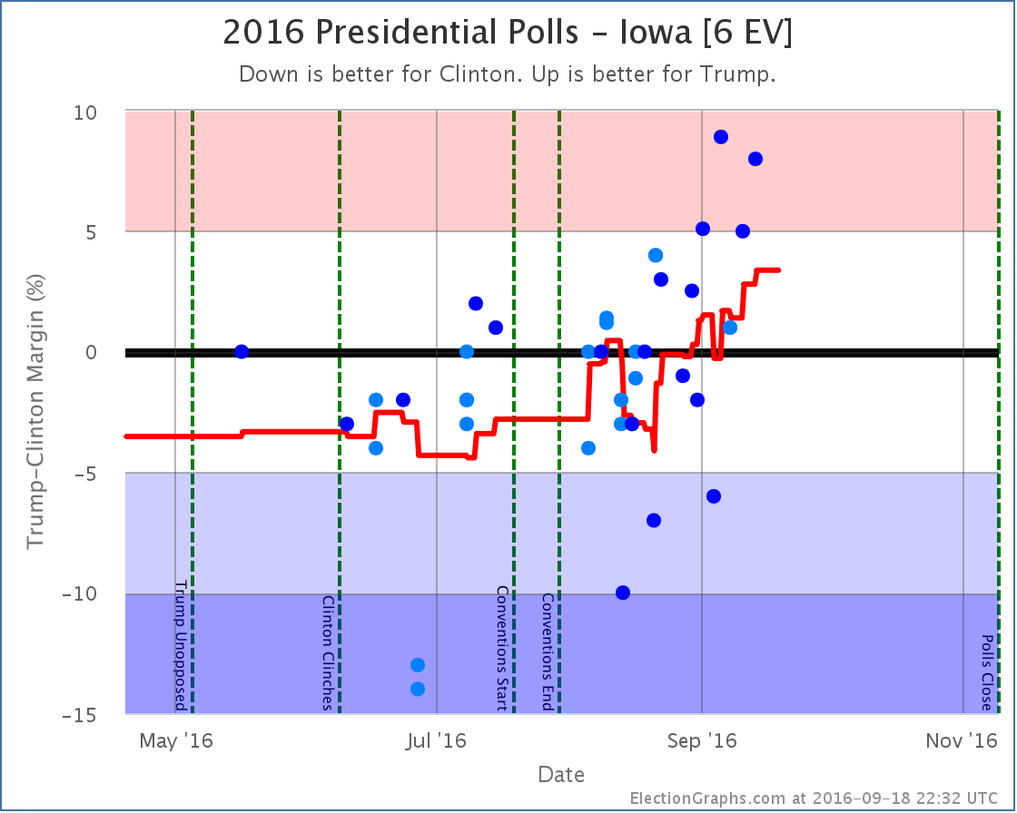
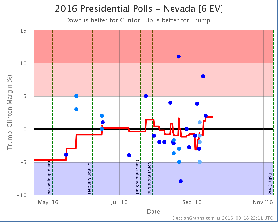
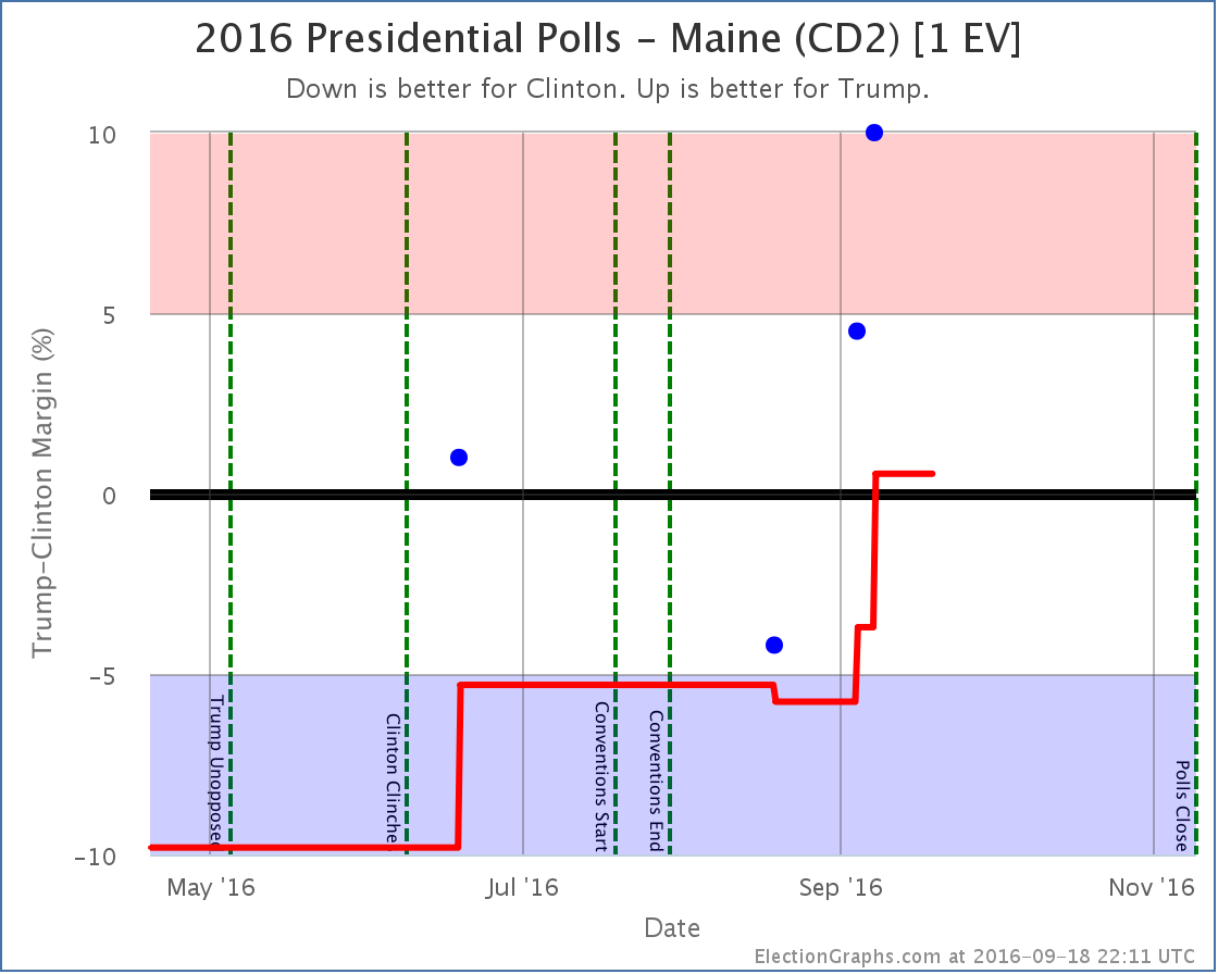
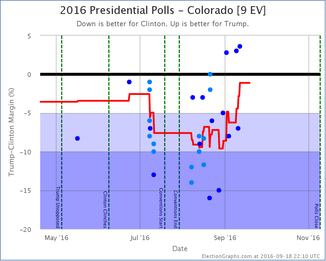
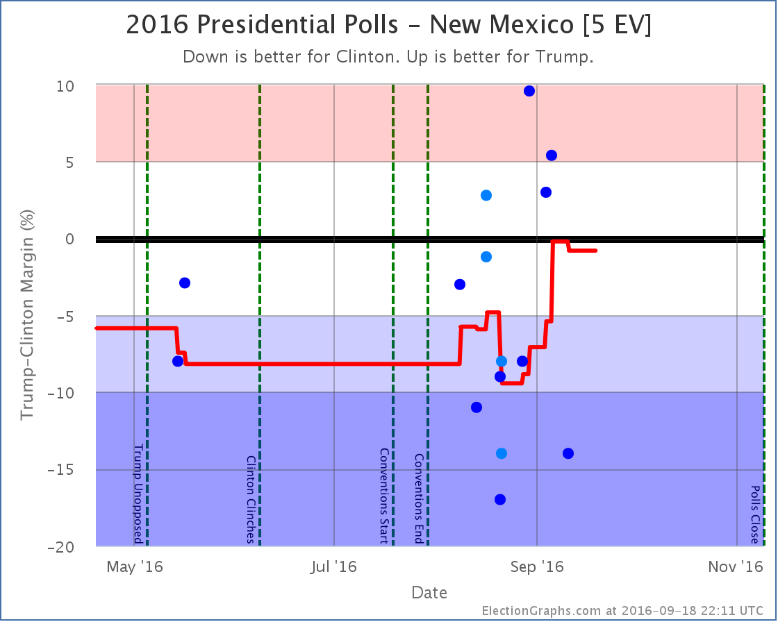
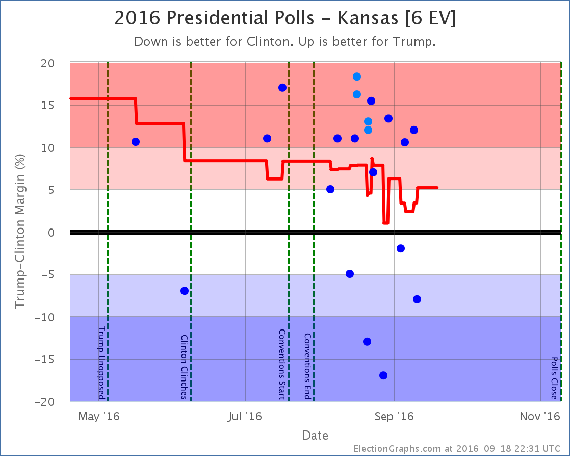
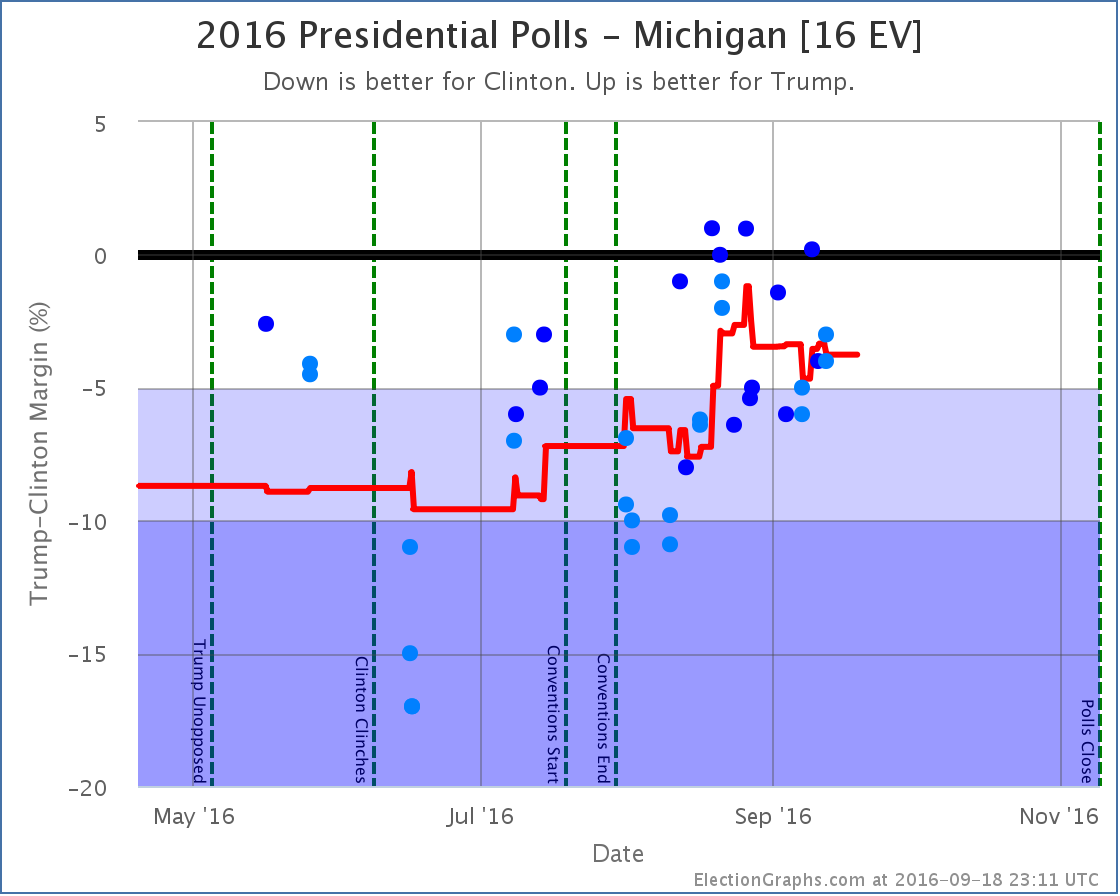
States with new poll data added since the last update: All 50 states, DC, and the Maine congressional districts. Notable changes in Colorado, New Mexico, Iowa, Nevada, Maine (CD2), Kansas, and the tipping point. National PictureTrump continues on the upswing, and at this point Clinton only leads by the very narrowest of margins. One more round of polls in his favor could easily put Trump in the lead for the first time this cycle. With this update, we have the following changes:
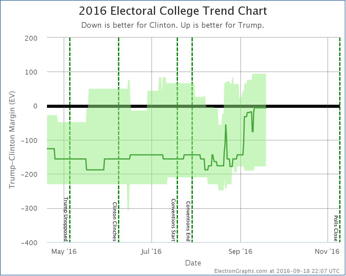
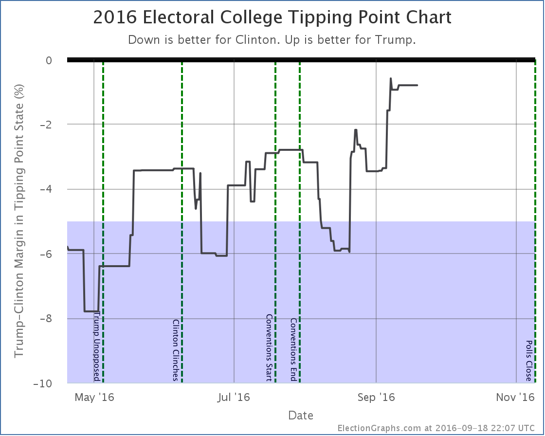
The full current summary: There is no denying this is now a razor thin race. This is close. If the election was held today, it could go either way. Looking at the trends: In both measures, Trump bottomed in mid-August and has been on a strong upswing ever since. Or is it that Clinton has been collapsing? In the end, the result is the same. Trump is now far outside the “McCain to Romney” zone where he had been stuck. The question is if he is establishing a new normal, with many people permanently converted to his cause, or if this is an unsustainable high that will soon undergo reversion to the mean. The race is not today. There are 51.0 days until we start getting the first real election results. A lot will happen between now and then. The first debate is now less than eight days away. Will it change anything? We shall see… Individual StatesI won’t provide individual commentary on all of these, but for those wanting to see the details on the states that changed the national summary this time around, here they are. Click through on any chart for the full detail page with individual polls listed. Moving from Clinton to Trump:Now close enough to be in play for Trump:No longer close enough to be in play for ClintonAnother state whose movement influenced the tipping pointNote on “50 State” pollsSince Election Graphs tries to be as inclusive as possible with polls, we are including some “50 state” polls that some other folks have decided to exclude because of various methodological concerns. Others, like 538, include these polls, but give them very low weights in their models. Because Election Graphs tries to “keep it simple” we don’t do that kind of weighting. Everything just counts and we do a straight average. Two of these “50 state” polls are now producing weekly results, Google Consumer Surveys and Reuters/Ipsos. Honestly there are some crazy things in there. For instance:
The craziness of some of these polls leads me to sometimes question my tenets of including everything and keeping it as close to a straight average as possible. But we’re sticking with that and we will see how it does. And even with this the general notion of this site, that even with very simple assumptions you end up with similar results to what folks with complex models get seems to be holding up. Although the exact state by state results may differ slightly, every analysis I have read has the same general conclusion right now. The race is now much much closer than it was, although Clinton retains a narrow lead. While these polls are a bit crazy, in the competitive states there are enough other polls so the average seems to be at least somewhat resilient when outliers like these pop up. And in the non-competitive states, well, these 50 state polls may be the only data in the average, so they may screw up the margins a bit, but in the end it doesn’t change the status of the state. For more information… This post is an update based on the data on ElectionGraphs.com. Election Graphs tracks both a poll based estimate of the Electoral College and a numbers based look at the Delegate Races. All of the charts and graphs seen in this post are from that site. Additional graphs, charts and raw data can be found there. Follow @ElectionGraphs on Twitter or like Election Graphs on Facebook to see announcements of updates or to join the conversation. For those interested in individual general election poll updates, follow @ElecCollPolls on Twitter for all the polls as they are added. If you find the information in these posts interesting or useful, please consider visiting the tip jar.
This week on Curmudgeon’s Corner, Sam and Ivan talk about Trump breaking the Romney barrier, the Trump Foundation, Clinton’s basket of deplorables comment, Clinton’s health issues, and the unhelpful way she responds to things. So they pretty much have the Election 2016 developments covered. In the last segment of the show they spend some time going over the new features in Apple’s iOS 10 update. So some tech too this week! Click below to listen or subscribe… then let us know your own thoughts!
Show Details: Recorded 2016-09-15
The Curmudgeon’s Corner theme music is generously provided by Ray Lynch. Our intro is “The Oh of Pleasure” (Amazon MP3 link) Our outro is “Celestial Soda Pop” (Amazon MP3 link) Both are from the album “Deep Breakfast” (iTunes link) Please buy his music and support his GoFundMe.
|
||
