This is the website of Abulsme Noibatno Itramne (also known as Sam Minter). Posts here are rare these days. For current stuff, follow me on Mastodon

Categories

Calendar

Curmudgeon’s Corner: It works better in the ear

This week on the Curmudgeon’s Corner podcast Sam and Ivan talk about television, thermostats, manipulating public opinion and a few other things besides Election 2016, but of course most of the show ends up being about the election. They cover the last gasp Sanders path to the nomination, Trump zig-zagging on the issues, the Republican civil war, and possible Trump VPs. Oh, and Sam’s son Alex keeps interrupting to promote his YouTube channel.

Click below to listen or subscribe… then let us know your own thoughts!

CCCover20151125bw
Recorded 2016-05-12

Length this week – 1:35:45

1-Click Subscribe in iTunes
View Podcast in iTunes
View Raw Podcast Feed
Download MP3 File
Follow the podcast on Facebook

Show Details:

  • (0:01:24-0:21:00) But First
    • Failed Alex Plan
    • Agenda
    • Feedback
    • TV Habits
    • More Election Graphs Comments
  • (0:22:21-0:52:01) Hodgepodge
    • Thermostats
    • Bernie’s Path
    • Facebook Trending Topics
    • Manipulating the Press
  • (0:52:41-1:04:08) Trump Zigzags
    • Trump on the National Debt
    • Trump on Taxes
    • Trump on Self-funding
    • Trump on Muslim ban
    • Trump on Hispanics
    • Trump on Tax Returns
    • Trump on Minimum Wage
    • So… Trump Pivot?
  • (1:05:12-1:35:25) Republican Civil War
    • Support the Nominee
    • Trump vs Ryan
    • Trump and turnout
    • Third Party Options
    • Ultimate Mole?
    • Clinton landslide?
    • Most Unfavorable Ever
    • Trump/Gingrich?
    • Alex Interruption
    • More on Newt
    • Other VP candidates
    • Alex’s Youtube channel

@ElecCollPolls tweets from 2016-05-13 (UTC)

@abulsme tweets from 2016-05-13 (UTC)

@abulsme tweets from 2016-05-12 (UTC)

@ElectionGraphs tweets from 2016-05-11 (UTC)

@ElecCollPolls tweets from 2016-05-11 (UTC)

  • 00:37:29 As usual, hourly delegate updates at @ElectionGraphs on election nights like tonight. First update of the evening just posted.
  • 15:06:21 Blog posts for yesterday’s primary results in both parties now up at @ElectionGraphs.

@abulsme tweets from 2016-05-11 (UTC)

Republicans: Trump sweeps Nebraska and West Virginia

With the final results all but inevitable, these updates will be somewhat mechanical absent something unexpected happening.

After Indiana, Trump needed 36.02% of the remaining delegates to win.

In Nebraska and West Virginia, Trump seems to have gotten all 70 of the available delegates. (There may end up being some oddness due to West Virginia geographic restrictions on delegate allocation that shifts this slightly.)

In other changes since Indiana due to uncommitted delegate preference changes in American Samoa and Louisiana as well as Louisiana’s Rubio delegates moving to Trump, there were net changes of: Trump +14, Cruz -3, Rubio -5.

So total change since Indiana: Trump +84, Cruz -3, Rubio -5

So Trump actually got 111% of the delegates since Indiana. (Over 100% is possible since he actually took delegates from his opponents as well as collecting “new” delegates.)

So Trump obviously well exceeded the required numbers to be on pace for a win.

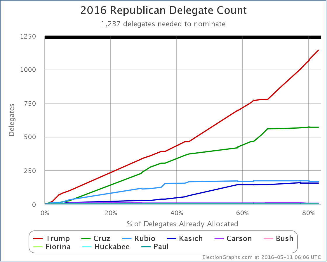
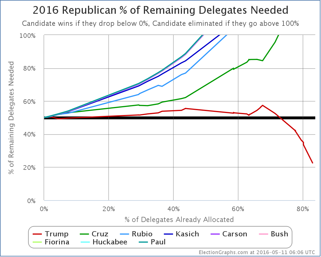
Updated graphs:

chart-139

New delegate totals: Trump 1142, Cruz 571, Rubio 168, Kasich 156, Carson 7, Bush 4, Fiorina 1, Huckabee 1, Paul 1.

There are 421 delegates left. Trump needs 95 of them.

chart-140

Trump now needs 22.57% of the remaining delegates to win.

Update 2016-05-14 14:31 UTC: Once the geographic restrictions on delegates was finalized and factored in, the final results in West Virginia were officially Trump 30, Kasich 1, Uncommitted 3. Two of the three uncommitted delegates have stated they are for Trump though, so we count this as Trump 32, Kasich 1, TBD 1. Net change from before: Trump -2, Kasich +1.

Update 2016-05-17 17:03 UTC: Update from New York. Net change: Trump -1, Kasich +1.

Update 2016-05-18 17:26 UTC: Update from Guam uncommitted delegates. Net Change Trump +9, Cruz -1.

Note: This post is an update based on the data on ElectionGraphs.com. Election Graphs tracks both a poll based estimate of the Electoral College and a numbers based look at the Delegate Races. All of the charts and graphs seen in this post are from that site. Additional graphs, charts and raw data can be found there. All charts above are clickable to go to the current version of the detail page the chart is from, which may contain more up to date information than the snapshots on this page, which were current as of the time of this post. Follow @ElectionGraphs on Twitter or like Election Graphs on Facebook to see announcements of updates or to join the conversation. For those interested in individual general election poll updates, follow @ElecCollPolls on Twitter for all the polls as they are added.

Democrats: Sanders wins West Virginia and falls further behind

With the final results all but inevitable, these updates will be somewhat mechanical absent something unexpected happening.

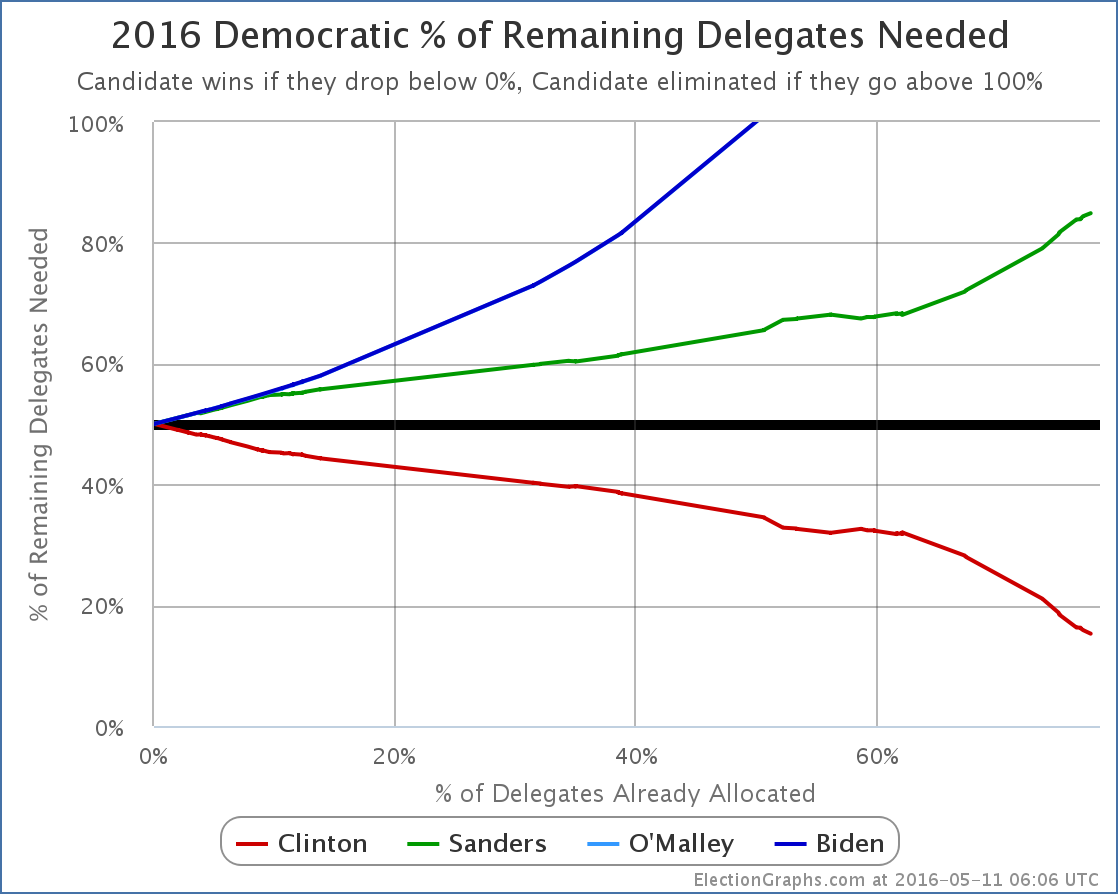
After Guam, Sanders needed 84.23% of the remaining delegates to win, Clinton only needed 15.95%.

In West Virginia, Sanders got 18, Clinton got 11.

In other changes since Guam due to superdelegate updates and revisions in the results from Maine, there was a net change of Clinton +1, Sanders +1.

So total change since Guam: Sanders +19, Clinton +12.

That is Sanders 61.29%, Clinton 38.71%.

So Clinton met her target, Sanders did not.

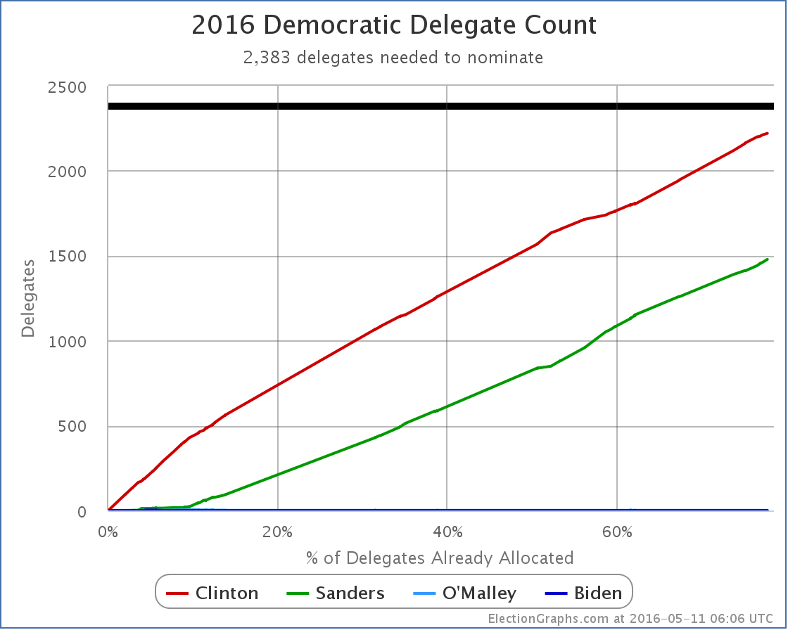
Updated graphs:

chart-137

New delegate totals: Clinton 2220, Sanders 1478, O’Malley 1.

There are 1066 delegates left. Clinton needs 163 of them. Sanders needs 905 of them.

chart-138

Clinton now needs 15.29% of the remaining delegates to win. Sanders needs 84.90%.

Update 2016-05-14 16:09: Superdelegate scan yields net change Clinton +2.

Update 2016-05-17 16:56: Superdelegate scan yields net change Clinton -2.

Update 2016-05-18 14:44: Superdelegate scan yields net change Clinton +1, Sanders -1

Note: This post is an update based on the data on ElectionGraphs.com. Election Graphs tracks both a poll based estimate of the Electoral College and a numbers based look at the Delegate Races. All of the charts and graphs seen in this post are from that site. Additional graphs, charts and raw data can be found there. All charts above are clickable to go to the current version of the detail page the chart is from, which may contain more up to date information than the snapshots on this page, which were current as of the time of this post. Follow @ElectionGraphs on Twitter or like Election Graphs on Facebook to see announcements of updates or to join the conversation. For those interested in individual general election poll updates, follow @ElecCollPolls on Twitter for all the polls as they are added.

Electoral College: Trump weakens as Florida moves toward Clinton

Since the last electoral college update there have been polls in West Virginia, New York, Georgia, Massachusetts, Florida, Ohio, Pennsylvania, and New Hampshire. Of all of these, only the one in Florida made a notable change to the overall picture of the election.

This was one of three Quinnipiac Swing State polls that were released on May 10th covering Florida, Ohio and Pennsylvania.

These polls got lots of press for showing a close Clinton vs Trump race in the three key states. But in both Ohio and Pennsylvania when you include the new polls in the average of the other recent polls, there was no change to the status of the states in the Election Graphs model. Ohio was and remains a “Weak Clinton” state… Clinton now leads by 3.4%. Pennsylvania was and remains a “Strong Clinton” state… Clinton now leads by 6.4%.

In Florida there was a category change, but despite the hype, the change doesn’t make the state look closer, instead it shows Clinton increasing her lead. Let’s look at this more closely.
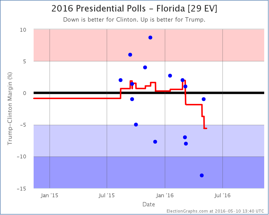
chart (111)

The new poll shows Clinton leading by only 1%, which is better for Trump than the previous average, which showed Clinton leading by 3.7%. So why did the average move toward Clinton instead of toward Trump? Well, to understand this, you need to look not at where the average was before, but instead at the polls being replaced in the average.

In this case the new Clinton by 1% poll replaced two polls*, one where Trump led by 2.7% in January, and the other where Trump led by 2.0% in February. So the average moves toward Clinton because even though the new poll was better than the recent average and the next most recent poll (which had Clinton +13%), it was worse than the older polls falling out of the average.

Looking at the dots for the individual polls, as well as the trend line, you can see that while the new poll does indeed show a close race, it now means that only one out of the last five polls in Florida show a Trump lead, while up until March you saw Trump leading many of the polls in Florida. He led in the average. The fact that people are now pushing “Trump is only 1% behind Clinton in Florida” as a good poll for Trump is actually an indication of the fact that he has fallen so much that this result is now unusually good for Trump. Back in early March it would have been completely unremarkable.

Looking at the average again, the line has been moving toward Clinton since March. With the Quinnipiac poll replacing the older polls where Trump was leading, Clinton’s lead in the state is up to 5.6%, which moves the state to “Strong Clinton” and takes Florida out of the list of states we give him in the “best case”.

So nationwide, the new situation looks like this:
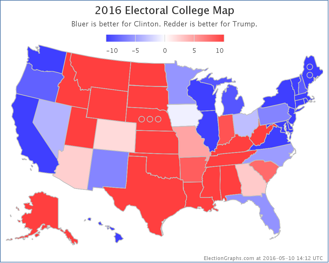
chart (112)

chart (113)

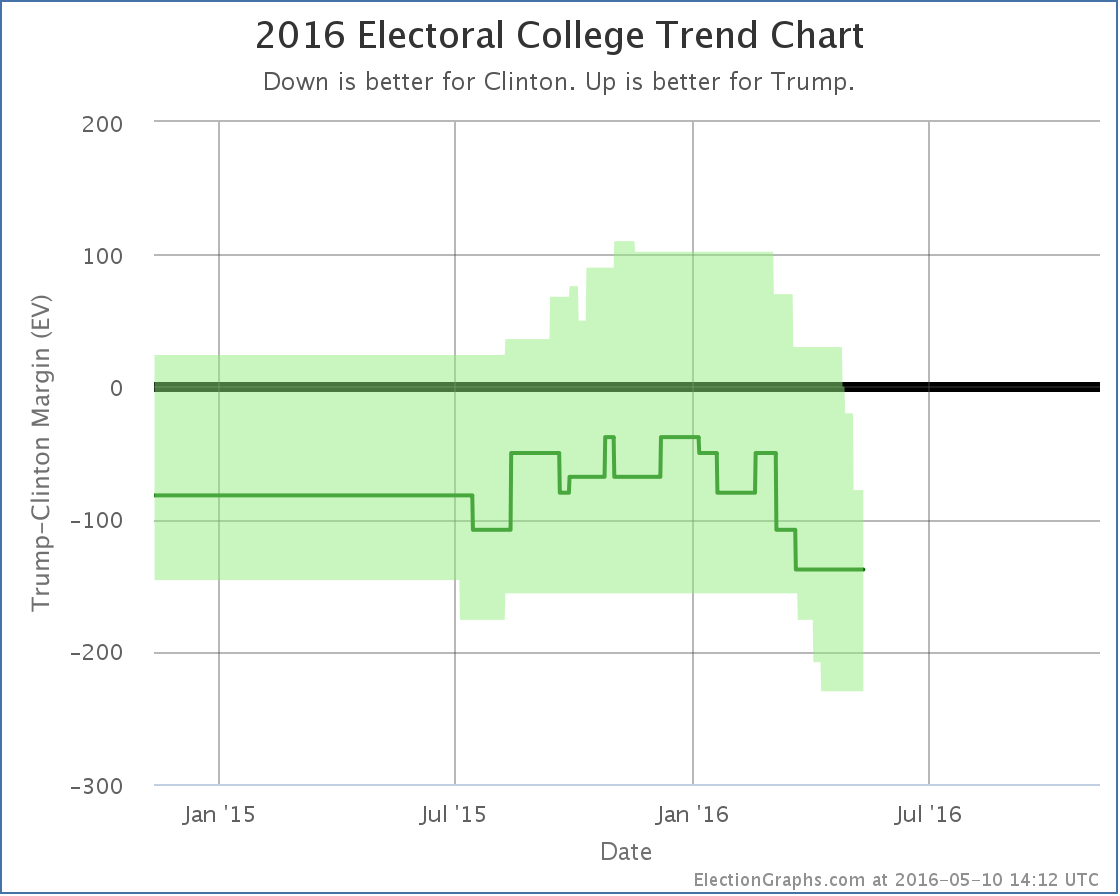
Without Florida, if Trump wins all the states he is ahead in, plus all the states Clinton is ahead by less than 5%, Trump loses by 78 electoral votes. This is a new low for Trump’s best case. The Trump deterioration that started in January continues.

Having said that, while this looks like an easy Clinton win, when people start talking about a Democratic win of historic proportions, the evidence doesn’t yet support that. Looking now at the expected case rather than Trump’s best case… so each candidate just wins all the states where they lead in the poll average… you get Clinton 338, Trump 200… a 138 electoral vote win.

By comparison, Romney lost by 126 electoral votes and McCain lost by 192 electoral votes. So right now Trump is doing worse than Romney, but still better than McCain. This is a solid loss of course, but we are nowhere near the comparisons some people are making to a possible Mondale style loss. (Mondale lost by 512 electoral votes to Reagan).

Even Trump’s worst case right now (losing by 230 electoral votes) is only in the neighborhood of Dole’s loss to Bill Clinton (217 electoral votes) and not even in Dukakis territory (losing by 315 electoral votes to GHW Bush). And of course Trump’s best case, while still a loss, would be better than either Romney or McCain did. We are a long way from Mondale.

With the Florida change, the tipping point also moved, which gives a different view:
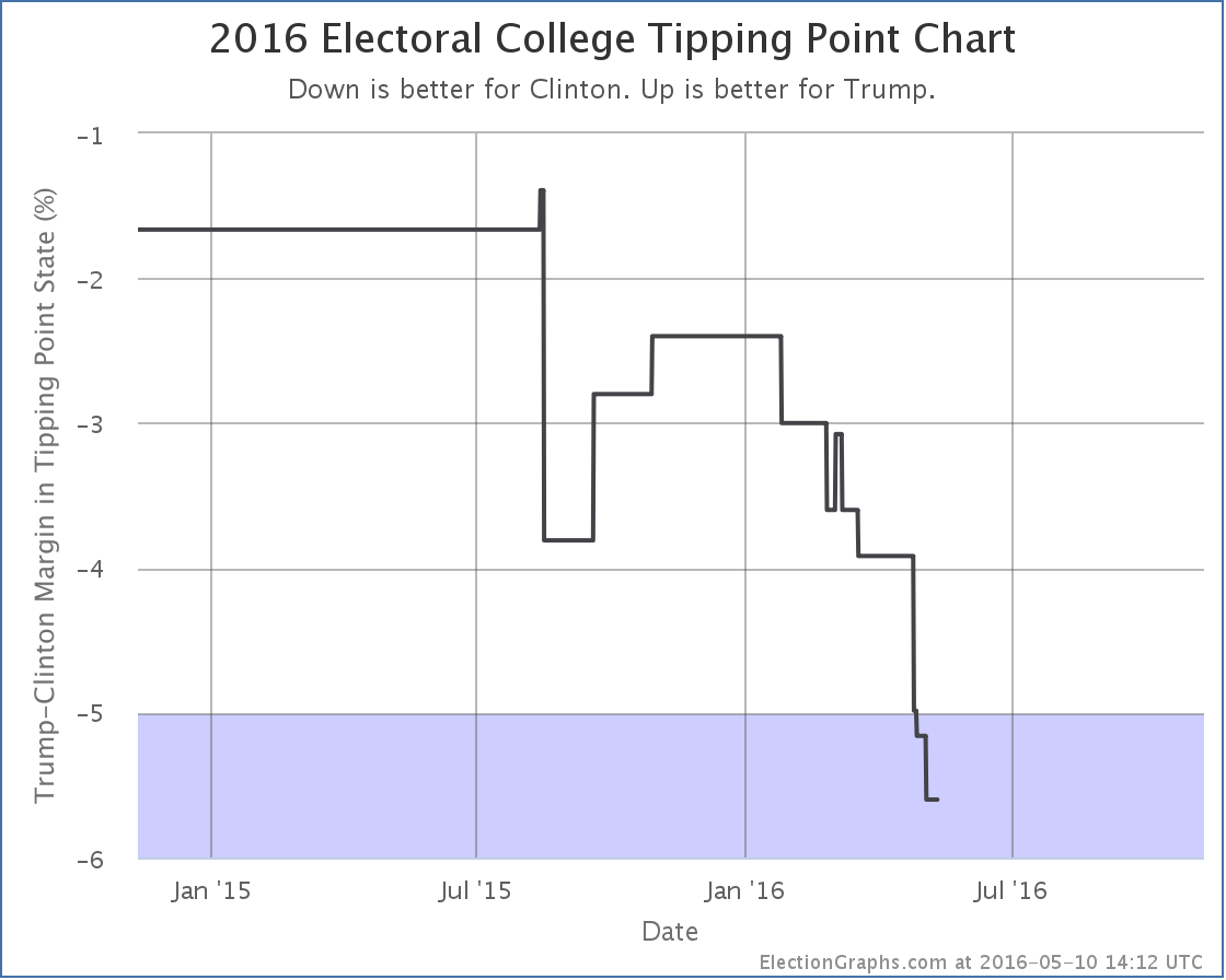
chart (114)

The tipping point is the margin in the state that would put the winner over the top. Right now it is Clinton’s 5.6% lead in Florida. What this means though is that you only need 2.8% of people to change their minds nationwide, and enough states flip that Trump would be winning. Given how divided the electorate is, that might actually be pretty difficult, but it doesn’t sound anywhere near as dire as the electoral college view. Changing the minds of 3% of Americans seems quite possible.

We have 181.8 days left until polls start to close on election day. Trump may be down right now, but there is still lots of time left. That may change. Do not be surprised if things tighten before election day… or if Clinton widens her lead further. There is still plenty of room for movement.

* The previous Clinton by 3.7% average was one of the cases where the Election Graphs poll average is based on six polls instead of the normal five. This happened because the five poll average resulted in a Clinton lead of exactly 5%. The primary purpose of the poll average on Election Graphs is not the average itself, but rather to categorize each state into one of the six categories… weak, strong, or solid for each candidate. 5% is the boundary between weak and strong, so additional older polls are pulled in as needed to get the average off the fence and put the average solidly in one category. In this case the one additional poll pulled the average back toward Trump and resulted in the 3.7% Clinton lead.

Note: This post is an update based on the data on ElectionGraphs.com. Election Graphs tracks both a poll based estimate of the Electoral College and a numbers based look at the Delegate Races. All of the charts and graphs seen in this post are from that site. Additional graphs, charts and raw data can be found there. All charts above are clickable to go to the current version of the detail page the chart is from, which may contain more up to date information than the snapshots on this page, which were current as of the time of this post. Follow @ElectionGraphs on Twitter or like Election Graphs on Facebook to see announcements of updates or to join the conversation. For those interested in individual general election poll updates, follow @ElecCollPolls on Twitter for all the polls as they are added.