- 02:29:50 Retweeted @jwpetersNYT 01:23:35 Unmanned Trump table at North Dakota GOP convention. Doesn't bode well for his chances to pick up delegates. https://t.co/9NDJ3kPTRR
- 05:57:07 Reading – Sanders likely flips two delegates after dominating Clark convention (Jon Ralston) https://t.co/qF0ZTY87oj
- 06:18:42 Retweeted @NateSilver538 05:00:33 Trump now <50% to win GOP nomination on betting markets. Close call but I'd be tempted to bet Trump at even odds. https://t.co/qpmkmQfImF
- 15:08:15 Reading – Why Trump Can’t Break the G.O.P. (Hacker/Pierson) https://t.co/IPEHE7hVDw
- 15:44:28 Watching – At This Hour Cold Open (SNL) https://t.co/0Wid8m7OK9
- 15:56:23 Retweeted @LOLGOP 14:26:31 Trump is proving that you can't fool all of the people all of the time. But you can fool 37% of the GOP base in pretty much any state.
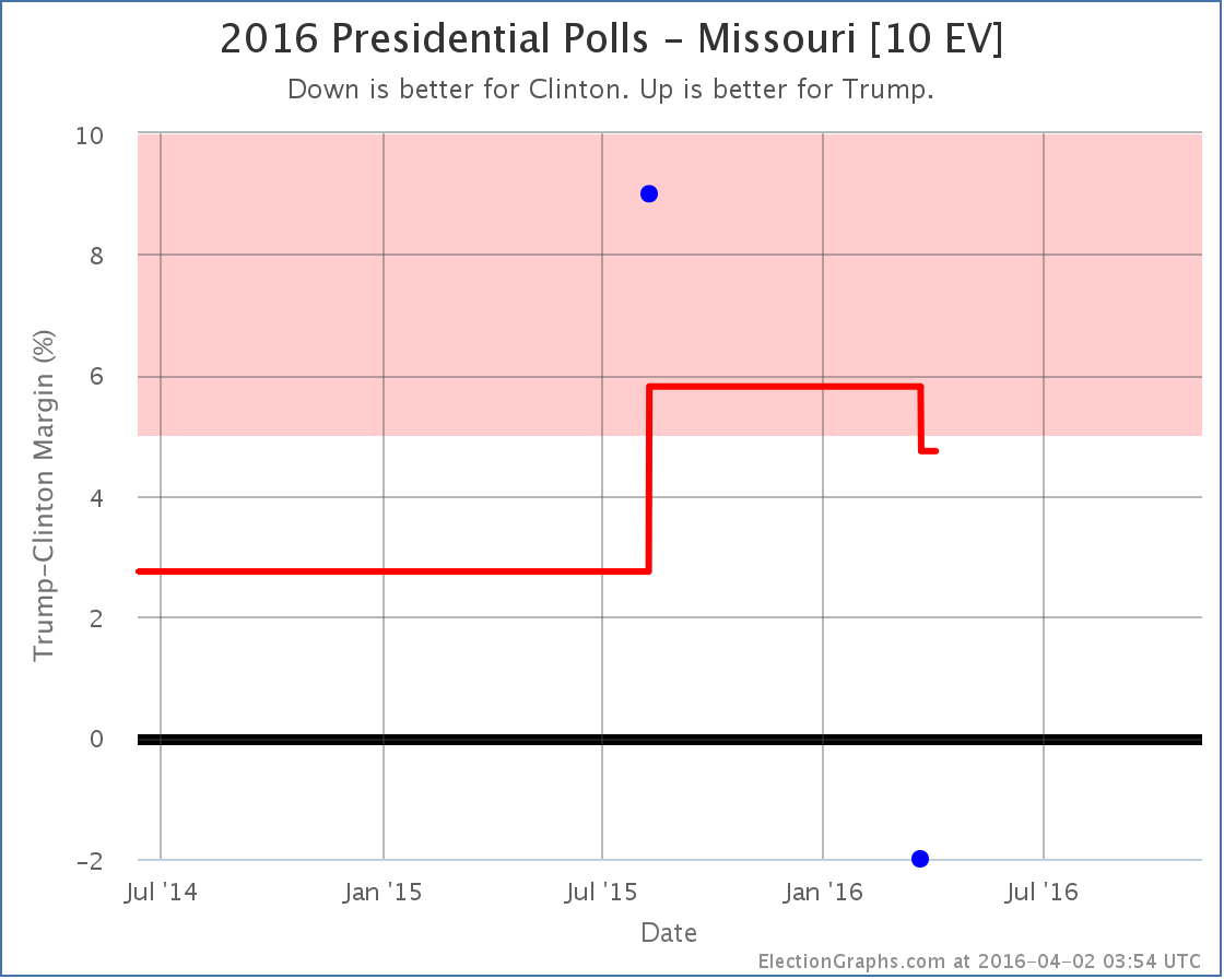
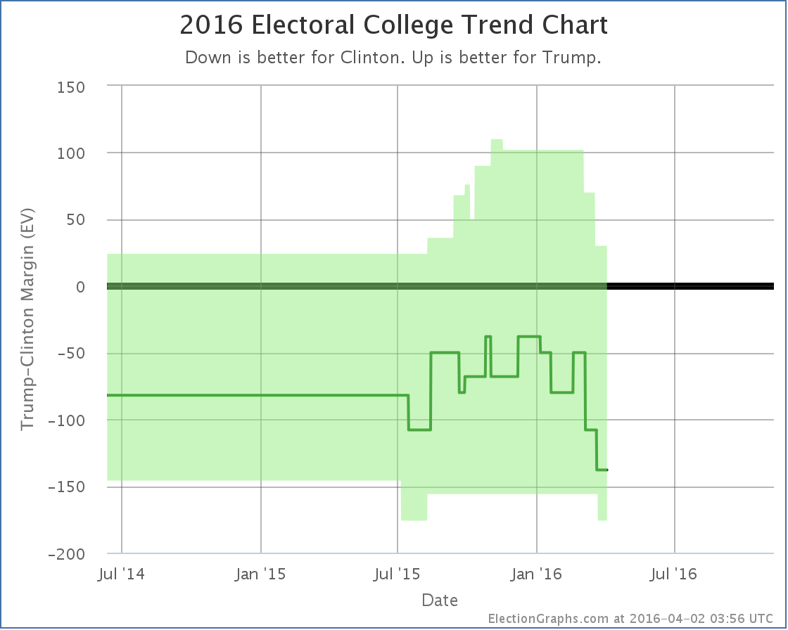
Since the last update there have been polls added in Wisconsin, New York, and Missouri. Missouri makes a difference in our models for Clinton vs Trump. Missouri has been very lightly polled. This is only the second poll that specifically asks about Clinton vs Trump, so my five poll average is still filled out with the election results from 2004 to 2012. Without those old elections, the average would move even further in Clinton’s direction. The newest poll actually shows Clinton ahead, but it is just one poll. Never trust one poll. We look at averages. As it is, the average now stands at Trump +4.7%. This now puts Missouri back in the “close enough it could go either way” category. This improves Clinton’s best case against Trump: Clinton’s best case if she wins all the states she is ahead in, plus the two where she is close (Colorado and now Missouri) is to win 357 to 181, an 176 electoral vote margin. Looking at the chart above, since the new year there have been eight changes (5 to the expected case, 2 to Trump’s best case, and 1 to Clinton’s best case). Seven of those changes have favored Clinton. Only one has been a move toward Trump. Trump’s situation has deteriorated significantly in the last three months. The question is of course if he is near a bottom and about to rebound, or if he has only started his fall and soon the real discussion will not be who would win, but rather how big a win Clinton would have. Of course, all of that is only relevant if he ends up as the nominee. The delegate race is still underway and Trump has a very narrow path to follow to get to the convention with a majority of delegates. If he falls short, we get a contested convention, and it looking less likely by the day that Trump walks out of that scenario with the nomination. (See nice 538 writeup on this here.) 220.0 days left until polls start to close on election night 2016. There will be lots of ups and downs between now and then. Stay tuned! Note: This post is an update based on the data on ElectionGraphs.com. Election Graphs tracks both a poll based estimate of the Electoral College and a numbers based look at the Delegate Races. All of the charts and graphs seen in this post are from that site. Additional graphs, charts and raw data can be found there. All charts above are clickable to go to the current version of the detail page the chart is from, which may contain more up to date information than the snapshots on this page, which were current as of the time of this post. Follow @ElectionGraphs on Twitter or like Election Graphs on Facebook to see announcements of updates or to join the conversation. For those interested in individual general election poll updates, follow @ElecCollPolls on Twitter for all the polls as they are added. On the Curmudgeon’s Corner podcast this week, most of the show is of course about the presidential election. Ivan and Sam discuss everything you would expect about Clinton, Trump, Sanders and Cruz. And Sam ran a caucus! But in addition, there is plenty of other good stuff about hard drives, Microsoft Tay, being sick, the 5th amendment, and more! Click below to listen or subscribe… then let us know your own thoughts! Length this week – 1:51:50
Show Details:
|
||


