- 02:22:29 Just got home from my commute. Been listening to #SOTU in the car. I liked the opening Iowa joke. :-)
- 02:24:14 By the way, the hubbub about him needing to mention the 10 Americans in Iran tonight is BS. Looks like that situation is minor and handled.
- 02:25:29 The agenda laundry list itself is useless most years, even more so this year. So he is just putting out his views using that as a vehicle.
- 02:27:30 What were Biden and Ryan just laughing about? I missed it…
- 02:28:15 Retweeted @JoshuaGreen 02:17:11 This speech is a giant @realDonaldTrump subtweet
- 02:28:22 Retweeted @natsecHeather 02:27:53 interesting thing is that so is the @nikkihaley response https://t.co/1V7YOxL1aJ
- 02:29:43 This speech marks the point where officially all attention shifts to the 2016 candidates and away from the current administration, right?
- 02:29:56 Or did that already happen a year ago…?
- 02:32:49 I liked the Sputnik line. Funny.
- 02:33:44 I like how this year’s speech feels a little more relaxed and informal. Well, as informal as talking to a joint session of congress gets.
- 02:35:23 Nice applause lines about the cancer initiative, but how much can be done in a year without significant congressional funding?
- 02:38:14 Retweeted @mollyesque 02:37:27 Shorter Obama: “We have so much winning, I’m getting bored with winning."
- 02:39:21 Retweeted @asymmetricinfo 02:36:45 So let me see if I’ve got this straight: in exchange for a trip to the moon, Joe Biden is agreeing to cure cancer?
- 02:43:43 Retweeted @speechboy71 02:37:46 BREAKING: Exclusive Photo of White House Refrigerator of F***ks https://t.co/pYLpapz49t
- 02:44:54 Liking Obama’s foreign policy section so far.
- 02:45:29 What a face on Lindsay Graham!
- 02:49:06 Obama is systematically doing the counter argument against everything Trump and Cruz & the other R’s have been saying on the campaign trail.
- 02:50:41 Retweeted @EsotericCD 02:50:15 Twitter tells me that the President has apparently inadvertently mispronounced a word.
- 02:54:14 Retweeted @politicalwire 02:53:50 President Obama broke his promise about this being a short speech
- 02:56:22 Retweeted @mmurraypolitics 02:56:06 Obama: "When politicians insult Muslims… that doesn't make us safer. It isn't telling it like it is… It betrays who we are as a country"
- 02:56:47 Retweeted @jbarro 02:56:34 Obama's is aiming straight at Trump in order to elevate him, not to diminish him.
- 02:59:20 Unfortunately not much appetite for the “we must compromise and work together” view at the moment. On either side really.
- 03:02:26 Retweeted @natsecHeather 03:01:12 Length of speech spurred 11-y.o. to put self to bed. First time ever. #ThanksObama https://t.co/pZSPGqcP8b
- 03:03:25 Retweeted @natsecHeather 03:03:13 no, the problem is that anyone who believes politics is hopeless is not listening an hour in
- 03:03:52 .@natsecHeather They weren’t listening one minute in either. in reply to natsecHeather
- 03:04:46 This part sounds more like a farewell speech than the rest did. He still has another year!
- 03:05:45 Arguing for political structural reform = Washington on parties and foreign entanglements, Eisenhower on military industrial complex, etc.
- 03:07:50 .@jbarro Maybe, but if so risky strategy. The “Trump would be easy to beat” hypothesis may not be true. Not worth the bet. in reply to jbarro
- 03:09:18 Retweeted @nxthompson 03:08:20 This speech has so many of the same themes—togetherness, diversity, change—as early Obama. But tempered.
- 03:10:29 And now we’re done. One of his better SOTUs. Which is a lower bar than his speeches in general.
- 03:13:06 As usual with this kind of speech, won’t change many minds. Nobody who hated Obama before will like him now. But that isn’t what it is for.
- 03:14:46 How long do we have to wait for the Republican response?
- 03:15:03 Retweeted @kimholcomb 03:12:10 And now, to the "hugging at the end of SNL" part of #SOTU.
- 03:15:51 Retweeted @hominidviews 03:15:44 Not long enough! https://t.co/WvJWPKkRtz
- 03:16:44 Retweeted @ezraklein 03:16:35 I think Obama would very much enjoy running against Donald Trump
- 03:19:37 Retweeted @danpfeiffer 03:19:20 The fact checker who is trying to ding everyone because this is technically Obama's 7th SOTU is a sad lonely person
- 03:21:11 Retweeted @AlexParkerDC 03:20:19 When Obama blamed gerrymandering for partisan polarization, that sound you heard was hundreds of poli sci professors gnashing their teeth.
- 03:21:15 Retweeted @jbarro 03:20:49 No, they're too busy repeating "Trump's poll numbers are illusory" like a mantra. https://t.co/mNhqRPgdV6
- 03:23:26 One of the CNN commentators said that 2016 won’t be about changing minds, it will be about mobilizing turnout. That sounds about right.
- 03:23:37 Ah, here comes Nikki Haley.
- 03:28:20 Retweeted @donnabrazile 03:28:05 Gov. Haley: "During anxious times, it can be tempting to follow the siren call of the angriest voices. We must resist that temptation."
- 03:29:01 Retweeted @BenjySarlin 03:28:31 So basically tonight was two different State of the Union responses to President Trump
- 03:29:57 Retweeted @FrankBruni 03:29:47 Resist "siren's call" of "angriest voices," says Nikki Haley in her #SOTU response. Translation? Tune out Donald Trump. (Cruz, too.)
- 03:30:54 Retweeted @natsecHeather 03:30:46 Wow, @nikkihaley cites Charleston killings and removal of Confederate flag. Kudos to her.
- 03:31:19 Haley actually managing to sound reasonable here. How long until she is run out of the Republican party for it? :-)
- 03:31:49 Retweeted @jimgeraghty 03:31:19 This is the best GOP response speech in a long time… but I'm not sure how big an impact it will have. Are people still watching?
- 03:34:01 That wasn’t bad. Too bad none of the kind of attitude she is showing is showing much in the Republicans running in 2016. At all.
- 03:34:24 Retweeted @NewsFletch 03:29:19 Hey why isn’t Nicki Haley a #gop presidential candidate? She sounds reasonable.
- 03:34:27 Retweeted @HarryBallzak1 03:32:16 @NewsFletch I believe you answered your own question. in reply to NewsFletch
- 03:35:21 Retweeted @oliverdarcy 03:33:38 Coulter: "Trump should deport Nikki Haley." https://t.co/jDVr17beEu
- 03:35:42 Retweeted @JohnFeehery 03:34:22 Haley did better than Rubio, Jindal and just about everybody else who has done a response.
- 03:38:39 OK, enough tweeting for now. Time to move on and take advantage of the fact my son fell asleep early to get some stuff done… :-)
- 04:39:51 Retweeted @JoshuaGreen 04:39:07 At 6 a.m. tomorrow, we'll release a new Bloomberg/DMR Iowa poll of the GOP field and add drama to the emerging Cruz/Trump contretemps
- 05:03:47 Retweeted @suss2hyphens 02:35:29 OBAMA: "I believe we can put a man on Mars within six months. That man will be Donald Trump. That is the end of the plan"
- 19:11:30 Retweeted @imbou 18:01:04 I did listen, just because i don't agree, it doesn't mean I didn't listen!!!!!
- 19:11:53 .@imbou You obviously didn’t listen well enough. Try again. in reply to imbou
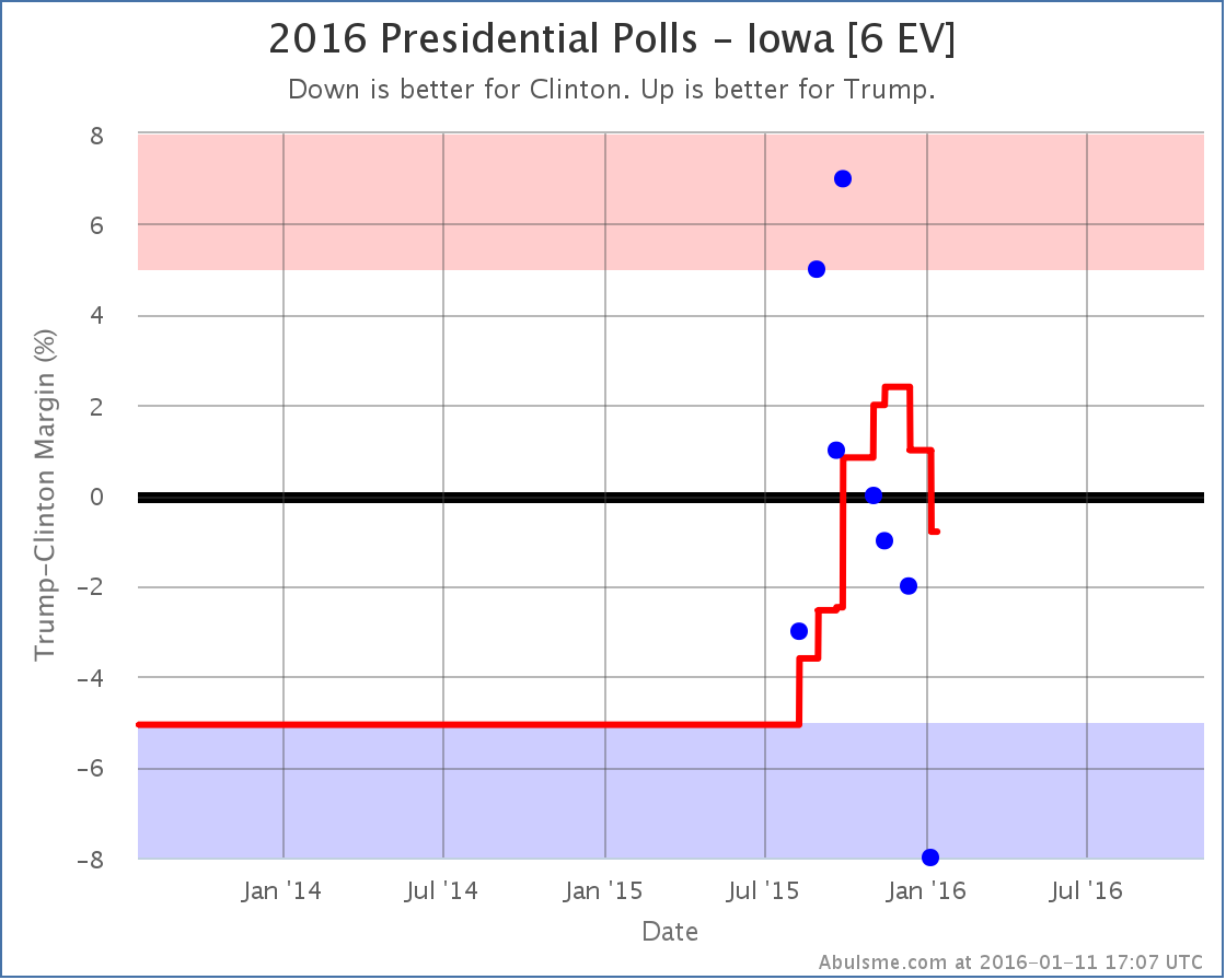
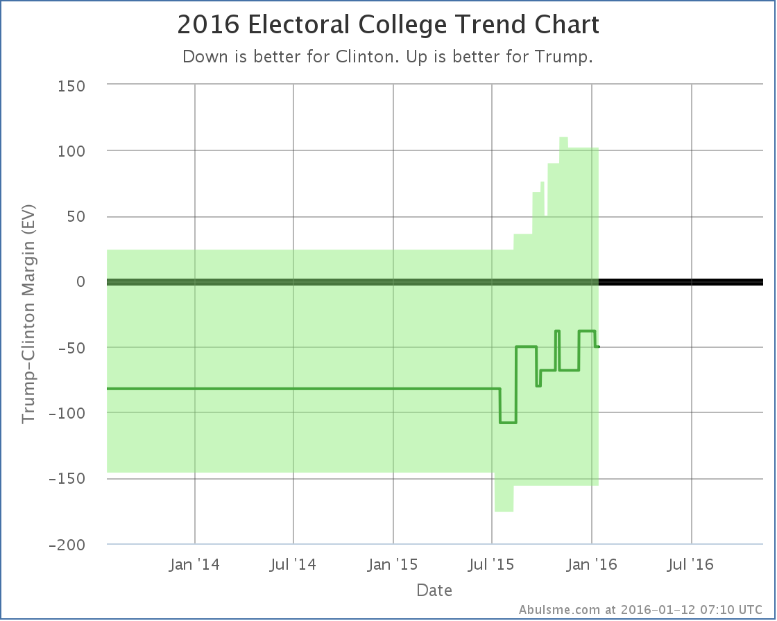
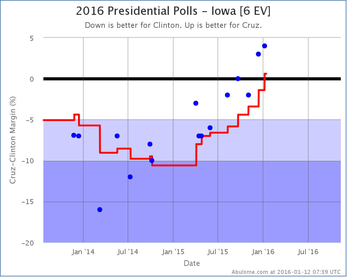
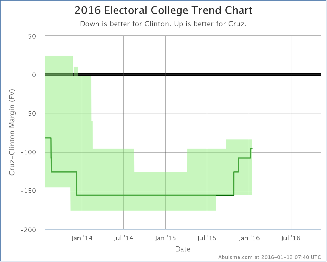
Another day with more Iowa and New Hampshire polls. This time no status changes in the five best polled candidate combinations in New Hampshire, but there were a couple of changes to talk about in Iowa. One of these favors Clinton, the other favors her Republican opponent. Lets take a look. Clinton vs Trump At the end of September after a series of good polls vs Clinton in Iowa, Trump had taken the lead in the Iowa poll average. Since then Trump hasn’t done quite as well, and with today’s addition of a Marist poll showing Clinton with up by 8%, the poll average once again shows a Clinton lead in Iowa. Clinton’s is only ahead by 0.8%, which means Iowa is still close and could easily go either way. The five polls included in the average range from Clinton up by 8% to Trump up by 7%. That is a pretty big range! The average puts Iowa in the “Weak Clinton” category though, so we give it to Clinton in the “expected case” for the moment. The updated national electoral college bubble looks like this: The last tick downward in the green center line is Iowa flipping to Clinton, which puts the “expected” Clinton vs Trump case at a 50 electoral vote Clinton win. But there are many close states still, so anything from a 156 electoral vote Clinton win to a 102 electoral vote Trump win would be within the realm of possibility given current state level polling. This just goes to reiterate the point I made last month: “Do Not Underestimate Trump“. Conventional wisdom is that if the election comes down to Clinton vs Trump, it would be a Clinton runaway win, but poll data just does not show that right now. (Insert usual comments here about how far we have until the election and how none of this is predictive yet. It only shows us a bit about how things look NOW, and even then only imperfectly due to the relative sparseness of state level polling.) Clinton vs Cruz Unlike Trump, who rose for awhile and then has been falling, Cruz has been consistently improving in Iowa for the last year. With today’s update, he takes the lead in the poll average. It is just a 0.6% lead, but it is a lead, and we give him the state for now. This brings Cruz up to… losing by 96 electoral votes to Clinton. Unlike Trump though, if you give him all the close states as well, it is still a loss to Clinton, just by only 84 electoral votes, which is still a pretty substantial Clinton win. Right now, Cruz is not “within range” of Clinton, while Trump is. This is based on state level polls though, which at this point in the cycle lag national polls. The RCP average for Clinton vs Cruz shows Cruz ahead at the moment. If there indeed is a big enough move toward Cruz that he starts to be competitive, it will show up in the state level polls soon enough. That isn’t evident from the state data yet, but I can say that Cruz is competitive in Iowa, and currently has a very slight lead there. Others I don’t talk much about candidate combinations beyond the top five best polled, as their polling data is generally sparser, but just to note them in passing… Today’s batch of polls also flips New Hampshire from Clinton to Rubio, strengthens the Sanders lead over Cruz in New Hampshire, and moves the national tipping point in Sanders vs Trump further toward Sanders. We’re going to see the pace of polling increasing dramatically as the primary season gets underway. As soon as we have clear front runners in both parties, we’ll stop seeing any polling at all for the other candidates and it will all be about the final general election match ups. Over the next couple months we’ll get to see just how quick that transition is. 301.7 days until the general election polls start to close. Note: This post is an update based on the data on ElectionGraphs.com. All of the charts and graphs seen here are from that site. Graphs, charts and raw data can be found there for the race nationally and in each state for every candidate combination that has been polled at the state level. In addition, comparisons of the best polled candidate combinations both nationally and each in each state are available. All charts above are clickable to go to the current version of the detail page the chart is from, which may contain more up to date information than the snapshots on this page, which were current as of the time of this post. Follow @ElecCollPolls on Twitter for specific poll details as I add them. And like Election Graphs on Facebook!
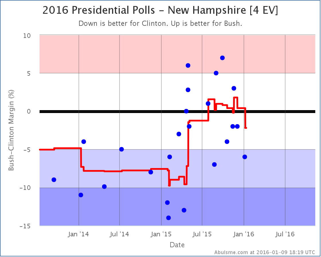
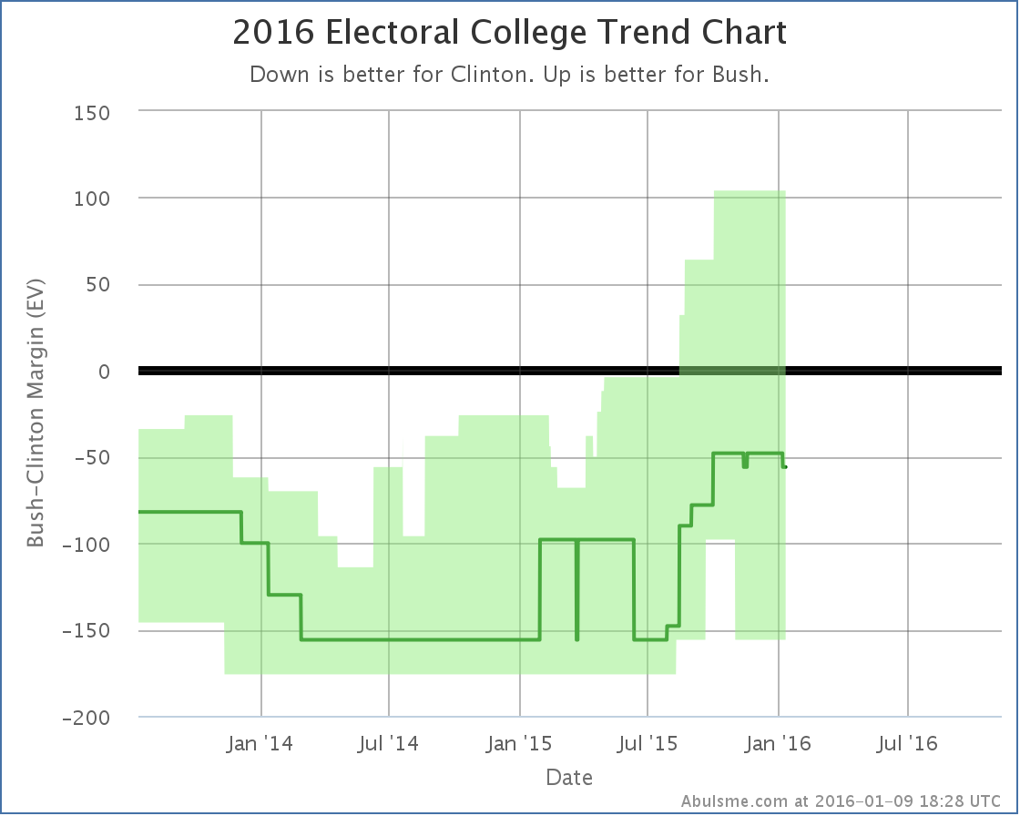
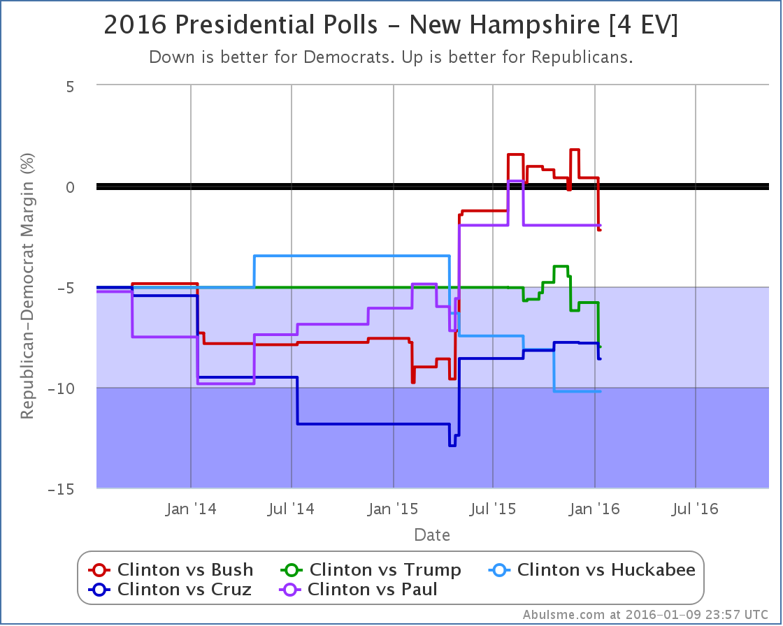
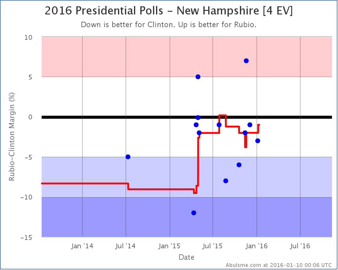
Election Graphs will be rolling out our primary delegate race coverage before the Iowa caucuses, but in the mean time, we’ve just had the first state level general election polls of the New Year. It is a PPP poll in New Hampshire. There was only one candidate pair where the new polls changed my classification of New Hampshire though. Clinton vs Bush For all but a few days in November, Bush had held a lead against Clinton in my poll averages since the end of July. Just barely. But he had hung onto that lead. With the latest poll though, Clinton leads in four of the last five polls, and by enough to take a lead in the average. New Hampshire moves from “Weak Bush” to “Weak Clinton”. The lead is still slim at 2.2%, so the state is still very much in the “could easily go either way” category, but it is enough to put New Hampshire back in Clinton’s column in the case where we give each state to the current leader. That little notch downward on the center line at the right hand side of the bubble is New Hampshire flipping to Clinton. We go from Clinton winning by 48 electoral votes, to Clinton winning by 56 electoral votes. Either way, Clinton is ahead, but the election is within the “bubble of uncertainty” since if you give Bush all the states where Clinton is ahead, but by less than 5%, Bush wins by 104 electoral votes. A Clinton vs Bush matchup could go either way. But, if the primary polls are to be believed, at this point Clinton vs Bush is a relatively unlikely scenario, so even though there were no other category changes, lets take a quick look at how the latest polls affected some of the other matchups. New Hampshire Matchup Comparison Looking at the five best polled candidate combinations nationally, the latest New Hampshire poll included three of the five (Bush, Trump and Cruz). In all three cases, the Republican weakened vs Clinton. For Trump and Cruz though, this just meant Clinton’s already strong lead in New Hampshire got stronger. It makes no difference what so ever to their possible races against Clinton if they were to win the nomination. Aside from Bush, the only one of these five that makes New Hampshire close is Paul, but that should be taken with a big grain of salt because he hasn’t been included in a general election match up poll in New Hampshire since August. So that data is a bit stale. Looking beyond the top five though, to what is currently the sixth best polled combination by my metric, you actually see another candidate that makes New Hampshire close with Clinton, and in fact in that case the latest polls actually improved the Republican’s average. That would be Clinton vs Rubio: Of the 10 candidate pairs included in the latest polls… Clinton and Sanders vs Bush, Carson, Cruz, Rubio and Trump… Clinton vs Rubio is the only combination where the Republican’s poll average improved. Does this imply larger things for the country at large? No, not really. New Hampshire is a special case in many ways. It is getting a huge amount of attention right now due to the upcoming primary. What is going on there right now in terms of public opinion may or may not be reflected in trends elsewhere. So, as usual, we need to just wait for more polls. Which states get polled in the next few months is probably going to be highly influenced by the primary calendar as well, so the picture we see in the state polls will be warped a bit by that. And of course once we have actual delegate numbers in both parties showing which candidates are actually leading in the nomination races, it starts changing perceptions of the general election, which may in turn cause more movement in the state polls. Keep checking in with Election Graphs. We’ll be launching our delegate tracking soon, and it looks like the kind of election cycle where watching the delegate situation carefully may actually be needed. In other words, we’re almost at Iowa, and things are going to get crazy. Hold on and have fun! 304.0 days until the general election polls start to close. Note: This post is an update based on the data on ElectionGraphs.com. All of the charts and graphs seen here are from that site. Graphs, charts and raw data can be found there for the race nationally and in each state for every candidate combination that has been polled at the state level. In addition, comparisons of the best polled candidate combinations both nationally and each in each state are available. All charts above are clickable to go to the current version of the detail page the chart is from, which may contain more up to date information than the snapshots on this page, which were current as of the time of this post. Follow @ElecCollPolls on Twitter for specific poll details as I add them. And like Election Graphs on Facebook!
|
||
