Today’s update was new PPP polling in Wisconsin. PPP polled 11 candidate combinations. Of these only one produced a notable change in one of the “5 best polled candidate pairs” I track most closely here.
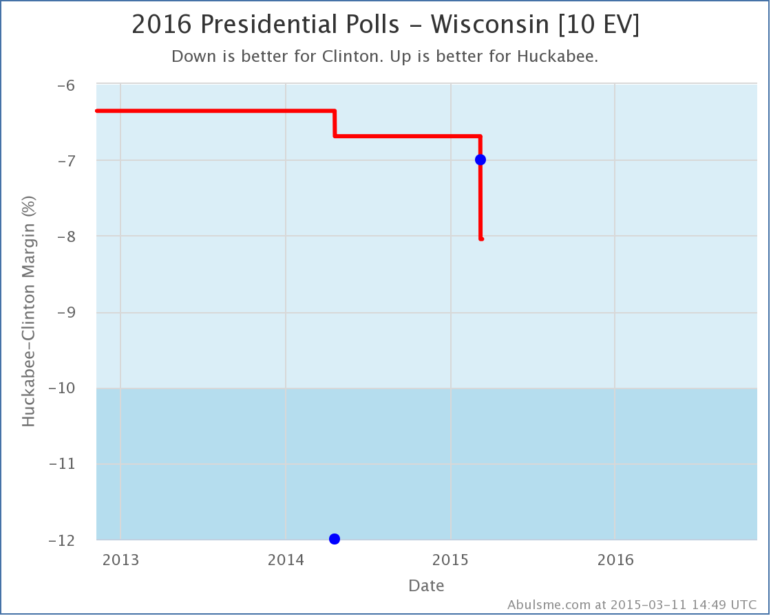
Specifically, this was the second poll of Clinton vs Huckabee in Wisconsin (the last was also by PPP, back in April 2014). This poll did not cause a category change in the average, it was Strong Clinton before, and it is Strong Clinton now:
So with no category change, why am I bothering with a post?
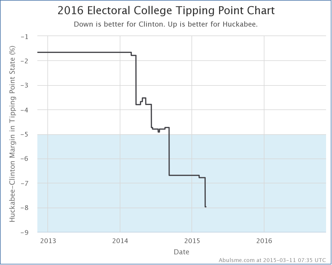
Well, Wisconsin slipping further into Clinton territory (from a 6.7% Clinton lead to a 8.0% Clinton lead) reshuffled the ordering of the states when sorted by margin and Wisconsin slipped past Minnesota (where Clinton leads by 6.8%). Minnesota had been the tipping point state. So Clinton doesn’t necessarily need Minnesota any more, because it is easier to get Wisconsin. This means the tipping point shifts to 8.0% in Virginia.
The last time the tipping point moved even briefly in Huckabee’s direction was last August, but as you can see, the general trend has been that the more polling there is on this combination, the worse it looks for Huckabee.
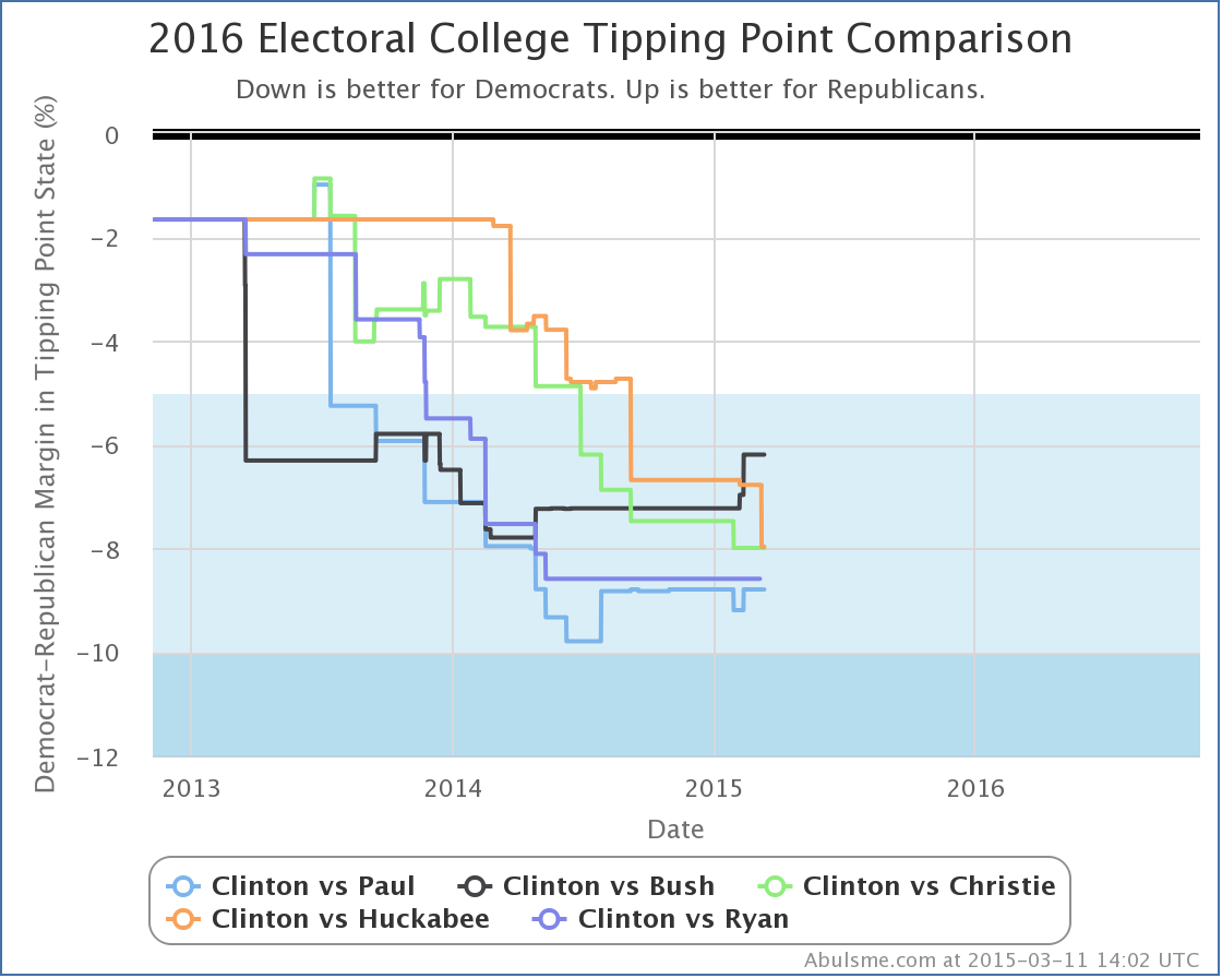
Since this is an otherwise short update, a quick look at how the tipping point looks across all five “best polled” candidate combinations at the moment:
All of the Republicans are running way behind Clinton, but the trends are different.
Basically, we can group the five candidates (all vs Clinton) into three categories based on the last six months or so of tipping point movement:
- Republicans gaining strength against Clinton: Bush
- Republicans basically flat against Clinton: Paul and Ryan
- Republicans losing ground against Clinton: Christie and Huckabee
Ryan has said he is not running of course. There is also lots of talk about Walker, and sometimes of Cruz or Rubio, or even of combinations involving Democrats other than Clinton occasionally, but polling at the state level on all of those other combinations is still significantly more sparse than the five combinations here, and therefore the data less reliable, so we leave them out for now.
Note: This post is an update based on the data on my 2016 Electoral College Analysis Site. All of the charts and graphs seen here are from that site. Graphs, charts and raw data can be found there for the race nationally and in each state for every candidate combination that has been polled at the state level. In addition, comparisons of the best polled candidate combinations both nationally and each in each state are available. All charts above are clickable to go to the current version of the detail page the chart is from, which may contain more up to date information than the snapshots on this page, which were current as of the time of this post.
Edit 2015-03-16 17:44 UTC to add standard note to end.


