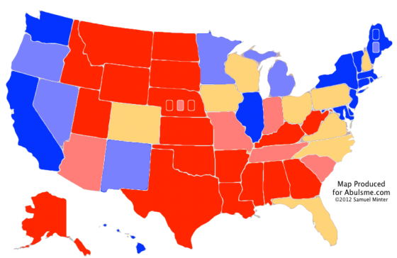

One change today. It is Florida. It is big. It moves from Leaning Romney to Leaning Obama… but… there are a lot of reasons this move doesn’t represent anything that is actually significant. At least not yet. So lets get into into it:

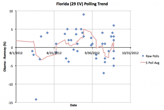
So, according to my five poll average, Florida moves from an 0.2% Romney lead where it was yesterday, to a 1.8% Obama lead today.
But… there is plenty of oddness here. First off, I do a “last five poll” average, with “last five” based on the end dates of the polls in question. Well, the most recent end date we have for polls is Thursday October 18th. But we are reaching the time in the race where some states get polled a lot… and so in Florida I now have SEVEN polls in my spreadsheet that ended on the 18th. So how do I pick which ones to include in the five poll average?
You could imagine all kinds of tiebreaker criteria, or you could imagine including more than five polls in situations like this. I essentially go with what is simplest for me to process, rather than something that I can justify from a “this is logically the right way to do this because X”, namely, I use the order I found them and added them to my spreadsheet. So the ones I found out about first in my normal daily sweep of sources age out first.
I admit that is kind of questionable and other approaches might be more valid from a theoretical point of view. Some are more complicated, like looking at both the start and end dates of the polls, or looking at the sample sizes of the polls, or things like that. I haven’t been keeping the data necessary to do that, so that would be a bit time intensive. So, what can we look at quickly.
First of all, if we looked at all seven of the polls that ended on the 18th instead of just five of them… We would have an Obama lead of 0.1%.
OK, what if we looked at all of the polls that ended after the second debate (8 polls)… We would have an 0.6% Obama lead.
What about the last 10 polls instead of the last five? Now we would have an 0.7% Obama lead.
What about if we just took any poll ending in the last week? Now we would have an 0.9% Obama lead.
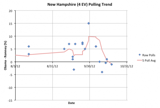
Well, OK, that is interesting, look at that. In all of these cases, we now have Obama leads. So maybe my choice of “last 5” isn’t really that important after all. The trend is indeed moving back toward Obama, and the chart of Florida polls shows that nicely. But…
Another thing to look at… the spread… of the 7 polls that ended on the 18th, we have a range from a 5% Romney lead to a 6% Obama lead. That is quite a spread. The average is slightly on Obama’s side… slightly… but there is a large variance.
And even if there was no oddness with how I choose which polls to include in the average, what do we have here? My straight five poll average gives a 1.8% Obama lead… which is still very very close. That is a sliver of a lead that could disappear with the very next poll.
Bottom line, Florida is too close to call. All of the states in my “Lean” categories could easily go either way, but Florida remains one of the closest.
So, where does this put us:
|
Romney |
Obama |
| Romney Best Case |
315 |
223 |
| Current Status |
223 |
315 |
| Obama Best Case |
191 |
347 |
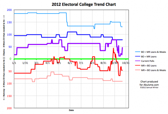
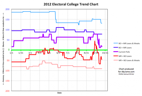
I won’t delve into all the details because I’m slightly behind schedule today, but Romney’s easiest path to victory is pull Florida back into his column and then win Ohio. This has been the primary scenario for a little while now. We’re off a bit from Romney’s highs, but Obama hasn’t yet started pulling states firmly back into his column. So this could still go either way.
We’ll start seeing the final view of what this election will look like once the post 3rd debate polls start coming in. By the time we get a full picture on that though, election day will be upon us. And of course early voting has been going on for weeks now. We’re right up against the end now, with Obama remaining a favorite, but by a slim margin.
Note: Chart and map from the Abulsme.com 2012 Electoral College Prediction page. Both assume Obama vs Romney with no strong third party candidate and show polling as it currently exists. Things will change before election day. On the map red is Romney, blue is Obama, gold states are too close to call. Lines on the chart represent how many more electoral votes a candidate would have than is needed to tie under several different scenarios. Up is good for Obama, Down is good for Romney.
