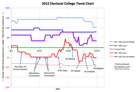
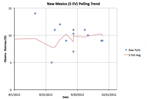
Minor change on the edges as New Mexico once again drops below a 10% Obama lead:
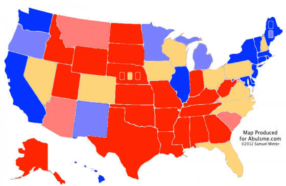
A few days ago Obama’s lead in the five poll average in New Mexico moved slightly above 10%, today a new poll pulls it back down to just below 10%. Either way, Obama will win New Mexico. So lets quickly move on so we can get to the good new stuff. First of all, new map and summary:
| Romney | Obama | |
|---|---|---|
| Romney Best Case | 321 | 217 |
| Current Status | 235 | 303 |
| Obama Best Case | 190 | 348 |
While New Mexico is colored lighter blue on the map, the summary is unchanged from yesterday, since New Mexico wasn’t moving in or out of “swing state” status.
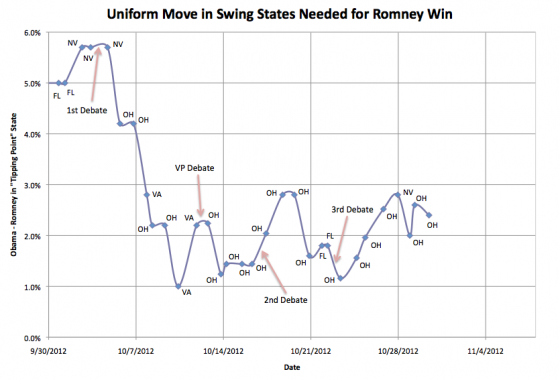
Since we still have a contest where Romney could win if he swept all the swing states, lets again look internally at how the polls stack up within the swing states, but rather than me listing the current margins in each of the swing states as I have done before, we’ll cut to the chase, and look at the “spiffy graph” I promised on Saturday. Graph first, then explaination:
OK, in my recent posts I’ve listed the swing states, listed their margins, and then mentioned which states Romney would need to win if he took them “in order” by how well he is doing in the state. When you do this, one state would put Romney over the top. I then looked at the margin in that “Tipping Point” state. In other words, if Romney improved his margin by the same percentage across the board in all states (or at least all the swing states) how much better would he need to be doing in order to actually win enough of those states to win the electoral college?
I base these margins off my five poll average rather than something more sophisticated, but the general concept of this is similar to Sam Wang’s “meta-margin” at the Princeton Election Consortium. It shows another way of looking at the race, and one which gives a closer look at who is ahead and by how much than simply looking at the three model lines I usually present. With the three lines I normally present you can tell who is ahead and that it is relatively close, but it is hard to get a sense of exactly how FAR ahead the candidate in the lead is when it is “close”.
So anyway, what does this show? Well, basically the same trends we see in Romney’s Best case line and the current line. Namely, the first part of October Obama was in free fall, but that stopped around the time of the VP debate, and since then there has been a pretty noisy signal, but with a slight trend toward Obama. If you are generous to Romney, you can say that the trend has been flat since the VP debate, but any argument that there has been continuing Romney momentum is clearly false.
The “tipping point state” has almost always been Ohio, with a few days here and there when polling moved states slightly out of their normal order. But be it Ohio, or occasionally Florida, Virginia or Nevada, Obama’s lead in the tipping point state has been staying in a fairly consistent band between 1% and 3% for the past three weeks.
Obama is no longer in the comfortable territory he was in before the 1st debate, where Romney would have to move the tipping point states by more than 5% to win… a state I described before as Romney’s best case being to lose. But he has a buffer there, and, so far at least, the key tipping point states are not showing the moment Romney would need in order to win.
Now, if something were to happen to induce a move as large as the decline Obama had at the beginning of October, then yes, that would potentially still be enough to flip the race. As I type these words though, there are 7 days and 55 minutes until the first polls close on election day. There is very little time left for a last minute change large enough to flip this to Romney.
It could happen, it is just becoming a bigger and bigger stretch with every day that goes by that does not move things dramatically in Romney’s direction.
Meanwhile of course, even while NO electoral college model that I’ve seen has put Romney ahead at ANY time in the past year, all the aggregators of national polls have shown Romney ahead for almost all of the last three weeks, and that lead continues today. If nothing happens to shake things up in the next seven days, the prospect of an electoral college / popular vote split seems to get more likely by the day.
Note: Chart and map from the Abulsme.com 2012 Electoral College Prediction page. Both assume Obama vs Romney with no strong third party candidate and show polling as it currently exists. Things will change before election day. On the map red is Romney, blue is Obama, gold states are too close to call. Lines on the chart represent how many more electoral votes a candidate would have than is needed to tie under several different scenarios. Up is good for Obama, Down is good for Romney.
Edit 2012 Oct 30 22:43 UTC to fix some wording issues.
Edit 2012 Oct 30 23:19 UTC to fix typo.


Ivan Bou liked this on Facebook.
If Romney is so likely to lose, then why is Clinton campaigning in Minnesota and why is the Obama campaign buying ads in Michagan? Perhaps it is worthwhile to look at what the campaigns are doing before making predictions?
RT @abulsme: [Abulpost] Electoral College: More Movement on the Edges (Plus New Chart!): Minor change on the edges a… http://t.co/Kq4 …
Lets take a look at some of that…
First of all “so likely to lose”… my model doesn’t give % chance to win odds, but there are many that do. They give Romney anywhere between 5% and 30% chance of winning. So he is an underdog, but Romney winning is by no means out of the question. An Obama win is not a done deal. In my post above, I mentioned that while time was running out, there are still scenarios that lead to a Romney win… just that if the status quo remains the same for the next week, then we have an Obama win. (Unless of course we have a systematic directional error in polling across ALL pollsters, not just the few usual suspects with large house effects…. this possibilty is also factored into the 5% to 30% that folks are giving Romney… if one could trust the polls completely, Romney’s odds would be even lower.) Anyway, just want to emphasise that this is indeed still close, and Obama does not have a lock on this. But he is a clear favorite.
Now lets look at Minnesota and Michigan. There are other ways to look at the data of course, but using my “five poll average” Obama is ahead by 6.8% in Minnesota and 6.5% in Michigan.
So, it seems like these are clear Obama wins. Why would Obama spend any money there?
Possibility #1) The very latest polls in both states show some tightening. There is not enough data yet to know if these are statistical outliers, or if there is enough tightening to actually put the states in play. The campaigns will have access to additional private polls as well though, so if those show tightening as well, Obama might want to spend some time and money on defense there. He is way ahead in both states at the moment, but he would like to keep it that way. Right now Romney has a very narrow path to victory through Ohio. If Romney manages to make Minnesota or Michigan competitive, then it opens up more possible routes to victory. Obama wants to make sure that doesn’t happen, so he throws some resources in to defend the state.
Possibility #2) Obama thinks he has the electoral college pretty well won, but would like to win the popular vote too. Right now every day that passes seems to make the possibility of an electoral vote / popular vote split more likely. Obama is clearly the favorite in the electoral college, but Romney is looking like the favorite for the popular vote. If Obama’s polling shows that these two states are ones where there is room to increase his margins through get out the vote efforts and energizing the base, it would make sense to put resources here, even if it made no difference to the electoral college.
Possibility #3) It is a big fake out. Obama wants to make Romney think that he is worried about these states, and that Romney might have a shot. So Romney might divert some resources to these states that would actually be better utilized in the states that are more likely to form the Romney route to the presidency, namely Iowa, Virginia, Colorado, New Hampshire and of course Ohio.
I think #1 is most likely, with a dose of #2 thrown in for good measure. We’ll know as polling comes out over the next couple days if there is any real tightening in either state that Obama has to worry about. It would take a pretty big move to make these states more likely to make a difference than Ohio though. For the most part, any scenario that makes these states close will put Romney ahead in Ohio. While polling has been relatively sparse in Minnesota and Michigan, it has been plentiful in Ohio and we don’t see that movement yet. If we do start to see substantial movement toward Romney, it will show up in my charts. So far it hasn’t.
But that doesn’t mean it won’t tomorrow.
Wow! I did not expect such a long answer. Thanks for taking the time.
I still disagree. Polls are estimates of future voting which vary in quality. The polls that have produced Obama’s biggest margin of victory have a big issue. They predict a Democratic turnout as a percentage of the voters will be much higher than in 2008. Given that in 2008, Obama was the Messiah and now he’s not and given much greater GOP enthuaism, a higher Democratic turnout seems absurd. Also, the few polls about party preferneces that are out there show a decrease in the percentage of Democrats.
A second issue is that I believe that presidential campaigns internal polls are among the highest quality polls in an election and that the presidental campaigns act on the basis of those polls. Judging from the states getting the most attention from the campaigns in this election, I would say it looks to me like Romney has more paths to victory than Obama. Obama has to win OH, but Romney doesn’t.
I do agree with you that tomorrow may bring changes. Sandy took Benghazi off the radar for a few days. It will be back. On a non-scientific note, I believe Romney would carry PA today. Hurricaine Sandy is going to depress votes in Obama leaning regions, but not the Romney leaning regions. What we learn about Benghazi may have made PA red without Sandy, or perhaps Benghazi will not matter.
And thank YOU for your long answer! So here is another long answer back…
On polls, they do vary in quality, and in systematic “house effects” where they tend to favor one party or another. The biggest defense against this is simple averaging. Simply by aggregating a large number of pollsters, a lot of this effect goes away. Some modelers do more sophisticated things like adjusting poll results based on the previously observed house effects from each vendor, but from what I’ve seen this ends up being a secondary level correction, and you get most of the benefit simply from the averaging. The Democratic leaning polls are balanced by the Republican leaning polls, and you end up with something closer to the ground truth. Now even these sorts of averages are vunerable if ALL of the pollsters are making some assumption that turns out to be way off. In the case of this election, a good deal of the 5% to 30% odds that various models give Romney to win is due not to the possibility of a last minute change in the race, but rather the possibility that in fact there is some sort of systematic Obama bias even in the aggregate polling.
I’m mad at myself because I can’t find the link right now, but there was a post in the last few days that looked systematically at how far off poll averages have been in the last few elections. In general the final poll averages going into election day have been very close to the actual final results, but there have been a couple election cycles where they have been off by a few percent. (I believe one of those was Clinton/Dole in 1996.) The poll averages at both the state and national level have historically shown themselves to be pretty accurate (certainly more accurate than looking at any individual pollster) but they do still have some years where they have been off. Could this year be one of those years? Maybe. So the sites that calculate percentage odds factor that in. As I mentioned in my last response, this is a big part of the reason why sites like 538 have Romney at a 23% chance of winning rather than at an under 5% shot of winning. Straight up looking at the polls would have you closer to the 5% end of the range.
Both candidates actually have multiple paths to victory without Ohio. But based on current polling, Obama’s paths without Ohio are actually easier than Romney’s. Right now if you take the states Obama is ahead in the polls in, but then give Ohio to Romney, Obama is still ahead and wins. Romney can also win without Ohio, but he needs to flip a bunch of states where he is currently behind. In the update I’ll post later today, Nevada actually takes Ohio’s place as the tipping point state, as Obama’s lead in Ohio increased and Nevada now has a narrower margin than Ohio. So Romney’s “easiest” path doesn’t involve Ohio anyway, it goes through Nevada instead.
As of today, Obama’s path to victory is just to stay ahead in all the states he is ahead in now. He can even afford to lose a few of those. Romney’s path to victory is to hold everything he is ahead in, then flip Virginia, Florida, Iowa, Coloado, New Hampshire and Nevada. Those states are all pretty close. Winning some (or all!) of them is clearly within the realm of possibility. The furtherst away at the moment is Nevada, where Romney is behind by 3.2% in my pending update. There are of course other paths to a Romney victory, that is just the one that requires Romney to move the polls the least to get there.
Anyway, there are paths to victory for both candidates that don’t involve Ohio. It is more likely that the candidate who wins Ohio will also win the electoral college, but it is by no means necessary in either direction.
Having said that, in a world where Romney erases Obama’s 3.3% lead in Ohio, Romney would almost certainly also have also erased Obama’s lead in a bunch of states that are closer than Ohio, and that would certainly be enough for Romney to win. The amount Romney has to move the swing states to win is increasing in the last few days though, not decreasing. (There will be more on that in my post later today.)
And you are right that Sandy may have an effect. A lot depends on how quick the recovery is, how much voting is actually supressed by the time we get to Tuesday, etc. There is also a potential effect based on how people evaluate Obama’s response to the storm. There have been studies that show the quality of response to events like that can potentially move opinion 1% or 2%. That’s either positive or negative depending on the perceptions of the response.
So there is indeed opportunity for things to get scrambled a bit in the wake of the storm. If despite polls showing Obama ahead by about 4.6%, Sandy does give PA to Romney by strongly supressing votes in the Philadelphia area, that could indeed make a pretty substantial difference in the electoral balance. Twenty electoral votes is nothing to sneeze at. The same kind of effect could be enough to make the difference in Virginia (13 ev), where Obama’s lead is currently less than 1%…. so it is essentially tied at the moment. Reduce voter turnout in Northern Virginia, and that easily flips to Romney.
Anyway, we’ll all know in just a few days…
Just posted today’s update. I addressed the PA/VA Sandy effects scenario in a bit more detail. That would indeed make things quite close! http://www.abulsme.com/2012/10/31/electoral-college-florida-flips-again-obama-continues-to-build-lead-in-tipping-point-states/