- .@mattyglesias No election other than the very first can be the most important… EVERYTHING after would be different based on first winner. #
- Reading – Should we bring back "Crossfire" (Seth Masket) http://t.co/awzapHxA #
- MT @brendanloy: Once upon a time fact-checking wasn’t part of journalism. It WAS journalism. We don’t need less of it. We need way way more. #
- @twitntwirp2012 All pols stretch and distort truth, but the R's seem to be making a real art of it this year! #
- Guess I'm watching Clint Eastwood. #
- Clint seems a little lost. Is he just ad-libbing? Not sure about the talking to the chair thing. #
- This is not going well for Clint. At least on TV. The crowd there seems to be OK with it. #
- Poor Clint. #
- Is he done yet? #
- What is he saying? #
- Wow. That was a bit nuts. #
- Will Rubio talk to an empty chair too? #
- Generally bored by these autobiographical bits. Although Obama's was good in 2004. #
- RT @ClintsChair Okay, I'm sick of taking this sitting down http://t.co/PllCbJVF #
- First time I'm really watching Rubio do anything. Not super impressed so far. #
- Looks real young though. Is he 12? #
- RT @HuffPostHill Somewhere backstage, Clint is still talking to the chair. #
- RT @mattyglesias FACTCHECK: There's no clear evidence that God exists. #
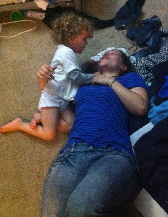
- Rubio's getting better as he goes along, but the toddler is climbing on me making it hard to listen. #
- I can see some of the Rubio appeal, but he probably does need another few years to season. We'll see how he looks in in 2016 or 2020. #
- RT @joshtpm New line item added to RNC manual: No ad-lib speeches by famous actors over 80. No exceptions. #
- Here's Romney! (Read in Ed McMahon voice.) #
- Here we go. #
- He accepts! (Surprise!) #
- iPod joke. Bleh. #
- My Slingbox audio and video are out of sync. Distracting. Bleh. #
- He seems to be stumbling over some of the lines. A few garbled sentences here and there. #
- "Hug your kids, spend more time praying." Uh, OK. #
- Oh no, the biographical part. Snooze. #
- Armstrong call out. #
- This would have been more interesting with Gingrich. Or Santorum. #
- I found Waldo! #
- Mitt has friends who are women. #
- Is he going to cry? #
- This disappointed with Obama thing resonates, but will the disappointed people really prefer Mitt? #
- MT @CenteredPols You know theres something wrong as president when the best feeling you had was the day you voted for him. /devastating line #
- MT @sullydish "He believes jobs come from govt." Really? private/public sector job record under GB & BO in first terms: http://t.co/QlXfsVYS #
- Steve Jobs would be a big Romney fan. Not. #
- MT @BuzzFeedBen The thing about Romney He does deliver. This is the speech he needed. Doesn't blow it away, but does what he needs to do. #
- Drill baby drill! Oh wait… #
- RT @petersuderman Why not just go ahead and promise energy independence – and *unicorns*? Just as plausible, but way more awesome. #
- No new taxes! Read my… oh wait. #
- OK, that Obama ocean line was really bad. He shouldn't have said that. Obama deserves being made fun of for that. #
- He actually isn't doing bad on the speechifying part. Ignoring the content. Just delivery. Better as he finishes up. #
- Balloons? Where are the balloons? #
- Balloons waiting for Ryan? He's there now. Balloons please. #
- Balloons! #
- That was OK, not great. But that might be all he needed for the moment. #
- Actually, he probably needed more. Not sure that will have changed many minds or swung many actually undecided voters. #
- Since he is currently behind, he needs something to start moving people over to his side. #
- It won't help that tomorrow more people will be talking about Eastwood than Romney. #
- OK, enough of that. Dinner time. #
- Hear hear! RT @markos: Choosing one's company over family doesn't make one a hero. I refuse to miss my kids' games and performances. #
- RT @JoeMuto: Nothing says "Party of the Future" like a rambling old man mumbling to an empty chair. #
|
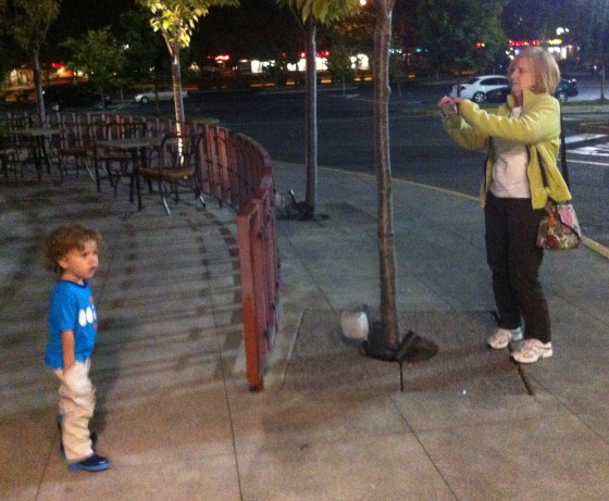
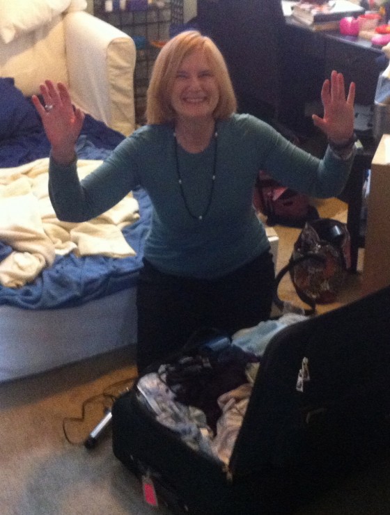
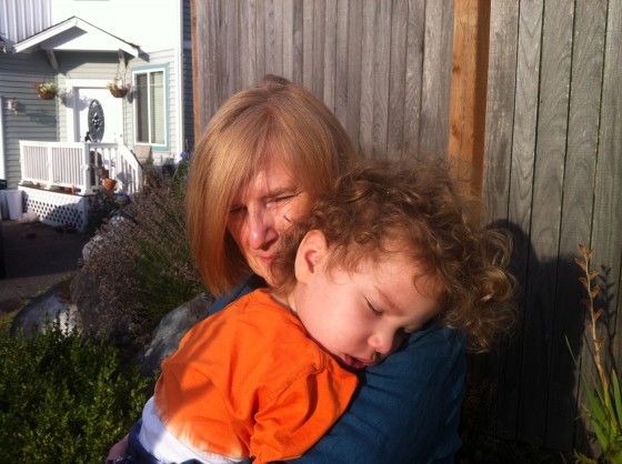
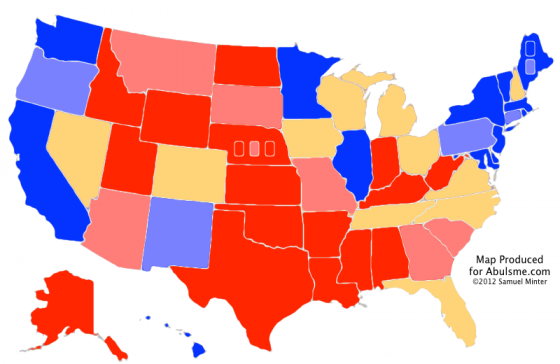
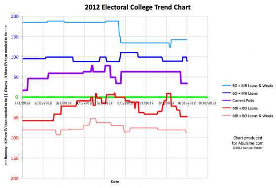
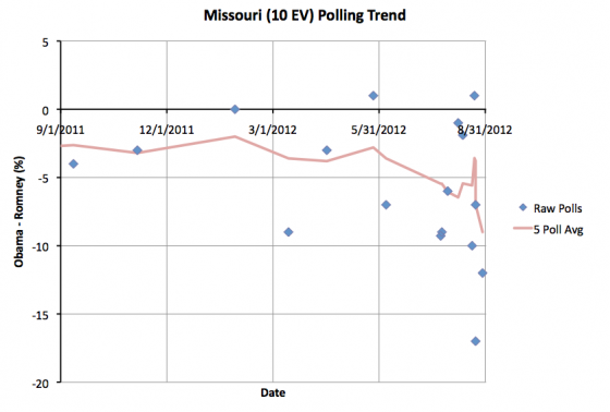
[Edit 2012 Aug 31 20:51 UTC to make it just “Sam talks about” instead of “Sam and Ivan”.] Playing with the EXAL train! Walking with Grandma Leslie Grandma Getting a Picture Blurry, but Grandma really wanted this shot of Alex and Daddy walking together. :-) (Photo by Grandma Leslie) Bedtime Father and Daughter (Photo by Grandma Leslie) [Photo of Brandy on the couch by Grandma Leslie Censored] Packing to go Alex and Grandma Leslie with sleeping Alex This might be worth opening one eye. Maybe. [Photo of Brandy with Grandma Leslie and Alex Censored] [Photo of Amy, Brandy, Grandma Leslie and Alex Censored] Back to sleep on Grandma Leslie And then she was off. Goodbye Grandma Leslie! Alex woke up in the car to say goodbye though. (Photo by Grandma Leslie) And Daddy went off to work! (For the record, that is not me on the zipline.) One update today, and it is Missouri reversing the move it made on the 25th: As you can see, polling in Missouri lately has been a bit, uh, wild. The last five polls, which only go back about a week and a half, have ranged from an Obama lead of 1%, to a Romney lead of 17%. That is just all over the place. I’m not sure that public opinion is really swinging quite so much so fast and there is something odd with the polls instead, but we have what we have. Before the two new polls I added today, the five poll average had a Romney lead of 3.8%. The two new polls were very good for Romney and we are now up to a Romney lead of a full 9%! This is a very quick moment in Romney’s direction. I guess if there was indeed any movement away from the Democrats due to Akin, the backlash is now in full effect. Most of the last year Romney has been ahead in Missouri, but not by much. If the trend of the last few polls holds up, it looks like Obama’s support in Missouri pretty much collapsed and the state may even be heading toward my “Strong Romney” category. With the polling as all over the place though, I’d reserve judgement on that. The next polls may move in the opposite direction. For the moment though, Missouri is very much in the “Weak Romney” category, meaning Romney has a pretty substantial advantage there, but not so large that he can feel safe completely ignoring the state. This change once again reduces Obama’s best case:
This means that even in his best case, Obama can’t reach his 365 to 173 victory margin from 2008. Even though Romney has had a good month in our models, Obama is still ahead… but the margins from 2008 are veery unlikely. This will be closer than 2008 unless something dramatic changes. Note: Chart and map from the Abulsme.com 2012 Electoral College Prediction page. Both assume Obama vs Romney with no strong third party candidate and show polling as it currently exists. Things will change before election day. On the map red is Romney, blue is Obama, gold states are too close to call. Lines on the chart represent how many more electoral votes a candidate would have than is needed to tie under several different scenarios. Up is good for Obama, Down is good for Romney. Edit 2012 Sep 6 09:34 UTC to add final note.
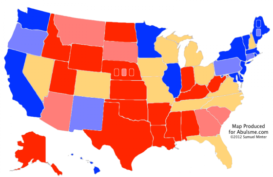
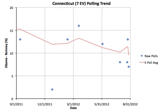
One state changing status today, and that is Connecticut, where Obama’s lead has diminished: Connecticut has been fairly sparsely polled, being generally considered to be a pretty safe Obama state. But there have been a few new polls recently, and they have shown Obama’s lead somewhat diminished from the levels it had been at most of the last year. With today’s update, Obama’s lead in the five poll average drops to 9.6%. Now, that is still a pretty substantial lead, but it moves Connecticut from my “Strong Obama” category to my “Weak Obama” category. In general, this represents states where the candidate has a definite lead, but not so large a lead that it is safe to ignore the state. The right set of events could potentially reduce the lead further and make the state competitive. Having said that, it would take a pretty substantial change in the dynamics of the race to make Connecticut competitive, so that is not expected. But the slow deterioration of Obama’s margin in the state may still be something to watch. Since Connecticut neither is nor was a “too close to call” state, the three models I track do not change:
Note: Chart and map from the Abulsme.com 2012 Electoral College Prediction page. Both assume Obama vs Romney with no strong third party candidate and show polling as it currently exists. Things will change before election day. On the map red is Romney, blue is Obama, gold states are too close to call. Lines on the chart represent how many more electoral votes a candidate would have than is needed to tie under several different scenarios. Up is good for Obama, Down is good for Romney. Edit 2012 Sep 6 09:33 UTC to fix link in final note.
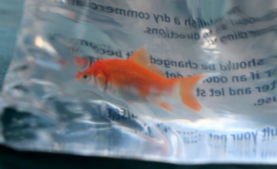
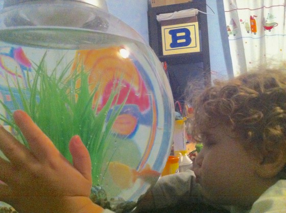
Grandma Leslie poses for the camera (Photo by Amy) Amy in line for a ride. (Photo by Grandma Leslie) Amy getting on the ride. (Photo by Grandma Leslie) Amy rides the ride (Photo by Brandy) Assessing the slide (Photo by Amy) Fun house mirror! (Photo by Amy) Hi Mom! (Photo by Amy) Finally coming down the slide… with help. (Photo by Grandma Leslie) Riding the Carousel – Again (Photo by Brandy) Alex’s very first roller coaster ride!! Daddy was very sad he missed it. Sniff. :-( (Photo by Brandy) Success!! (Photo by Grandma Leslie) Birds! (Photo by Amy) A fish was won! (Photo by Amy) Going to the fair is dirty work! (Photo by Amy) Amy blurring down the big slide (Photo by Grandma Leslie) Grandma Leslie at dinner Telling grumpy daddy about the scary roller coaster ride he missed A fishy face for the prize fish in its new home Playing with Sister Grandma Leslie with her more furry grandchild. [Edit 2012 Aug 30 00:15 UTC to make minor edit to one of the captions.] While there are still speeches yet to come, and a few more things my happen at the Republican National Convention, the actual nomination is now complete. The Republicans officially have a nominee. So time to review the final results of the delegate race.
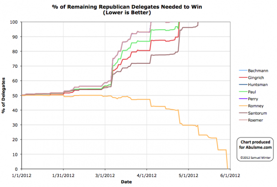
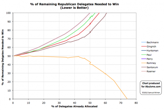
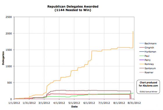
Peak represents the highest delegate estimate the candidate had during the primary season (not counting the final convention results). The final estimates reflect the best estimates used here as of the “end” of the primary season. Specifically these is the estimate on August 22nd 2012, right before Gingrich and Santorum released their delegates. These released delegates were then free to vote for whoever they wanted in the Roll Call. The roll call represents the count of the votes verbally given by the states at the Roll Call at the convention on August 28th 2012. (There were five votes in Pennsylvania that some reported as going to Paul Ryan, others have said the speaker said “Paul, Ron”. I believe these were intended for Ron Paul, so have counted them as such.) The official count represents the vote as recorded by the convention. Romney was the only candidate who was officially nominated and seconded at the convention, so therefore was the only candidate who could officially receive votes and have them registered. Officially any votes for anybody else were equivalent to abstentions. Lots more details on the final results of the full process can be found on the Results of the 2012 Republican Party presidential primaries page on Wikipedia, Green Papers (including totals), and DCW. Note: Charts from the Abulsme.com 2012 Republican Delegate Count Graphs page. The first and second charts represent the % of remaining delegates the candidates needed in order to reach 1144 and win the nomination. Going above 100% represented being mathematically eliminated, dropping to 0% represented “clinching” the nomination. The first chart shows this by date, while the second shows this by % of the delegates determined so far. The third chart is the % of delegates the candidate has collected. The fourth is the actual number of delegates. These numbers include estimates of the eventual results of multi-stage caucus processes as those estimates were refined over time. The final data point represents the roll call count, not the official results which only counted votes for Romney. [Edit 2012 Aug 29 14:59 to add two more charts and revise the final note.] [Edit 2012 Aug 29 15:42 to add links to sources for more info.] |
||||||||||||||||||||||||||||||||||||||||||||||||||||||||||||||||||||||||||||
