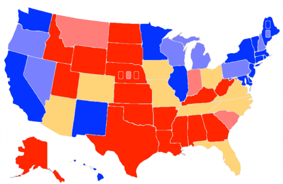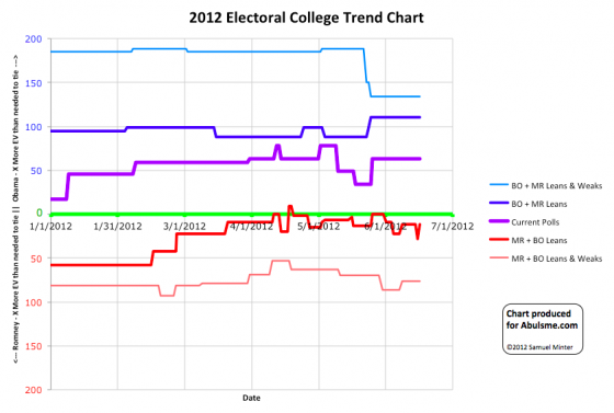

Chart and map from the Abulsme.com 2012 Electoral College Prediction page. Both assume Obama vs Romney with no strong third party candidate. Both show polling as it currently exists. Things will change before election day. On the map red is Romney, blue is Obama, gold states are too close to call. Lines on the chart represent how many more electoral votes a candidate would have than is needed to tie under several different scenarios. Up is good for Obama, Down is good for Romney.
So, um, the change from yesterday, I guess, well, never mind:

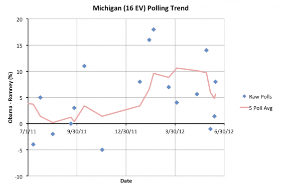
So, yesterday a new poll pulled Obama’s lead in the five poll average in Michigan under 5%. Today another new poll pulls that lead back up over 5% again. Easy come, easy go I guess. This takes Michigan once again out of the set of states we consider going both ways in our models.
| Romney | Obama | |
|---|---|---|
| Romney Best Case | 281 | 257 |
| Current Status | 206 | 332 |
| Obama Best Case | 159 | 379 |
So, we can, for the moment anyway, just take everything I said yesterday about momentum in Romney’s direction, and say “OK, maybe not so much after all”. Romney’s best case is now back in the range it has been ever since the end of February, with relatively narrow paths to victory. Maybe we’ll see a more permanent move in that direction soon… but not yet.
Meanwhile, one final correction due to the data from a spreadsheet provided by Darryl at HorsesAss. With more precise information from a poll back in February, one of Wisconsin’s transitions, from Weak Obama to Strong Obama, moves from March 30th to March 31st. The rest of Wisconsin’s history stays the same (it has moved around several times), as does the current situation as a “Weak Obama” state where Obama leads by between 5% and 10%. This only affects the older part of the historical chart. That chart is adjusted starting with today’s update.
Leave a Reply
You must be logged in to post a comment.