|
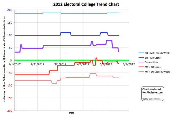
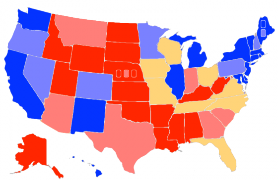
Chart and map from the Abulsme.com 2012 Electoral College Prediction page. Both assume Obama vs Romney with no strong third party candidate. Both show polling as it currently exists. Things will change before election day. On the map red is Romney, blue is Obama, gold states are too close to call. Lines on the chart represent how many more electoral votes a candidate would have than is needed to tie under several different scenarios. Up is good for Obama, Down is good for Romney. One state changes status today:
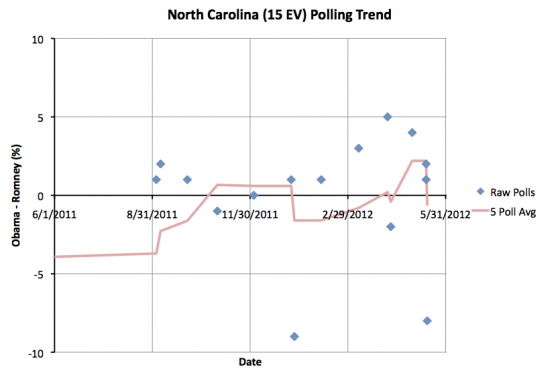
North Carolina moves from Obama up by 2.0% to Romney up by 0.6%. Either way, this is too close to call. North Carolina remains a swing state. Now, the latest poll actually has Romney ahead by 8%. This might be the start of a larger move toward Romney. Or maybe it is an outlier. It is too early to tell. For now, North Carolina is now a swing state that leans ever so slightly to Romney. Since North Carolina remains too close to call, this doesn’t change either candidate’s best case scenarios, which represent the range of reasonably possible results based on current state polling. The current line drops a nice ways in Romney’s direction though.
Glancing at the chart, it looks like there has been a nice move in Romney’s direction lately. Lets look at some specific numbers and compare to one month ago. One month ago was the first time that the state polls showed Romney’s best case being to lose. Things clearly look much better for him today. On April 18th, Romney’s best case showed him losing 260 to 278. Now he wins 276 to 262. He has moved 16 electoral votes (net) back into contention that a month ago seemed out of reach. On the current line, a month ago Obama was winning 328 to 210. Now he is only winning by 303 to 235. Over the last month Romney has pulled a full 25 electoral votes (net) over the line toward him. As for Obama’s best case… no change. The needle hasn’t moved at all. Obama hasn’t managed to pull more electoral votes into being competitive, nor have any moved out of reach. So the movement has definitely been in Romney’s direction. If he keeps it up, we’ll start to see the map looking much more competitive soon. By comparison, look at 4 years ago… the two best cases were much more symmetric around the tie line. The candidates were more evenly matched and the range of possibilities was not really favoring either candidate. It was clearly a wide open race four years ago. Having a lot more swing states helped. The “current” status looked very similar to today’s though… we had McCain 302, Obama 236. Reverse the parties, and we are almost exactly in the same place we are today. Of course McCain did not go on to win. One should look at Obama’s current lead in the model with that in mind. There is still a long time until November. Edit 2012 May 20 06:39 UTC – Fixed Map, SC was incorrectly colored as a swing state, it is now correctly colored as “Weak Romney”.
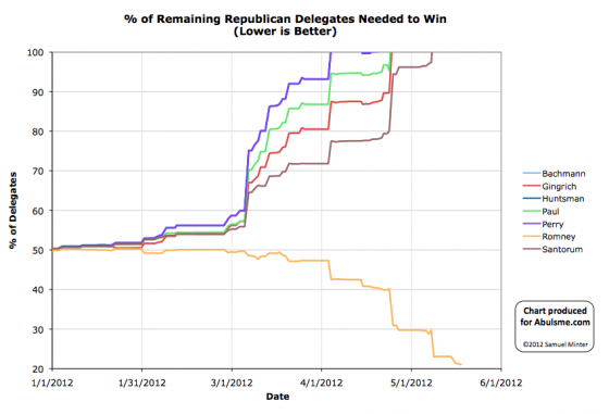
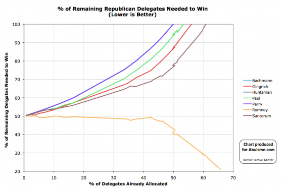
Charts from the Abulsme.com 2012 Republican Delegate Count Graphs page. When a candidate gets down to 0%, they have clinched the nomination. If they get above 100%, they have been mathematically eliminated. The first chart is by date, the second is by “% of Delegates Already Allocated”. These numbers include estimates of the eventual results of multi-stage caucus processes which will be refined as the later stages occur. Via DCW we have two more superdelegates for Romney today. This moves Romney’s % of remaining needed to win from 21.2% to 21.0%. He needs 165 more delegates to wrap this up. |
||||||||||||||
