- Reading – Mitt Romney Platform 'Like An Etch A Sketch,' Top Spokesman Says (Sam Stein) http://t.co/TOlXPU5I #
- Reading – The Horserace Ends (Andrew Sullivan) http://t.co/ZJh2I3AG #
- Reading – Poll Analysis: Obama leads Romney (Darryl, HorsesAss) http://t.co/2sDzrfEb #
- MT @ppppolls: Nebraska won our vote on where to poll this weekend. Taking question suggestions for there and for NC: http://t.co/F0mNu2V1 #
- @ppppolls CD breakdown planned for weekend NE poll? Relevant since NE can split EV like it did in 2008. #
|
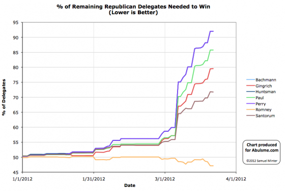
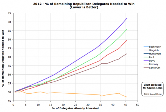
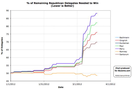
Charts from the Abulsme.com 2012 Republican Delegate Count Graphs page. When a candidate gets down to 0%, they have cinched the nomination. If they get up past 100%, they have been mathematically eliminated. The first chart is by date, on the second chart rather than the date on the x-axis, we show the “% of Delegates Already Allocated” as this better represents the progress through the race. Note that these numbers include estimates of the eventual results of multi-stage caucus processes which will be refined as the later stages occur. Right after the caucuses there, delegates from Alaska were estimated as Romney 8, Santorum 7, Paul 6, Gingrich 3. The district Convention vote is now final, and the estimate changes to Romney 8, Santorum 8, Paul 6, Gingrich 2. So net for the day: Santorum +1, Gingrich -1. (The three superdelegates from Alaska are still up for grabs.) This of course doesn’t substantially change anything. (For the die hards: Santorum’s % of remaining needed to win declines from 71.84% to 71.76%, while Gingrich’s rises from 79.49% to 79.57%.)
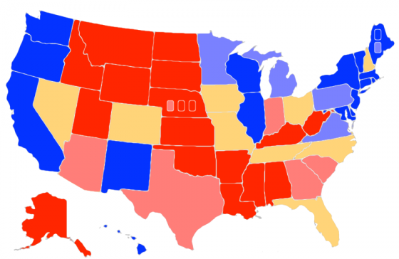
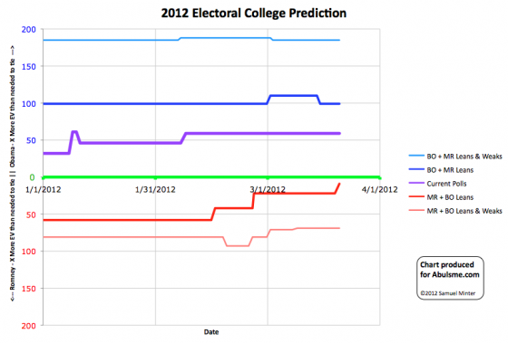
Map and chart from the Abulsme.com 2012 Electoral College Prediction page. Both assume Obama vs Romney with no third party strong enough to win states. Lines on the chart represent how many more electoral votes a candidate has than is needed to tie under several different scenarios. Up is good for Obama, Down is good for Romney. Surely we must be close to Romney’s nadir, right? We expect him to suffer in the polls while going through his primary battle, but once it becomes clear he is the nominee and he can start pivoting to the general election, he should start fighting back. Right? That’s what we expect? Romney should hope that this is his low point, because his best case is now just barely squeaking out a win… The new update today to my “last five poll average” for Virginia pushes Obama’s lead to over 5%. So I move the state out of the swing state category and into “Weak Obama” which I color light blue above. This change makes our summary look like this:
This means that in Romney’s best case (that is, he wins every single swing state), he wins with only 9 more electoral votes than the 269 needed to tie. That is getting awfully close. That would mean that out of the nine swing states (defined as states where the leading candidate is ahead by less than 5% in the polls)…
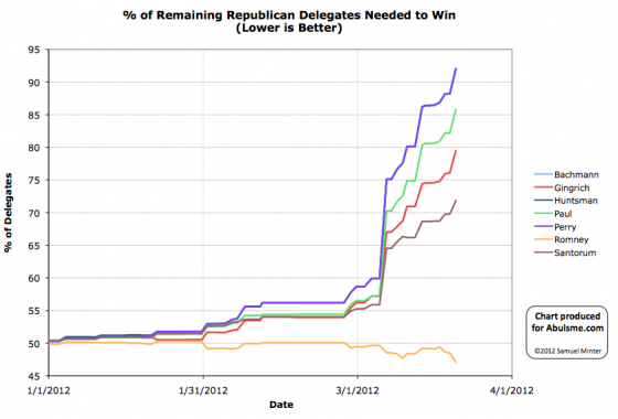
(Meanwhile, in Obama’s best case, he wins with 99 more electoral votes than needed to tie.) That is of course if the election was today, which it is not. We have a long way to go. These lines will move up and down quite a bit before we get to November. Charts from the Abulsme.com 2012 Republican Delegate Count Graphs page. When a candidate gets down to 0%, they have cinched the nomination. If they get up past 100%, they have been mathematically eliminated. The first chart is by date, on the second chart rather than the date on the x-axis, we show the “% of Delegates Already Allocated” as this better represents the progress through the race. Note that these numbers include estimates of the eventual results of multi-stage caucus processes which will be refined as the later stages occur. So this looks like it might be it. As I indicated might be a possibility in yesterday’s update, between Romney’s lead growing rapidly in recent polls and Santorum failing to file proper delegate slates everywhere, Romney did indeed do well enough to be moving in the direction of getting to 1144. (In fact he blew away the percentages he needed to get for that.) He is now in the best position he has been in since the race began, and the chances of any brokered convention shenanigans are receding quickly. Lets look at the specifics. With 99% of precincts reporting, Romney has 46.7% of the popular vote in Illinois. But because of the specifics of how delegates are allocated, and Santorum’s failure to have delegate slates everywhere, this translates into getting 42 of the 54 delegates that were up for grabs tonight. That is 77.8% of the delegates. WELL above the 48.5% of delegates he needed to improve his position overall. Santorum gets the other 12 delegates allocated tonight. Gingrich and Paul are shut out and get nothing. Also today the one Puerto Rican superdelegate who had previously endorsed Gingrich decides to echo the election results there, says it is “time to unite” and switches his endorsement to Romney. This makes the totals for today: Romney +43, Santorum +12, Gingrich -1 And looking at “% of remaining delegates needed to win”:
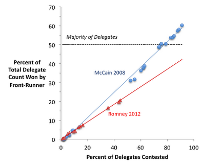
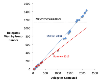
Looking at the charts at the top of this post, between Puerto Rico and Illinois, Romney is finally starting to really drive down this number. His line is finally starting to move downward rapidly. The three non-Romneys continue their race toward mathematical elimination. It won’t be long now. How about the possibilities for blocking Romney? Well, at this point the combined non-Romneys would need to consistently get 52.9% of the remaining delegates in order to be on a pace to stop Romney from getting to 1144. Up to this point the non-Romney’s have managed 46.5% of the delegates. Making the jump from 47% to 53% is a big jump, but still not an unimaginable jump. Perhaps with a few major Romney stumbles in a row? And a few good states in a row? Louisiana maybe? The RCP average for Louisiana has the non-Romneys at 56%. If the popular vote ends up like that, and the delegates parallel the popular vote… Well, yes, Romney may not get what he needs in Louisiana. But after that the calendar starts looking better for Romney again. And with it being essentially 100% clear at this point that none of the non-Romneys have a chance at 1144 (despite what Santorum’s camp was saying recently) and it is all just about blocking Romney, do people continue to vote for candidates who are clearly losing? And perhaps just as importantly, do rich donors still throw millions at candidates who clearly are going nowhere? Probably not. It has taken awhile, but it really does look like Romney is finally starting to put the chances of being blocked in the rear view mirror. I’m not ready to call it impossible quite yet. But it is getting closer to that point and is already very unlikely. We can already say that the non-Romney’s getting it together enough to block Romney would require a major change to how they’ve been doing so far, and a reversal of recent trends. Once Romney’s “% of remaining needed to win” drops below 45% or so we can pretty safely call this a done deal absent a major catastrophe. From then on out, it will just be Romney slowly but surely grinding his way to 1144. But we aren’t there quite yet. Lets see how Louisiana, DC, Maryland and Wisconsin go. (Those last three are winner take all, so April 3rd will be a big day!) This of course does mean that Santorum is now the frontrunner to be the 2016 Republican nominee. (Since Romney will lose to Obama in November according to current polling, and by coming in 2nd this time around, Santorum would be “next in line” on the Republican side.) Too soon? The following was also posted as a series of comments both on the last post here and on the Enik Rising blog, but I thought it was worth repeating as a full fledged post as well, because it helps interpret the graphs in the last post more intelligently. Bottom line, the % vs Absolute difference didn’t make a big difference in the two charts, our underlying data was nearly the same, but some minor differences made the two charts appear to give entirely different conclusions. I’ll post a revised chart once we get past Louisiana. Anyway, the comments… First, I commented on Enik Rising with a link to my last post. Seth replied in the comments with:
The addition to his earlier post was:
So of course I had to dig deeper. At first I was sure it was just different sources doing delegate counts differently. Then I was sure it was the 2008 results being complete results that came later dated back to the original primary/caucus dates vs incomplete results now. Both of those were incorrect. When you actually look at the data points on the two charts, they actually match up very nicely. The TL;DR: The data points in my chart and his chart actually line up quite nicely. But….
These three things fully account for looking at these two charts and seeing two different things even though the underlying data is very nearly the same. So here is what I posted in the comments on Enik Rising as I was figuring it out:
And then in a follow up… (Well, OK, I had to split it into two comments because I was unnecessarily long winded and it was too long for one comment… I could have edited it down to the TL;DR above before posting it as a comment, but I didn’t… Oops.)
And then I thought of the aspect ratio thing:
Moral of the story… little details matter in charts like this, and can greatly affect the conclusions you draw from looking at them.
I had previously talked about the comparisons between the 2012 and 2008 Republican races here, here and here. The last of those is the most relevant, and if you haven’t checked it out before, feel free to go back and do so now. :-) In any case, a few hours ago I saw this tweet from @DemConWatch. It links to the article below. I’ve quoted the key conclusion, but please click through and read the whole thing. Romney, McCain, and the long slog to 1,144
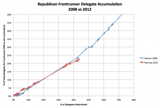
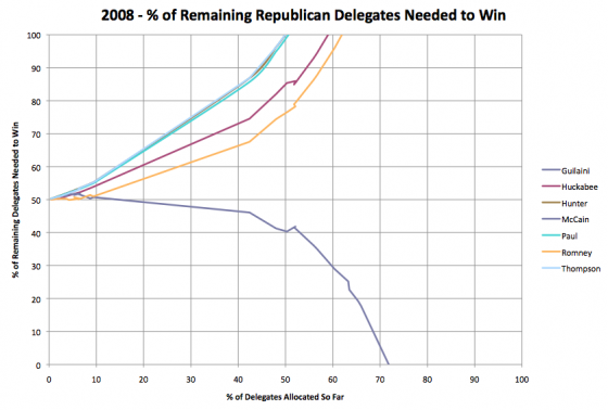
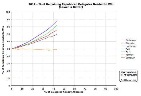
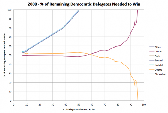
The thing I immediately noticed… the total number of delegates was different in 2008 and 2012! In 2008 there were 2380 delegates total. In 2012 there are only 2286! So using absolute numbers of delegates on the axes is not doing a direct comparison. You need to look at these as percentages of the total number of delegates available. So I redid the chart on that basis, using the data I had collected in my 2008 Delegate Race Page (which used CNN’s delegate counts, grabbed and put into a spreadsheet on a daily basis) and which I am now collecting in my 2012 Delegate Race Page (which uses the Soft Count from Greenpapers including DCW’s Superdelegate numbers also grabbed daily for a spreadsheet). Now, both my 2012 and 2008 numbers include so called “fantasy delegates” projecting the eventual results from caucus states, etc, which many folks argue is not the right way to track delegates, but since both years followed that practice, it seems like a valid comparison. In any case, the result is this: Romney is indeed behind McCain’s pace, but only very slightly, and that only developed in the last few contests. For most of the race so far, the pace of the two candidates tracked very closely, with Romney actually being ahead of McCain’s pace until Super Tuesday. He certainly is not as far behind as he appeared in Seth’s chart from Enik Rising. Rather, once you correct for both the calendar changes and the differing number of delegates, we see that the whole narrative of Romney being much slower to wrap things up than McCain was four years ago just falls apart. I’ll note that using the Green Papers count instead of the RCP Count that Seth used puts Romney slightly BETTER than the pace he needs to get to 1144 rather than slightly worse than that pace. And indeed, which sources you use for both the 2008 and 2012 delegate counts probably matters here. Given how much the various estimates vary I imagine how far the two lines are from each other may be quite different based on which delegate counts you use… but the above is what I get using the sources I chose to use for tracking in these two cycles. I’ll also use this opportunity to update the comparison between 2008 and 2012 using the metric I prefer… “% of remaining delegates needed to win”. This hits 100% once a candidate is mathematically eliminated or hits 0% once they have the needed number of delegates to secure the nomination. In 2008 on the Republican side the chart of this number for the various candidates looked like this: As of right now in 2012 (a few hours before the March 20th Illinois primary) this looks like this: Comparing these, as with the other chart, you can see that McCain in 2008 was indeed a bit better off at this point than Romney is this time around, but not by a huge margin. Using the sources I noted above, as of today 43.3% of the delegates have been allocated (or at least estimated in the case of those pesky fantasy delegates). As of today Romney needs 48.5% of the remaining delegates to wrap up the nomination. The closest equivalent day in 2008 would have been February 6th 2008 (just after Super Tuesday, with incomplete delegate results from those contests as results trickled in over several days) with 42.4% of the delegates determined (or estimated). At that point McCain needed 46.1% of the remaining delegates to win. Unquestionably better than Romney today, just not by a HUGE margin yet. In any case, the massive perception difference in terms of how well Romney is “wrapping it up” in 2012 compared to McCain in 2008 is almost all due to the spread out calendar. In reality, Romney is actually only a little bit behind McCain’s pace four years ago. It just SEEMS like he is much much further behind due to the fact it is the end of March at this point rather than the beginning of February which is when we were at the equivalent point in the delegate race back in 2008. Finally, just for an additional comparison, here is the same graph for the Democrats in 2008… (Minor wording edits and fixes were made in the 90 minutes or so after posting.) Chart from the Abulsme.com 2012 Republican Delegate Count Graphs page. When a candidate gets down to 0%, they have cinched the nomination. If they get up past 100%, they have been mathematically eliminated. Note that these numbers include estimates of the eventual results of multi-stage caucus processes which will be refined as the later stages occur. A minor update from Georgia today. My primary source, Green Papers, previously had the results from Georgia as Gingrich 54, Romney 19, Santorum 3. This has now been updated to Gingrich 52, Romney 21, Santorum 3. So the net for the day is Romney +2, Gingrich -2. So Romney’s “% of remaining needed to win” drops from 48.7% to 48.5%. (And Gingrich’s rises from 75.9% to 76.1%.) This is a minor change that does not change the state of the race significantly. But since there is an update today, it gives me a chance to modify something I said in the last update based on new information. I had said:
Well. two things. First, recent polls have been moving in Romney’s direction over the last week. The most recent poll as of this writing was a poll from PPP (pdf) that has Romney at 45%. Now, polls predict popular vote, not delegates, and the 48.5% Romney needs is a percentage of delegates, not a percentage of the popular vote. But assuming at least some correlation between popular vote and delegates, those numbers are getting pretty close to each other. Which brings us to… Second, Santorum failed to properly file for delegate slates in some parts of the state. This means that Santorum’s delegate take will almost certainly underperform his performance in the popular vote. This implies that Romney’s delegate take may well overperform his popular vote number. With these two factors together, Romney’s chances of getting to the 48.5% he needs to improve his “% of remaining” number and move closer to the nomination and further away from the scenarios where he doesn’t get to 1144 is much more likely than it looked previously. By this time tomorrow, we should know how that turned out.
|
||||||||||||||
