I had previously talked about the comparisons between the 2012 and 2008 Republican races here, here and here. The last of those is the most relevant, and if you haven’t checked it out before, feel free to go back and do so now. :-)
In any case, a few hours ago I saw this tweet from @DemConWatch. It links to the article below. I’ve quoted the key conclusion, but please click through and read the whole thing.
Romney, McCain, and the long slog to 1,144
(Seth, Enik Rising, 2012 Mar 19)
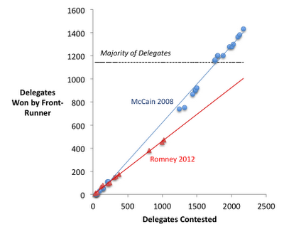
Below, I’ve charted McCain’s and Romney’s delegate shares compared to the total number of delegates that have been awarded to date. So, for example, by the time 1,247 delegates had been awarded in 2008 (Super Tuesday), McCain had won 740 of them. (I’ve used RCP’s estimates of delegate shares in 2008 and 2012.) I’ve projected a linear path for both years.
So the big thing to note here is that Romney is accumulating delegates at a slower pace than McCain did four years ago. Also of note: Romney will not get to 1,144 delegates (a majority) by the end of the primaries and caucuses assuming he keeps accumulating delegates at his current pace.
The thing I immediately noticed… the total number of delegates was different in 2008 and 2012! In 2008 there were 2380 delegates total. In 2012 there are only 2286! So using absolute numbers of delegates on the axes is not doing a direct comparison. You need to look at these as percentages of the total number of delegates available.
So I redid the chart on that basis, using the data I had collected in my 2008 Delegate Race Page (which used CNN’s delegate counts, grabbed and put into a spreadsheet on a daily basis) and which I am now collecting in my 2012 Delegate Race Page (which uses the Soft Count from Greenpapers including DCW’s Superdelegate numbers also grabbed daily for a spreadsheet).
Now, both my 2012 and 2008 numbers include so called “fantasy delegates” projecting the eventual results from caucus states, etc, which many folks argue is not the right way to track delegates, but since both years followed that practice, it seems like a valid comparison.
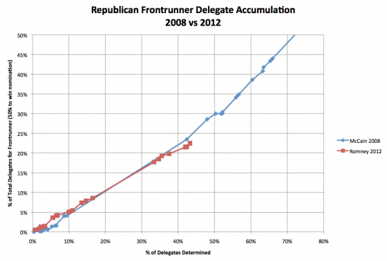
In any case, the result is this:
Romney is indeed behind McCain’s pace, but only very slightly, and that only developed in the last few contests. For most of the race so far, the pace of the two candidates tracked very closely, with Romney actually being ahead of McCain’s pace until Super Tuesday. He certainly is not as far behind as he appeared in Seth’s chart from Enik Rising. Rather, once you correct for both the calendar changes and the differing number of delegates, we see that the whole narrative of Romney being much slower to wrap things up than McCain was four years ago just falls apart.
I’ll note that using the Green Papers count instead of the RCP Count that Seth used puts Romney slightly BETTER than the pace he needs to get to 1144 rather than slightly worse than that pace. And indeed, which sources you use for both the 2008 and 2012 delegate counts probably matters here. Given how much the various estimates vary I imagine how far the two lines are from each other may be quite different based on which delegate counts you use… but the above is what I get using the sources I chose to use for tracking in these two cycles.
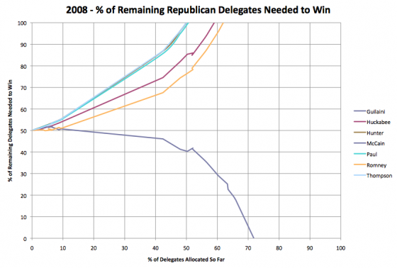
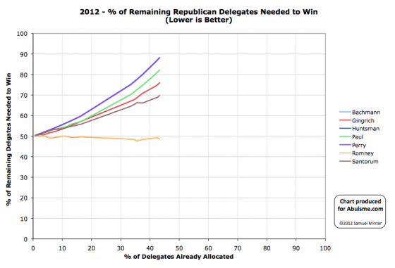
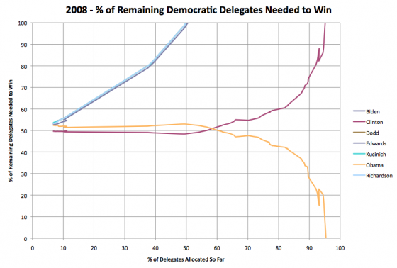
I’ll also use this opportunity to update the comparison between 2008 and 2012 using the metric I prefer… “% of remaining delegates needed to win”. This hits 100% once a candidate is mathematically eliminated or hits 0% once they have the needed number of delegates to secure the nomination.
In 2008 on the Republican side the chart of this number for the various candidates looked like this:
As of right now in 2012 (a few hours before the March 20th Illinois primary) this looks like this:
Comparing these, as with the other chart, you can see that McCain in 2008 was indeed a bit better off at this point than Romney is this time around, but not by a huge margin.
Using the sources I noted above, as of today 43.3% of the delegates have been allocated (or at least estimated in the case of those pesky fantasy delegates). As of today Romney needs 48.5% of the remaining delegates to wrap up the nomination.
The closest equivalent day in 2008 would have been February 6th 2008 (just after Super Tuesday, with incomplete delegate results from those contests as results trickled in over several days) with 42.4% of the delegates determined (or estimated). At that point McCain needed 46.1% of the remaining delegates to win. Unquestionably better than Romney today, just not by a HUGE margin yet.
In any case, the massive perception difference in terms of how well Romney is “wrapping it up” in 2012 compared to McCain in 2008 is almost all due to the spread out calendar. In reality, Romney is actually only a little bit behind McCain’s pace four years ago. It just SEEMS like he is much much further behind due to the fact it is the end of March at this point rather than the beginning of February which is when we were at the equivalent point in the delegate race back in 2008.
Finally, just for an additional comparison, here is the same graph for the Democrats in 2008…
(Minor wording edits and fixes were made in the 90 minutes or so after posting.)
I pointed out this post to Seth on a comment on has blog and by twitter. He responded:
Thanks for noticing my error! I’ve added a new chart above, although it looks virtually identical to my previous one. I assume the big difference comes from the different methods of determining delegate shares.
March 20, 2012 8:58 AM
And added the following to his post:
Update: Samuel Minter makes the very important observation that there are different total numbers of Republican delegates in 2008 and 2012, making a direct comparison of raw delegate counts misleading. I don’t have a good excuse here. Anyway, I went ahead a changed the raw counts to percentages and produced… almost exactly the same chart:
(Chart)
I’m not really sure why his chart looks so different from mine. Perhaps it’s because he’s using Green Paper numbers rather than RCP numbers, perhaps because I use a linear projection and he doesn’t….
From SM via Enik Rising:
Thanks for taking a look Seth. Lets try to figure out why the two charts look different.
The source counts are different of course, but not by much, at least for 2012. RCP has Romney at 516 delegates right now (22.6% with 42.0% determined), Green Papers has him at 515 (22.5% with 43.3% determined). So Green Papers actually has the Romney 2012 line LOWER than you would get with RCP, but they are pretty close.
It must be the 2008 numbers that differ between the sources then. RCP’s line must be much higher than the line I got from tracking CNN in 2008.
Looks like on the 2008 line you have a data point at about (60%,37%). My data taken daily from CNN back in 2008 had 60% being hit on February 20th. At that point the count was McCain 918 out of the 2380 delegates, or 38%. So… almost the same place you have your data point. It looks like our data points around the 50% mark in 2008 line up pretty well too.
Hmmm…
Ah! I know now. I have a few additional data points that come from the days right after super Tuesday since those results came in over the course of a few days and I took snapshots of the count every day, rather than just having the final results as if they were immediately known on Super Tuesday. I have additional data points other places as well due to more intermediate results.
So I have more data points right around the percentage we are at right now, whereas on your chart right now Romney is in the gap caused by Super Tuesday and the next data point for McCain is the one with complete 2008 results. And it looks like those initial delegate results I have filling in that gap were slightly less favorable to McCain than the results that came in more slowly over the next couple of days. (My spreadsheet is linked on my wiki, feel free to look through the details.)
Then the rest of your data points are AFTER Super Tuesday. But of course after Super Tuesday McCain started accelerating because he was the presumptive nominee and so started collecting delegates faster at that point. Both your linear trend line and what the eye is drawn to for the data points, picks up on that accelerated post-Super Tuesday velocity and thus pulls the trend line to a higher slope.
Between these two things (my additional data points for partial super Tuesday results and McCain acceleration after passing the 52% mark) I think we completely explain the difference between the two charts.
March 20, 2012 1:43 PM
From SM via Enik Rising:
The place where that “kink” happened and McCain started accelerating happened immediately post Super Tuesday. In 2008 once all the Super Tuesday results were in, the delegates awarded so far percentage was at just about 52%. This is about where we will be this time around right after Louisiana on Saturday.
So if we both redraw our graphs when we add the data points for Illinois and for Louisiana, we should see our data points for the 52% mark line up much more closely with each other again, and we’ll be looking at a comparison with data points close to the same percentages again (as opposed to Romney currently being in the “Super Tuesday gap” when compared to 2008).
At that point I think we’ll have a clear picture of how far behind McCain’s pace Romney really is at the moment. Right now the big 2008 Super Tuesday gap makes the comparison very dependent on small details of the analysis.
After Louisiana we’ll be able to compare 2012 at 52%, with 2008 at 52% and have a real apples to apples comparison.
So what would it take for Romney to catch up with where McCain was at the 52% mark? Lets do that math really quickly… To catch up Romney would need to hit the 30% of total delegates mark… or 686 delegates. That is a gain of 171 delegates. There are only 115 delegates between Illinois and Louisiana, and not all of them will be determined this week, and Romney won’t be getting 100% of them anyway, so that clearly isn’t happening.
Romney will be behind McCain’s pace no matter what, the only question will be by how much. My charts will start to show Romney falling behind McCain too at that point.
(And more relevantly for this time around, is he able to get enough to be on pace for 1144, or do we get brokered convention talk getting louder and louder in volume….)
Anyway, mystery solved. I think. :-)
March 20, 2012 1:43 PM
From SM via Enik Rising:
I know, too long already, but thought of one other factor. My chart is wider than they are tall, where yours is taller than it is wide. This means the same vertical difference on both charts will look larger on your chart.
Between these three things, the difference in perception of the two charts is fully explained, even though the underlying data is essentially the same.
Anyway… Illinois. :-)
March 20, 2012 8:25 PM