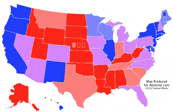
Map from the Abulsme.com 2012 Electoral College Prediction page.
And so, in the first update since I began tracking the general election matchup between Obama and Romney, we have a change in the status of one of the states. A new poll in Montana brings my five poll average (seeded with 2004 and 2008 results) under 10%, which moves Montana from Strong Romney to Weak Romney. Now, my average still has Romney ahead by 9.7%, which is still almost strong… his lead would need to fall below 5% for me to consider the state a toss up, and it is a long way from that.
But still, movement! State by State polls are still relatively infrequent at this point… a few per week… so change will be slow. Plus the focus hasn’t shifted to the general election campaign yet. By the time we get to the summer and fall, things will accelerate rapidly.
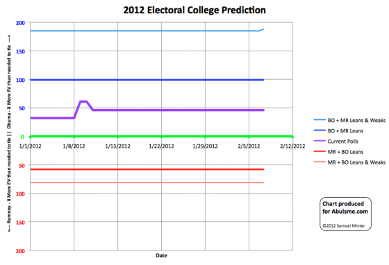
Below see the chart of where this puts us in terms of the electoral college. Montana only has 3 electoral votes, so it is just a minor movement on the upper line, which represents how many more electoral votes Obama would get than he needed to tie if he won all of the states he is ahead in, all the too close to call “lean” states and Romney’s weak states. This is of course a highly unlikely scenario. For the most part likely outcomes “if the election was held today” are between the dark blue and dark red lines below.
A better way to think about the “weak” states is that they are states that the candidate has a healthy lead in, but not so big a lead that they can ignore the state completely, as they could become vulnerable if the other candidate gets on a roll and gets a major nationwide surge in the polls. (Meanwhile, the “strong” states can indeed be ignored almost completely, and almost all the campaigning, advertising, and dollars will be pouring into the “lean” states.)
Chart from the Abulsme.com 2012 Electoral College Prediction page. Lines represent how many more electoral votes a candidate has than is needed to tie under several different scanarios.
And of course a final reminder… none of this represents an actual prediction for the results in November. This represents the state of things NOW, as imperfectly determined by still very sparse polling. Between now and November, quite a lot will happen, and the states will ebb and flow between categories as events unfold. This is why these charts show changes over time rather than just the snapshot of “now”. The goal is to show how the situation changes over the 10 months (and a few days) of the 2012 campaign season.


Leave a Reply
You must be logged in to post a comment.