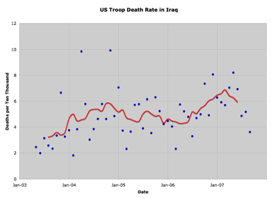
On Tuesday the Political Arithmetik blog featured a post titled U. S. Monthly Deaths in Iraq that featured a chart showing the trends in the number of US Military deaths in Iraq over the last few years. It was interesting, but I wondered if the trend would look different if you looked at it as a rate and took into account the varying number of troops in Iraq over that time period. I emailed Professor Franklin asking just that. He hadn’t examined it that way but pointed me at his data source at Brooking’s Iraq Index. Although the first time I looked I was blind and didn’t see it, this did have the total number of US troops as well as the deaths per month. So, dividing appropriately, this is what comes out:

The trend line is just a simple centered average of 7 months. (So, for instance, the trend in June is just the average of March through September.) There are definitely more sophisticated ways of marking a trend, but this is easy. :-)
As it turns out, even with the surge, the number of troops in Iraq hasn’t actually varied THAT much, so it doesn’t really tell you that much that’s different than the trend in the raw death numbers in the original post that inspired this.
But, for me anyway, looking at this as a rate somehow seems a more satisfying measure of… what should you call it… the “risk of death” measure or some such. It compensates for the fact that when there are more troops present one would expect more to die, all other things being equal.
There does look like there is a noticeable drop in the last few months after the surge was in place… but the downward trend is really only the last five data points, but there have been other periods in the past with five points in what looked like a downward trend, but which disappeared into the variation once there were more data points.
So we shall see I guess.

